Why data-heavy products become difficult #
Data-heavy products process and present large amounts of information: intranets, CRMs, financial analysis tools, news sites, e-commerce admin panels and analytics dashboards. Users usually come to work and may spend hours in the same tool each day.
Complexity has several sources. Hundreds of data points, charts and tables compete for attention. Disorganised menus turn access to a common document into several steps. Unclear presentation hides important changes and delays decisions. Slow or inconsistent dashboards undermine trust in the data.
Users genuinely need much of this information. Design’s job is to show the right data at the right time and level of detail.
Build information architecture around tasks #
A data-heavy product often mirrors a database or organisation chart. Users come with tasks: checking pending orders, reviewing customer history or preparing month-end reports. Grouping screens and menus around these tasks brings the product’s structure closer to the user’s mental map.
- Identify user groups and their most frequent tasks. A salesperson and finance manager need not share the same home screen.
- Provide strong search, filters and saved views so users do not rebuild the same filter every day.
- Use shortcuts such as recent records and favourites to speed up repeated work.
- Keep personalisation limited and reversible. Completely different layouts for every user make support and training harder.
Reveal detail progressively #
Nielsen Norman Group defines progressive disclosure as moving advanced or infrequent features to secondary screens to make an app easier to learn. In data-heavy interfaces, it becomes a layered path from overview to detail.
The first layer offers a few indicators for understanding the situation at a glance. Selecting one opens a related list or chart, then an individual record’s full detail. Each layer answers the previous layer’s question without forcing users through unnecessary information.
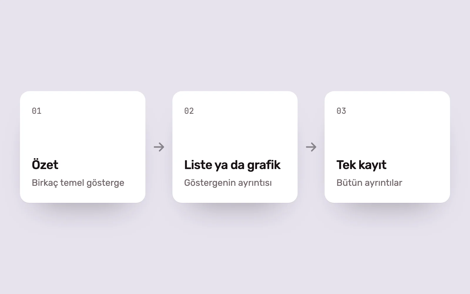
Distinguishing primary from secondary information is critical. Information most people frequently need should remain in the first layer. Otherwise, constant trips to detail screens slow work rather than simplify it.
Design tables around user tasks #
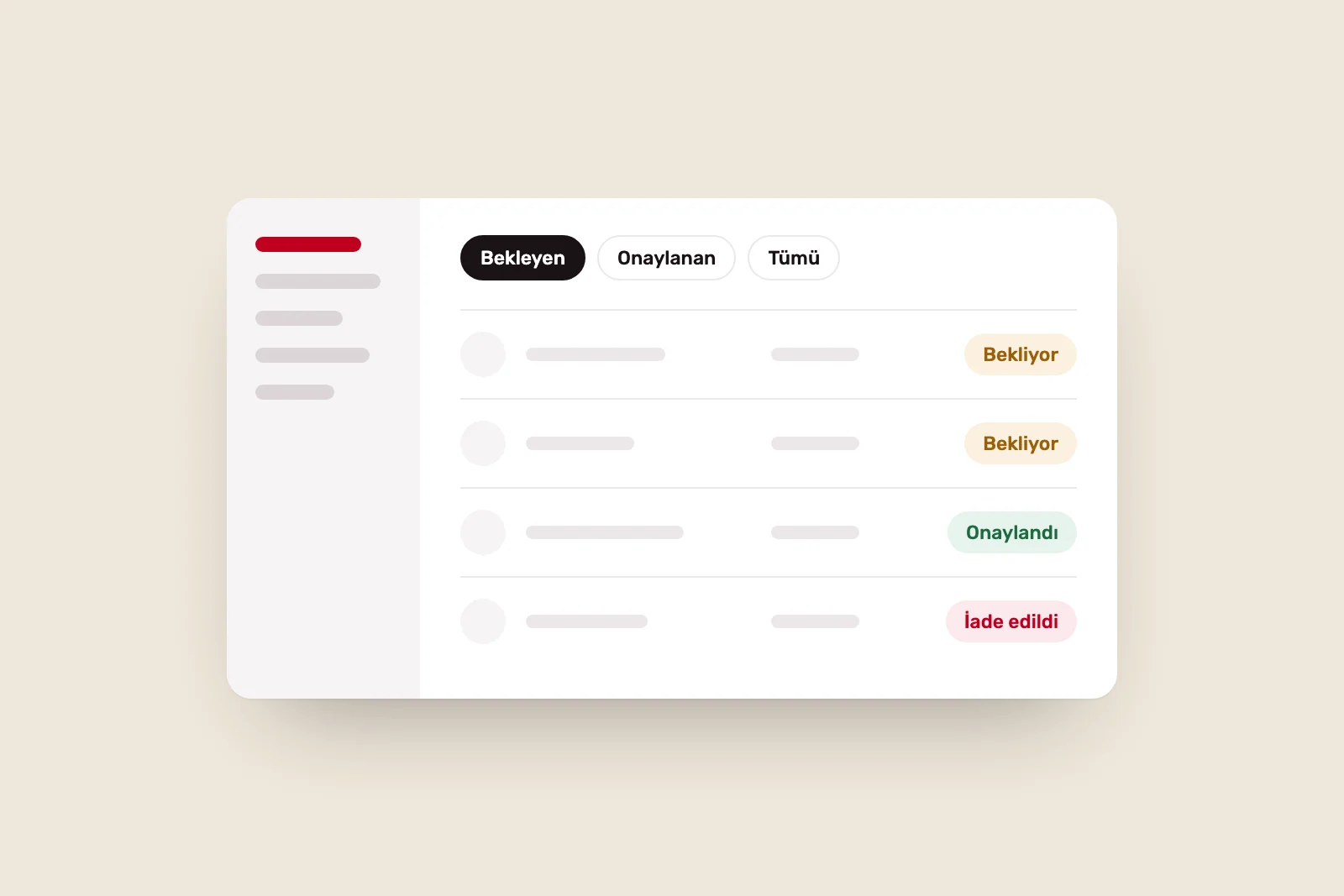
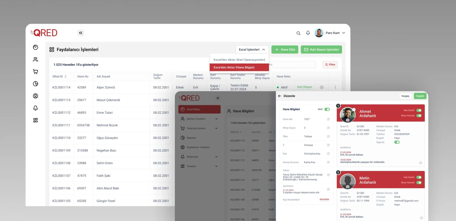
Tables remain the most compact way to show large, multi-variable datasets. Nielsen Norman Group identifies four core tasks: finding records that meet criteria, comparing data, viewing, editing or adding a row, and acting on records.
- Keep column headings fixed during scrolling so users retain context.
- Right-align numbers and use consistent decimal precision for easier comparison.
- Make sorting and active filters visible, with one-click clearing.
- Allow multiple row selection and bulk actions.
- Offer compact and comfortable density options. People working in tables all day may want more rows visible.
Choose visualisations for readability #
Nielsen Norman Group’s dashboard guidance recommends visual properties people process quickly, such as length and two-dimensional position. In practice, bar and line charts are often easier to read for comparisons than pie and doughnut charts.
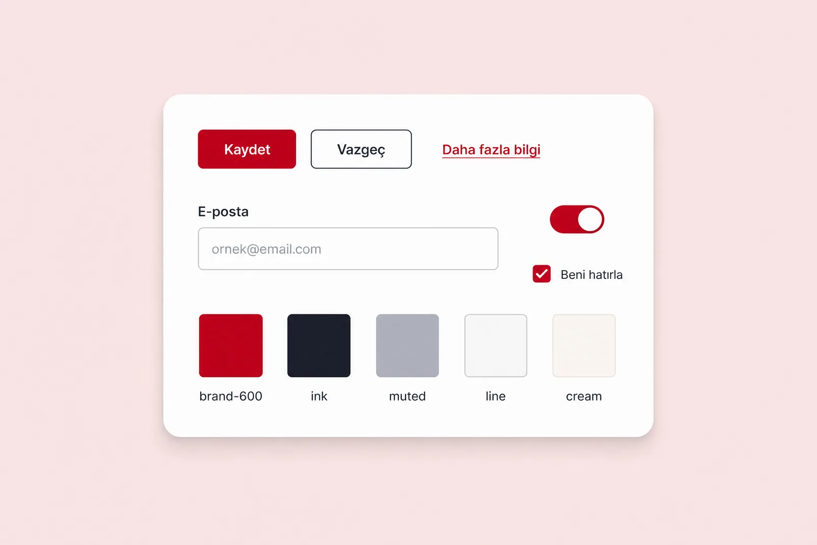
Colour should convey meaning. Red reserved for warnings loses that meaning if used decoratively elsewhere. Do not rely on colour alone: add labels, icons or patterns for colour-blind users.
Give every chart a title stating what it shows and the period covered. Indicate non-zero axes and show units and currencies in labels. These details prevent misreading and different interpretations of the same figure in meetings.
Treating charts as design-system components preserves consistency. Open-source systems such as IBM Carbon provide accessible chart components with usage guidance. Defining axes, labels, colours and empty states once in your own system avoids repeating decisions for every report screen.
Design states to build trust #
Data-heavy screens rarely appear in their ideal state. What users see while data loads, when no records exist, when a source fails or when data is stale determines their trust.
- Show a page skeleton during loading and progress for long-running tasks.
- Explain why an empty state has no data and what users can do next.
- Show when data was last updated. Decisions based on stale data can be riskier than having no data.
- For bulk deletion or updates, show how many records are affected, request confirmation and offer undo where possible.
Our approach to data-heavy projects #
At Pars Design, we begin with user research. Interviews and workflow observations reveal decisions users make, which data they consult and how often, and current workarounds. Excel files, emailed reports and screenshots are useful clues to gaps in the product.
We prototype with real or realistic data wherever possible. A table that looks perfect with sample data may behave very differently with long customer names, missing fields and thousands of rows. We test these prototypes with users and carry findings into a modular design system, allowing new modules without unnecessary interface complexity.
Sources #
- Progressive Disclosure, Nielsen Norman Group; reducing complexity by moving advanced features to secondary screens
- Data Tables: Four Major User Tasks, Nielsen Norman Group; four core tasks tables should support
- Dashboards: Making Charts and Graphs Easier to Understand, Nielsen Norman Group; readable visualisation through length and two-dimensional position
- Data visualization: Get started, Carbon Design System; accessible chart components within a design system