When a product feels dated, the first instinct is to change its appearance: new colours, a new typeface, rounded corners. The work is quick and immediately visible. Yet users still get stuck in the same places, abandon the same form and struggle to find the same information. The problem is often deeper than the surface.
The difference between a refresh and a redesign #
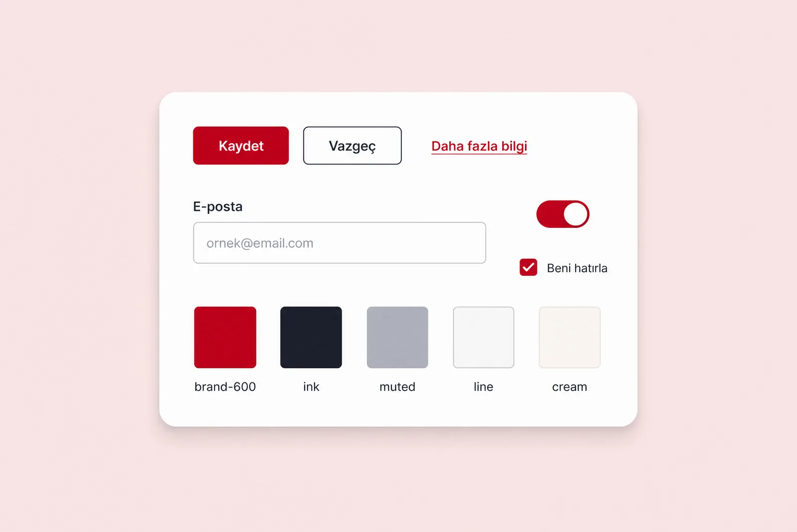
A visual refresh redraws existing screens without changing their structure. Menus, steps and content stay the same; only the appearance changes. When a brand has changed or the visual language has become inconsistent, that may be exactly what is needed.
A redesign changes how users complete a task. It can reduce steps, present information in a different place or sequence, and remove entire screens. The question is: are users unhappy with how the product looks, or unable to finish what they came to do? If it is the latter, a new coat of paint will not help.
The four layers of a redesign #
A thorough redesign is not one decision but a set of decisions across four layers. Each layer shapes the one above it.
- Purpose: whose task does the product solve today? Features added over the years may have obscured its original purpose.
- Flows and information architecture: what route does a user take from starting a task to completing it, and where is information organised?
- Content and data: do the text, labels, tables and status messages speak the user’s language?
- Interface and technical foundations: components, the design system and the code behind them.
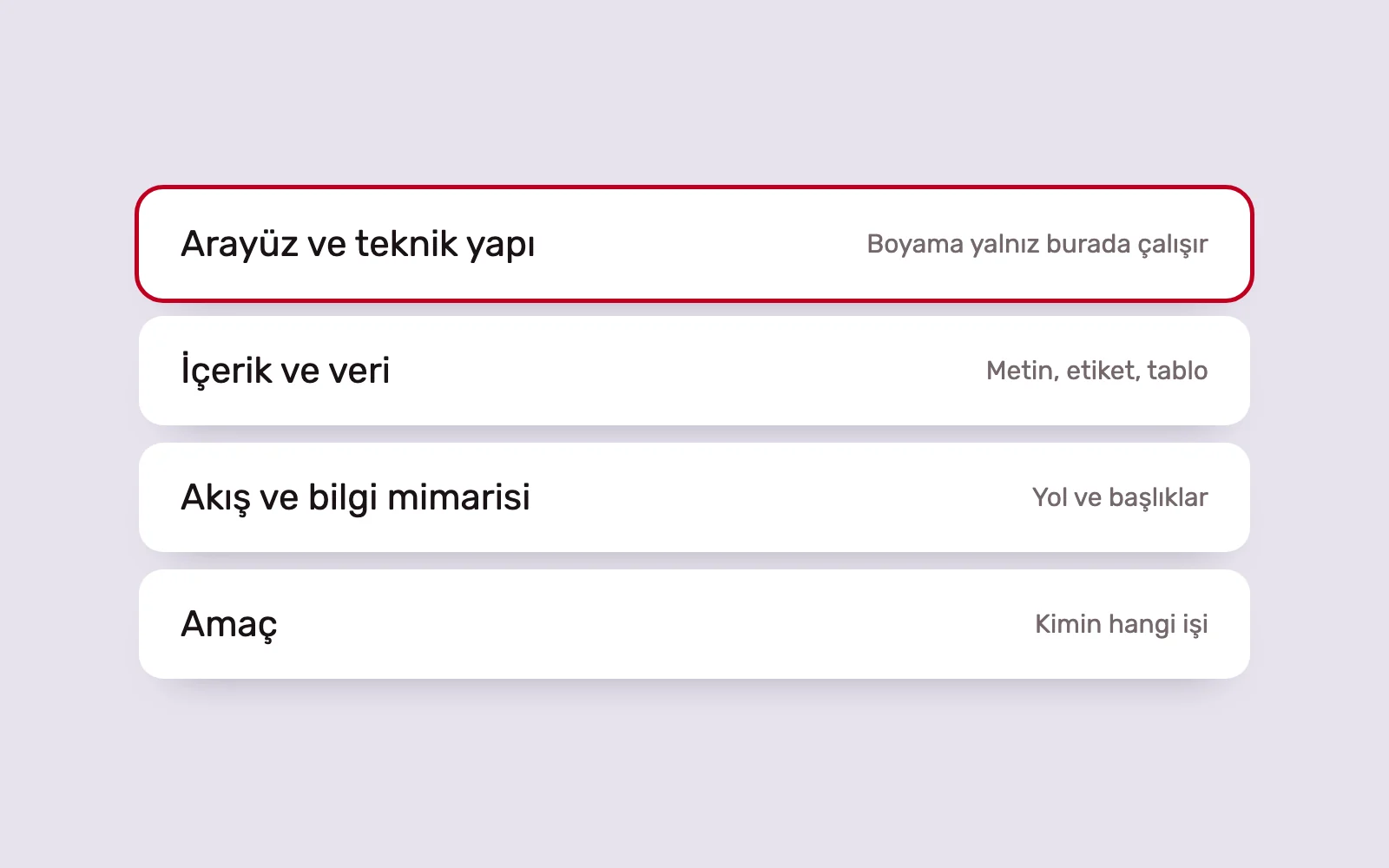
A visual refresh works only at the top layer. Changes there cannot resolve problems below. If a product’s menu mirrors the organisation chart, even excellent visual design will not make it easier for users to find what they need.
Decide what to keep first #
A thorough redesign does not mean throwing everything away. Existing users have learnt a particular structure, and its working parts are valuable. People expect familiar patterns; changing a familiar flow without a reason can create more problems than it solves.
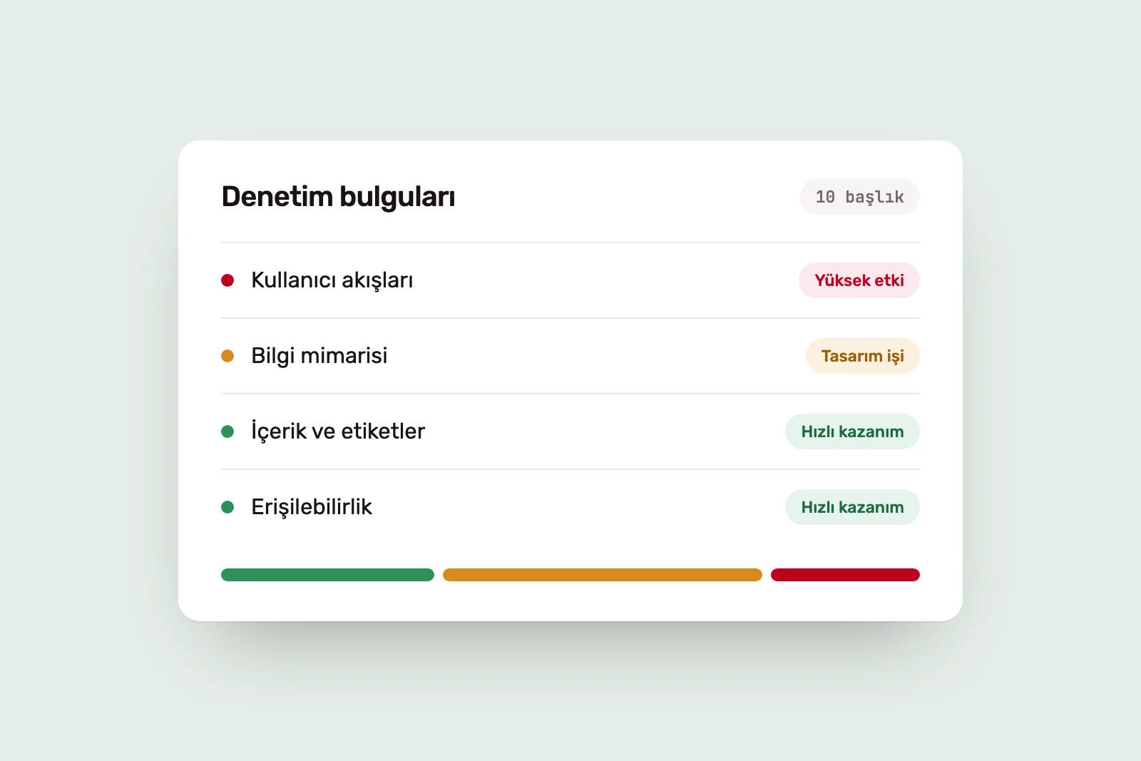
We begin with an inventory: which flows are completed without difficulty, which screens are used frequently, and what habits have users developed? We keep the parts that work and rebuild those that do not. We explain how we create this inventory in what we audit before a redesign.
Reorganising existing functions around tasks #
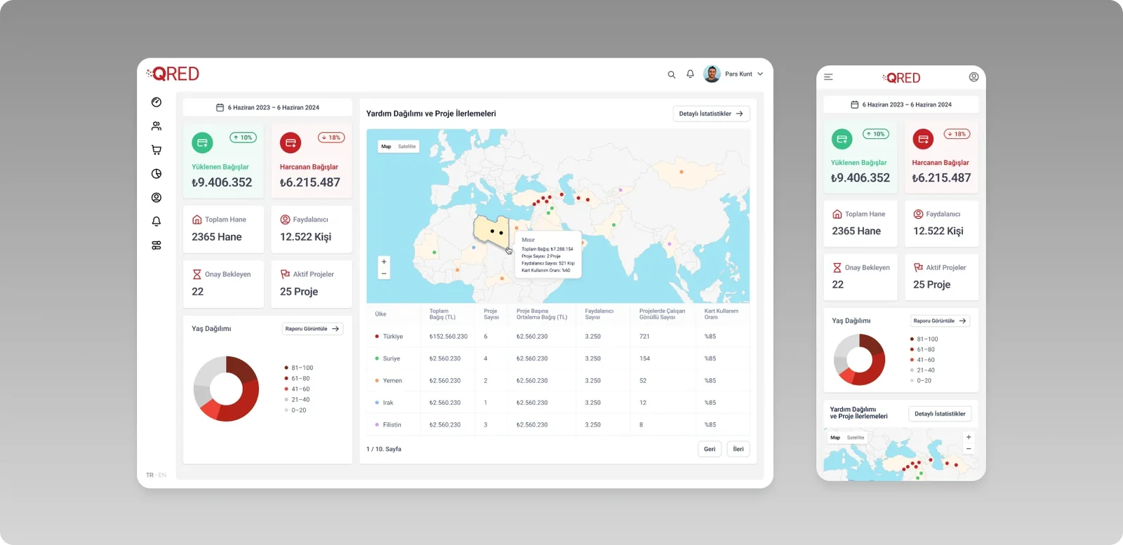
Our work on Türk Kızılay’s card-based support programme, QRed, illustrates this approach. The core functions worked, but an interface shaped by different teams’ needs had produced convoluted flows and inconsistent screens.
We first separated the existing functions, user roles and interconnected operations. We then reorganised the modules around task-led information architecture and brought the web and mobile experiences together through one design system. The change was not in the colour of the screens, but in how information was organised and how users reached their tasks.
All at once or in stages? #
Tying a major redesign to one release day is risky: existing users wake up to an unfamiliar product, and feedback arrives too late to act on. A phased approach is often safer.
- Start with the most critical flow: the most frequently used or most often abandoned is the first candidate.
- Run the new and old structures alongside each other for a while, giving users time to adjust.
- Write down the change you expect at each stage, then check after release.
- Establish the design system in the first phase so later screens follow the same language.
A single cutover makes sense only when keeping the old structure prevents the new one from working. A changed data model, for example, may make it impossible to run both in parallel.
Design and development decisions belong together #
A common redesign mistake is to finish the design before involving the technical team. Shortening a flow may depend on the data structure; combining screens on permissions; speeding up search on infrastructure. If these constraints emerge late, the design may be impossible to implement, or only partly implemented.
That is why our design and development teams make redesign decisions together. We distinguish interface-only changes from those affecting infrastructure early, then phase the work accordingly. For live products, this is the redesign side of our UI/UX design service. If the problem is not yet clear, the starting point is an Audit and Transformation engagement.
When everything really does need to change #
Sometimes the product’s underlying assumptions have changed: users have moved to a different device, the business model has shifted, or new technology can do the same job much more simply. In that case, the product needs rethinking rather than incremental improvement.
This should be a rare, evidence-based decision. “A competitor redesigned” or “the design looks old” is not enough. The reason should be evidence that the existing structure can no longer support the user’s task.
Sources #
- Jakob's Law, Laws of UX; users’ expectations of familiar structures
- Disruptive Innovation Theory, Christensen Institute; the conditions that justify fundamental change