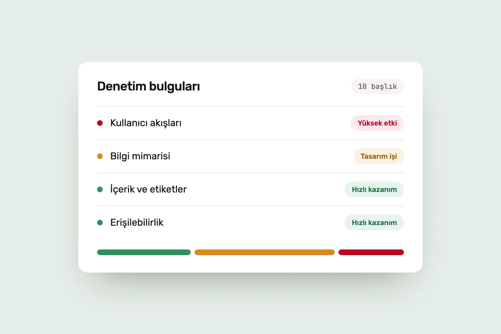
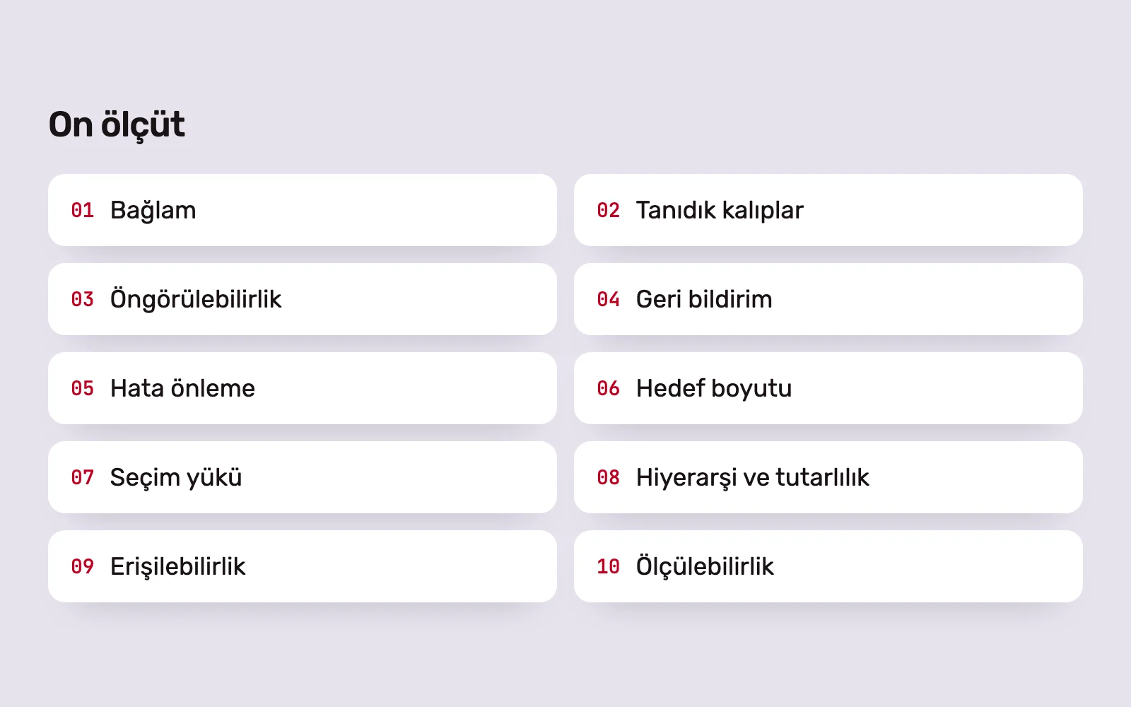
Interface discussions that begin with “I think this looks better” often go nowhere because there is no shared basis for judgement. The ten criteria below draw on established usability research. We use them to review designs and audit live products.
1. Context: does the screen suit the person and situation? #
What we check: the actual user, device and conditions. A desktop dashboard used with full attention needs different decisions from a phone screen used one-handed, standing up and in a hurry.
The cost of a poor decision: a design looks good in a meeting but fails in the field. Small text, crowded buttons and long forms become errors and abandoned tasks in real conditions.
2. Familiar patterns: does the layout respect what users know? #
What we check: whether common functions such as navigation, search, baskets and forms appear where and how users expect. People spend most of their time in other products and bring those expectations with them.
The cost of a poor decision: every pattern changed simply to look original adds something the user must learn. A radical redesign that changes familiar structures overnight can leave existing users facing what feels like a foreign product.
3. Predictability: is the result clear before the action? #
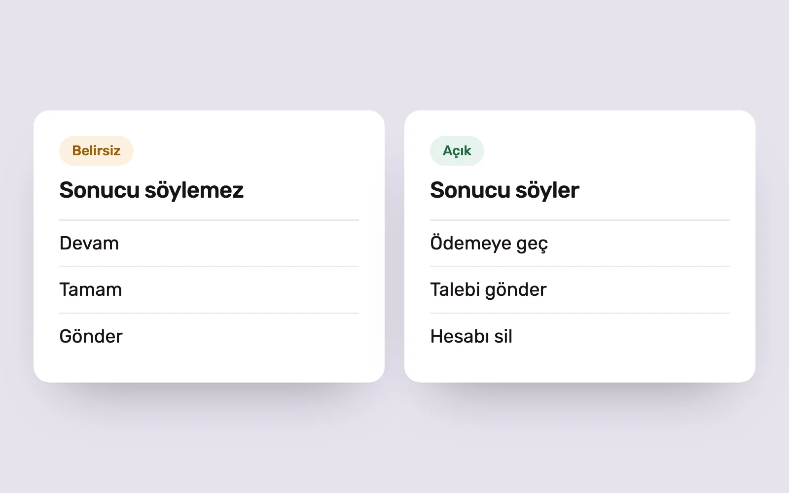
What we check: whether button and link labels explain what will happen. “Proceed to payment” rather than “Continue”; “Send request” rather than “OK”.
The cost of a poor decision: users hesitate to press a button with an unclear outcome, or press it and get an unwanted result. Both undermine trust.
4. Feedback: does the system explain what it is doing? #
What we check: a visible response to every action, such as a loading state, success or error message, or confirmation that a change has been saved.
The cost of a poor decision: without feedback, users press again, repeat a transaction or leave. A silent interface feels like a broken one.
5. Error prevention: are mistakes hard to make and easy to undo? #
What we check: confirmation for irreversible actions, fields that prevent incorrectly formatted input, undo options and messages that explain how to fix an error. We assume users will make mistakes.
The cost of a poor decision: a record deleted with one click or a message that says only “An error occurred” sends users to support or to a competitor.
6. Target size and placement: are important actions easy to reach? #
What we check: touch target size and spacing, and whether frequent actions are within easy reach. The time needed to reach a target depends on its size and distance. WCAG 2.2 also defines a minimum target size.
The cost of a poor decision: small, closely spaced targets cause accidental taps. A primary action in the farthest corner of a phone screen makes every use harder.
7. Decision load: how many choices are presented at once? #
What we check: the number of options on a screen and how they are grouped. More options mean more decision time. Breaking a long task into steps, providing defaults and giving secondary options less prominence reduces the load.
The cost of a poor decision: a screen showing everything at once can make it hard to choose anything. With five equally prominent calls to action, the primary action disappears.
8. Visual hierarchy and consistency: does the eye follow the right order? #
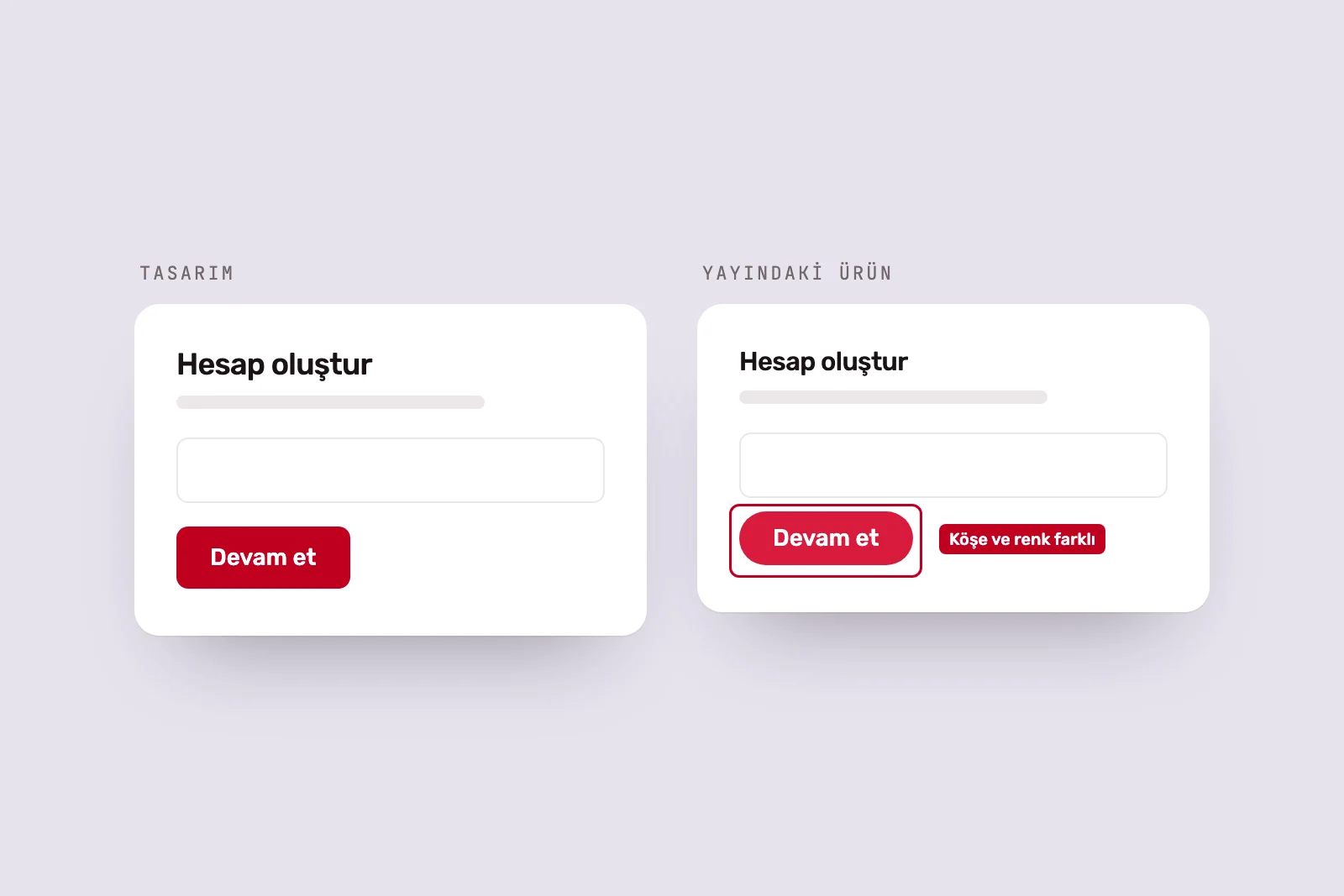
What we check: the relative emphasis of headings, content and actions, and whether elements with the same function look the same across screens. Visual care makes a product feel more usable.
The cost of a poor decision: inconsistent buttons and spacing make the product feel careless and weaken trust. The reverse is also a risk: an attractive screen can hide underlying usability problems during testing.
9. Accessibility: can everyone use the screen? #
What we check: text contrast, keyboard navigation, visible focus, form labels and whether any information is conveyed by colour alone.
The cost of a poor decision: low-contrast grey text is hard for anyone to read in bright light. An error indicated only by colour may be invisible to a colour-blind user. Accessibility problems affect everyone in different circumstances, not just a small group.
10. Measurability: how will you know the decision worked? #
What we check: which behaviour each important design decision is intended to change, and how to track it. Signals such as completion, abandonment, errors and support requests are defined before release.
The cost of a poor decision: an unmeasured decision returns to a matter of taste in the next discussion. The team moves on without knowing what worked.
Applying the criteria to a product #
These ten criteria can be used as a checklist, but their real value is in prioritisation. A product will not excel at all ten at once. Find the issue that most obstructs users and start there.
For a new product, we apply these criteria within the UI/UX design process, alongside prototyping and user testing. For a live product, our Digital Experience Audit ranks findings by impact and implementation effort. We explain what else we examine in what we audit before redesigning a digital product.
Sources #
- 10 Usability Heuristics for User Interface Design, Nielsen Norman Group; visibility of system status, error prevention and consistency
- Jakob's Law, Laws of UX; users’ expectations of familiar patterns
- Fitts's Law, Laws of UX; the effect of target size and distance
- Hick's Law, Laws of UX; the relationship between the number of choices and decision time
- Understanding Success Criterion 2.5.8: Target Size (Minimum), W3C WAI; minimum touch target size
- The Aesthetic-Usability Effect, Nielsen Norman Group; the effect of visual care on perceived usability
- Preventing User Errors: Avoiding Unconscious Slips, Nielsen Norman Group; designing to prevent slips