QRed Kızılay.
A simple digital system for complex aid operations.
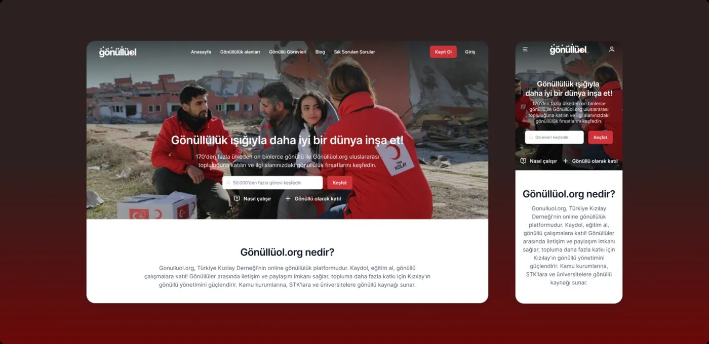
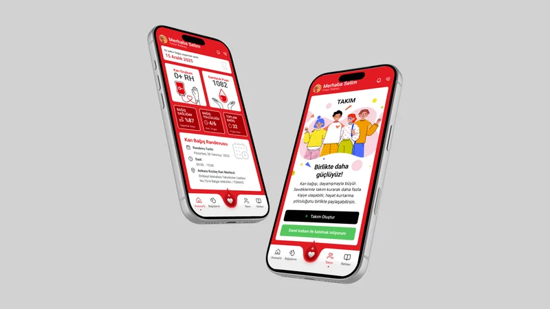
Working with ID3, we redesigned web and mobile experiences for Türk Kızılay’s card-based assistance programme, QRed. Its core functions worked, but the experience was fragmented. We brought projects, beneficiaries, households, cards, merchants, payments and reporting into one coherent product.
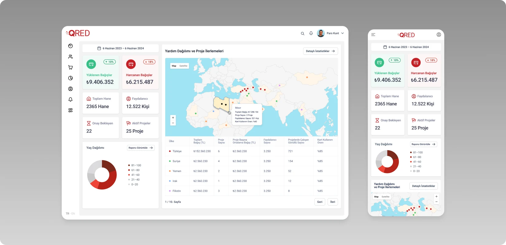
Dashboard and mobile view
Need.
QRed connects many roles and tasks, from loading assistance balances onto cards to spending at partner merchants. The existing interface had evolved around different teams’ needs, resulting in indirect flows and inconsistent screens that made processes difficult to follow.
The system needed to become clearer, more efficient and easier to learn so Kızılay teams could manage programmes, merchants could complete transactions and field users could reach essential tasks quickly.
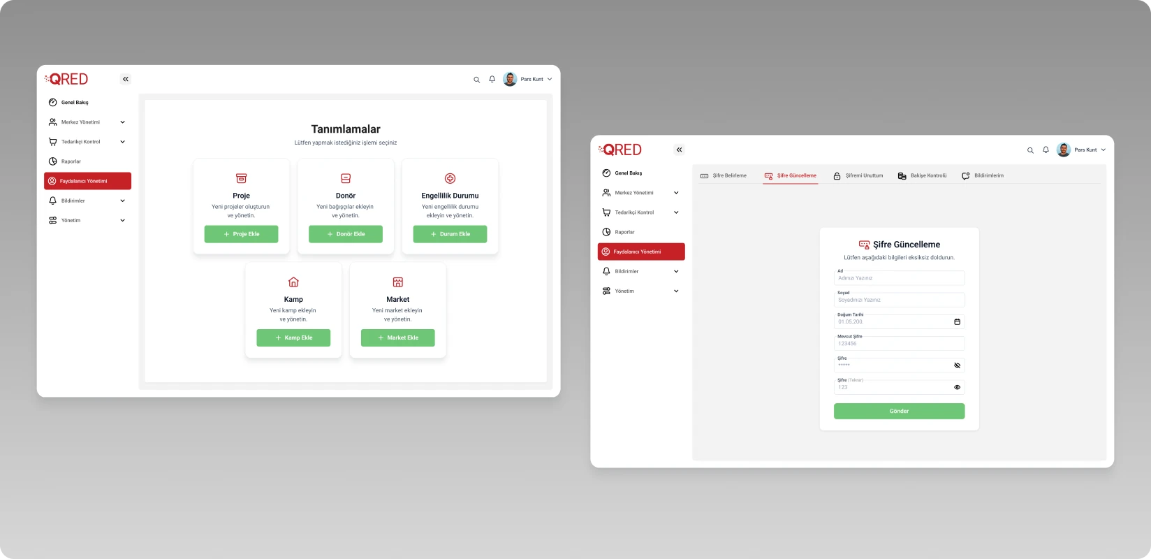
Settings and form screen
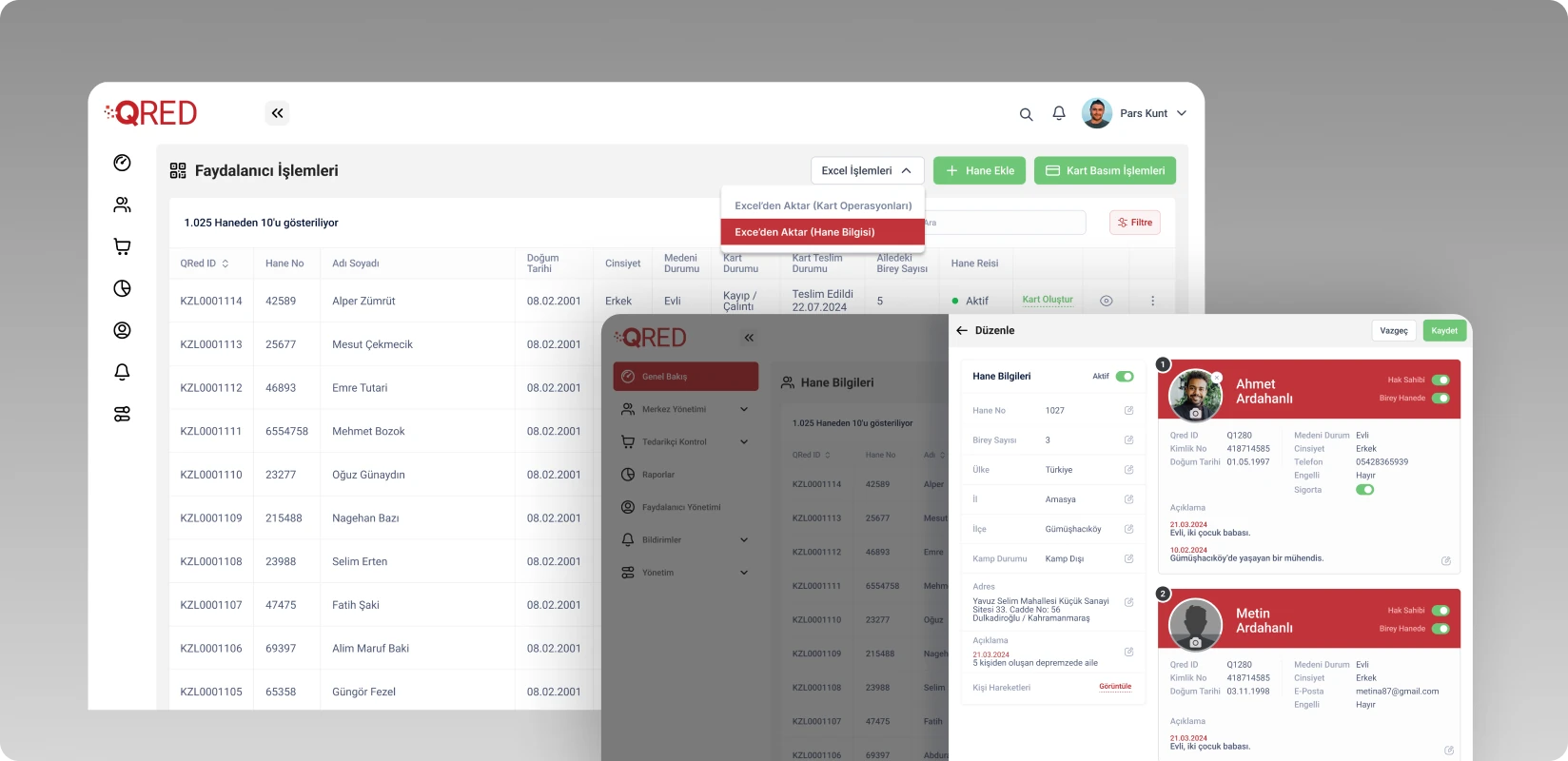
Beneficiary operations
Design approach.
We first separated functions, roles and interconnected operations. Project and centre management, beneficiary and household records, donors, cards, merchants, balance activity and reporting were reorganised around tasks.
The dashboard makes loaded and spent balances, active projects, pending tasks, households and beneficiary counts readable at a glance. We simplified dense tables around filtering, importing, viewing and editing. Particular care went into presenting sensitive beneficiary and household information in an orderly, controlled and traceable way.
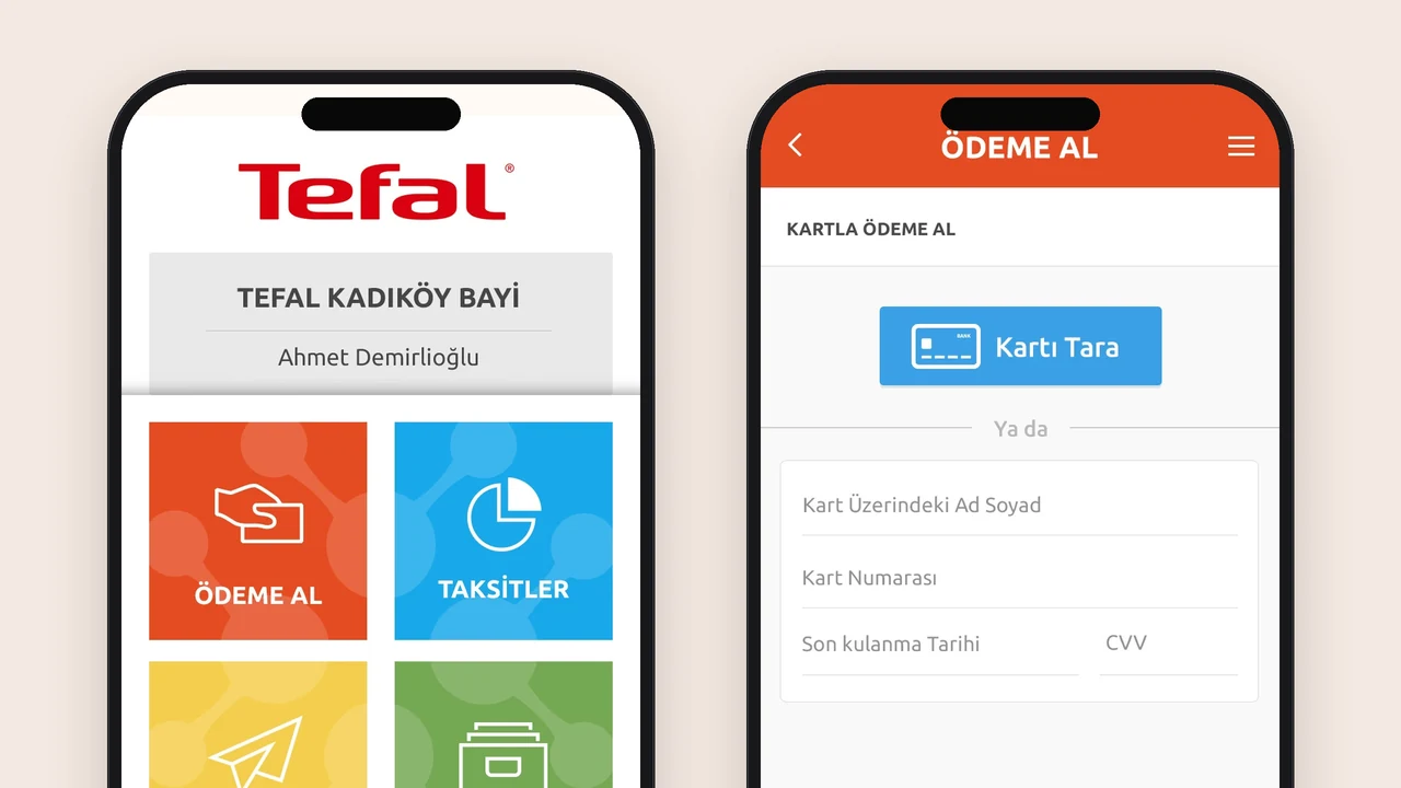
Web management and mobile transactions share one visual language. A flexible system covers light and dark use, status colours, components and screen sizes, aiming to accommodate new modules without disrupting the structure.
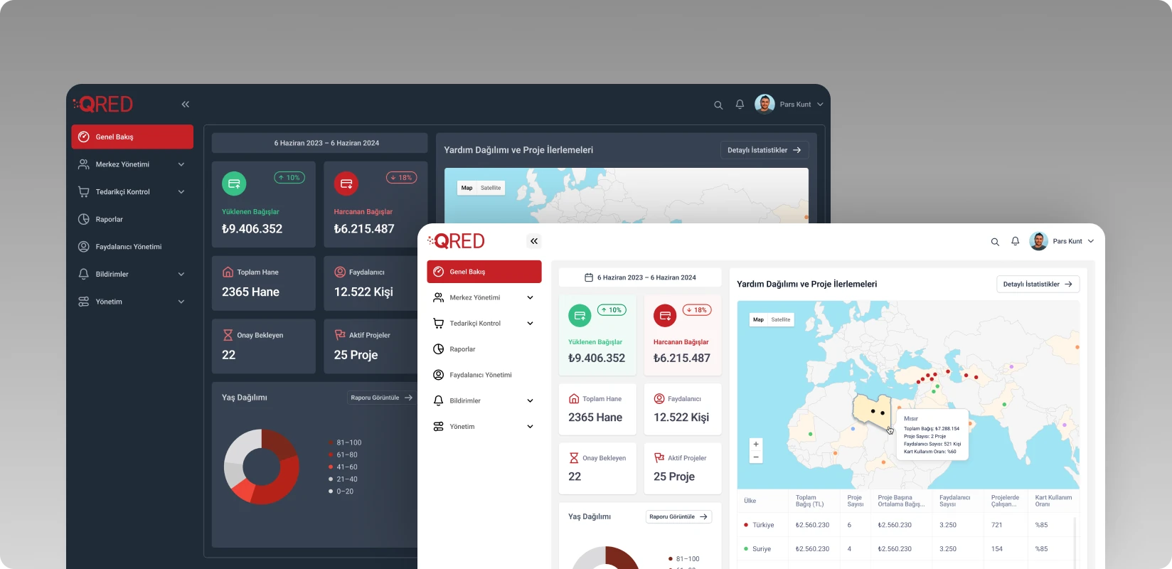
Dark and light themes
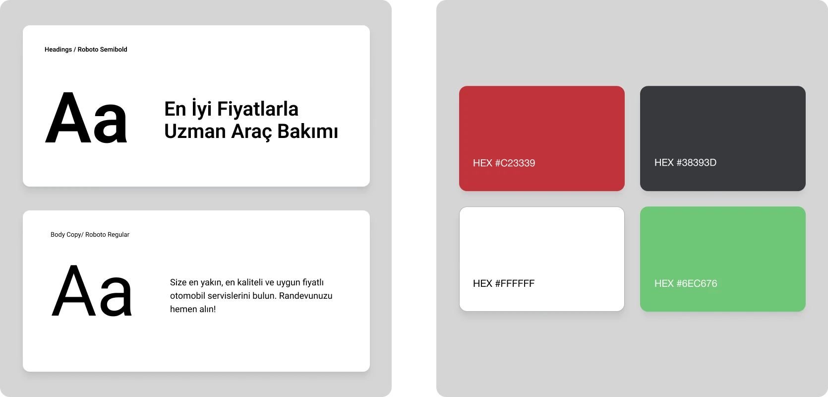
Colours and typography
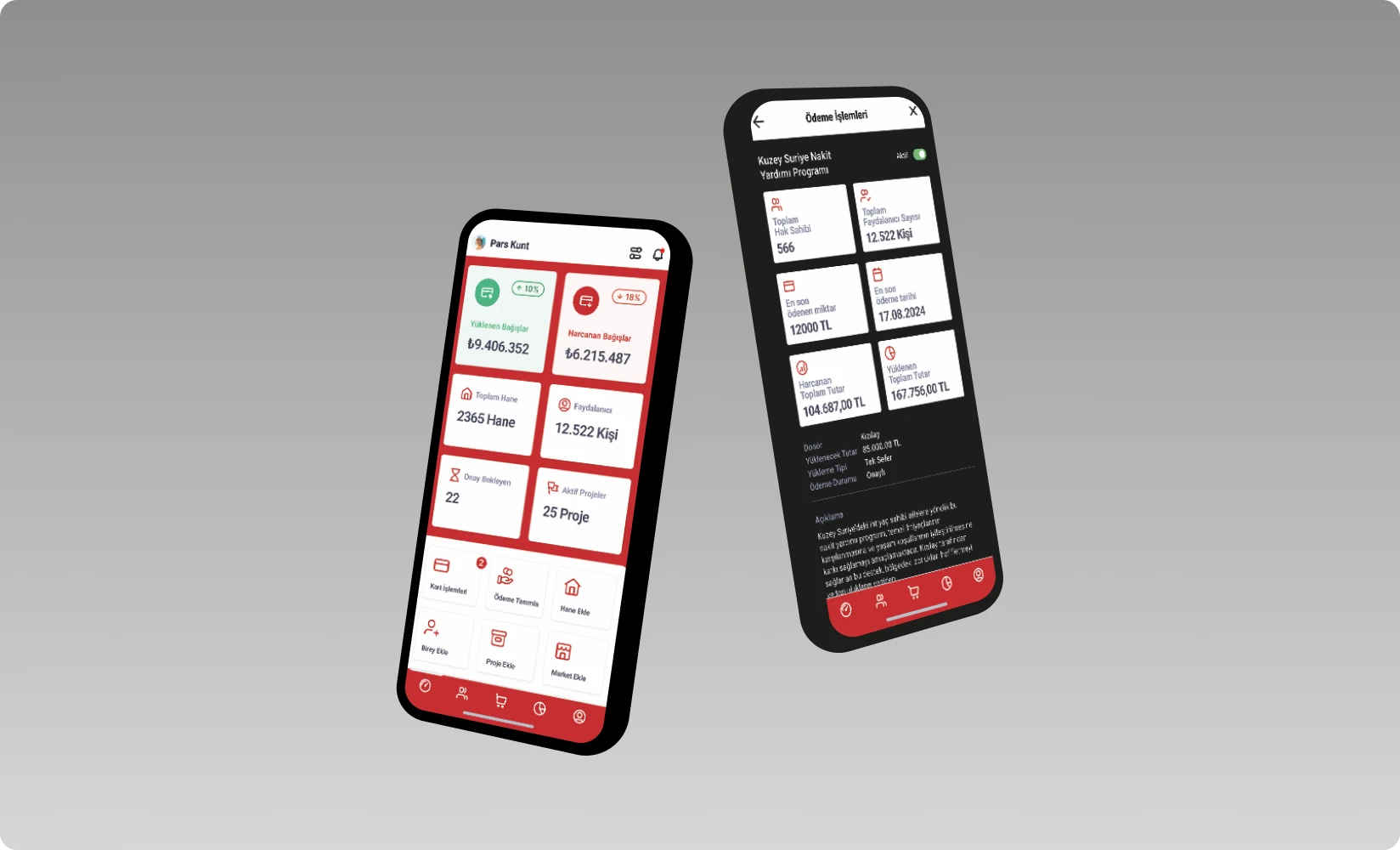
Mobile screens
The work.
We turned an increasingly complex template-based interface into a consistent operational product with direct routes to each user’s tasks. Central management, mobile transactions and merchant tools share information architecture and a design system.
The work did more than refresh screens. It provided an interface framework that Kızılay could develop on its software infrastructure and adapt to new needs and modules.