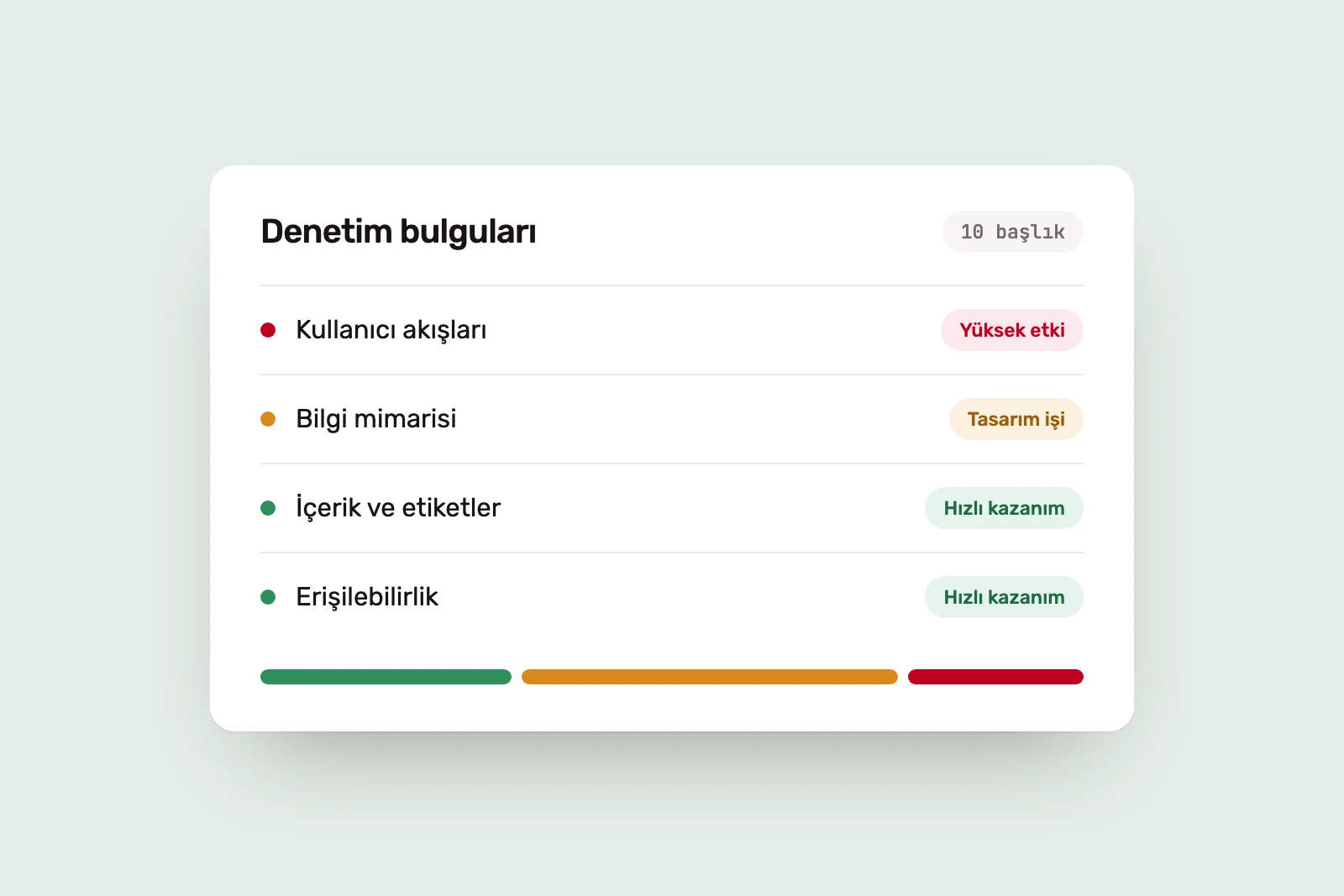
“Our site is dated; let’s redesign it” and “Nobody uses the app; let’s rebuild it” name a solution, not a problem. Starting a major redesign without a clear problem can send time and money in the wrong direction. That is why an audit comes first. These are the ten areas we examine in a website or app.
1. The product’s goal #
The first question is not about screens: what should this product do for the organisation? Collect applications, sell, reduce support demand or speed up an employee task? Without a written goal, the rest of the audit has no clear basis for identifying problems.
We also ask what success would look like. What should change after the redesign? That answer becomes the roadmap’s criterion at the end of the audit.
2. User flows #
A few critical flows carry the product’s purpose: registration, purchase, requesting a quote or completing a request. We walk each from start to finish as a first-time user, recording what is asked at every step and where hesitation may arise.
Problems often sit between screens rather than on one: information requested in the wrong order, data lost when going back or a button with an unclear outcome.
3. Information architecture #
Do menus, page hierarchy and labels reflect users’ mental models or the organisation’s internal structure? Pages and sections accumulated over years often undermine the architecture.
The test is simple: can users predict where frequently needed information lives in the menu, or must they resort to search?
4. Content #
Is copy current and in the user’s language? Is the same thing named differently in different places? Button labels, error messages and empty-state copy count as content too.
Content problems can look like design problems. A user may abandon a form because of an unclear field label, not its layout. These findings can be addressed without redesign.
5. Visual consistency #
Do elements serving the same purpose look the same across screens? We compare button styles, spacing, type scales, icons and colours, including any gap between the brand identity and product visuals.
Inconsistency is not only aesthetic. It makes users learn again on each screen and weakens trust.
6. Accessibility #
We check text contrast, keyboard navigation, visible focus, form labels, image text alternatives and touch target size against WCAG criteria.
Accessibility findings are usually concrete and actionable. Some need design decisions, others code changes; we list them separately.
7. Technical constraints #
What infrastructure does the product use? Which changes are easy, and which expensive? We examine performance, mobile behaviour, CMS limits and integrations.
Without this, an audit can recommend changes that cannot be implemented. A shorter flow may depend on the data structure; a faster page on a third-party tool. Prioritisation requires knowing the cost.
8. Design system #
Does the product have a component library or design system? If so, do the design files and live product match? We count how many components perform the same job.
This determines the redesign approach. A sound system lets component-level changes spread through the product. Without one, screens need individual work, increasing the cost. We discuss the timing in our guide to design systems.
9. Analytics and user feedback #
An expert review identifies possible problems. Data shows which are real. We gather available analytics, support requests, store reviews, sales notes and any user interviews.
We record the limits of the data too. Without measurement or enough data, a finding is labelled an observation, not evidence. Missing measurement is itself a finding.
10. A prioritised improvement roadmap #
The first nine areas produce a long list, which alone is not useful. We group findings by root cause and rank them by impact, effort, risk and dependencies.
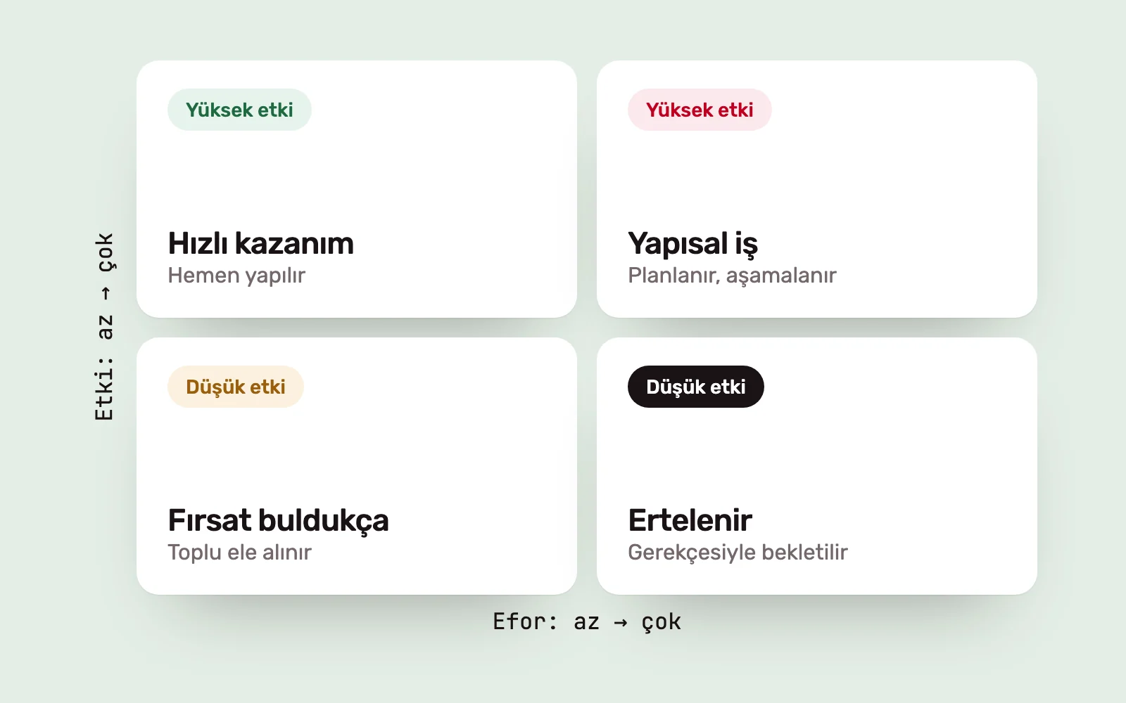
The roadmap distinguishes three types of work.
- Quick improvements: copy, labels, contrast and small flow corrections that need not wait for a redesign.
- Design work: rethinking specific flows or screen groups.
- Structural work: changes to information architecture, the design system or infrastructure.
Sometimes this reveals that a major redesign is unnecessary. Sometimes it reveals the opposite: the problem is the product’s structure, not its interface. Both are worth knowing before starting.
After the audit #
The output is a decision document with evidence and priorities, not an abstract assessment. For websites and apps, we offer this as a Digital Experience Audit. If the brand and design system also need review, the scope extends to other Audit and Transformation services.
Design tasks on the roadmap move into the UI/UX design process. We explore the difference between a visual refresh and a genuine product redesign in redesigning a digital product from the foundations.
Sources #
- Web Content Accessibility Guidelines (WCAG) 2.2, W3C; the criteria behind accessibility checks
- 10 Usability Heuristics for User Interface Design, Nielsen Norman Group; usability principles used in expert reviews