Tech İstanbul Initial Logo Design.
The first identity for a technology platform at the idea stage.
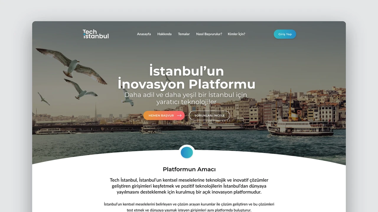
We designed Tech İstanbul’s first logo, connecting the city, technology and collaboration in a simple wordmark. The initiative was developed by YGA and launched in partnership with İstanbul Büyükşehir Belediyesi.
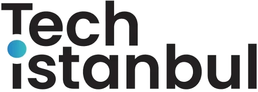
Original logo
Need.
Tech İstanbul began as an idea for technology ventures to address the city’s challenges. Bringing startups and public bodies together around environment, energy and transport, it needed an identity that immediately expressed technology, connected with İstanbul and could be adopted by different stakeholders.
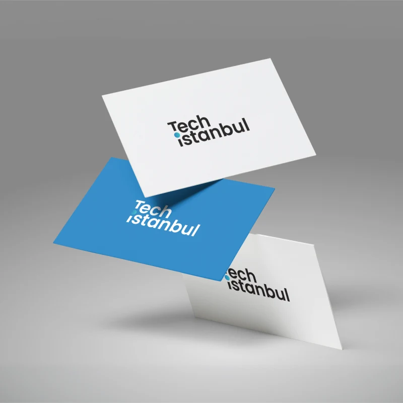
Business card
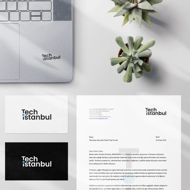
Kurumsal uygulamalar
Design approach.
Stacking the two words in a compact structure connects technology and city in one name. Geometric lowercase lettering creates a young, approachable character while preserving the credibility of a public initiative.
The dot in ‘İstanbul’ becomes a distinct blue and turquoise focal point. This small detail suggests new ideas, collaboration and a city activated by technology, giving the logo recognition without a separate emblem.
Muli’s open geometry supports readability. Blue, turquoise, dark grey and white balance innovation, trust and openness.
Print application
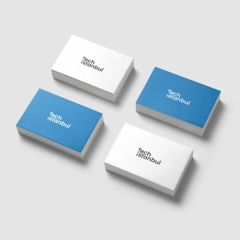
Business card stacks
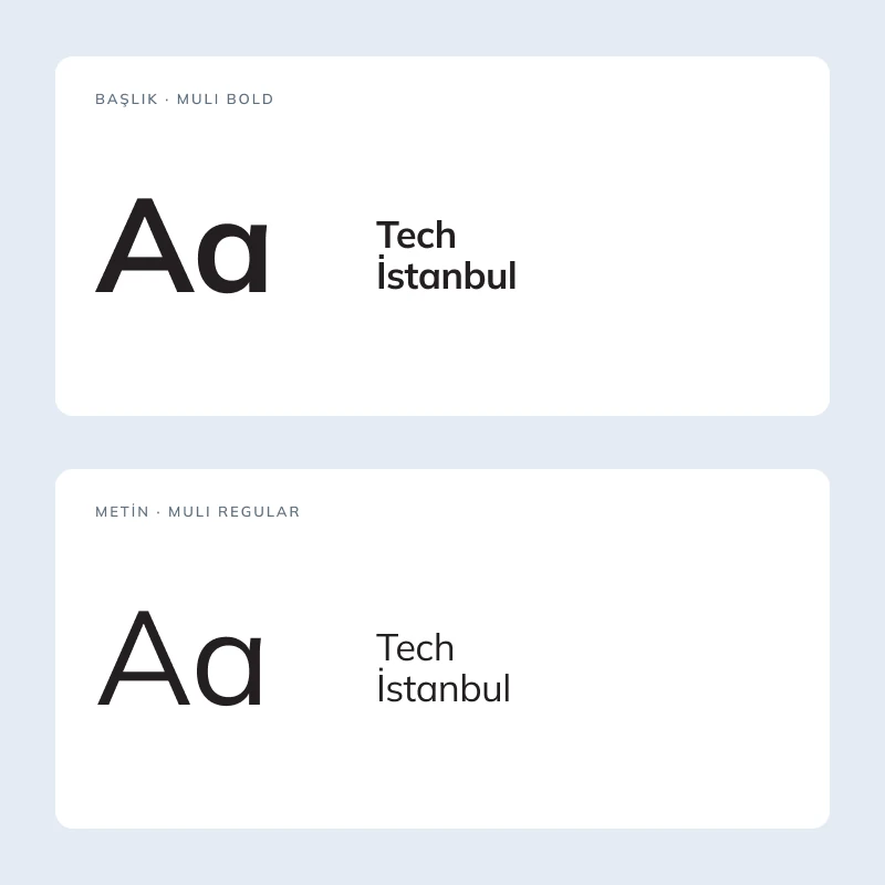
Typography
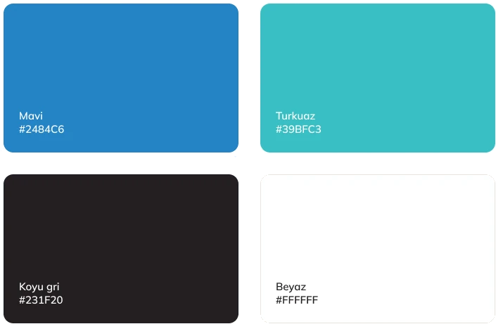
Colour palette
The work.
The logo anchored Tech İstanbul’s launch identity. Adaptable to business cards, letterheads, screens and print, it gave the emerging platform a consistent, recognisable starting point.
Tech İstanbul later expanded its scope and developed its visual identity. This project documents its original logo and founding-period visual language.