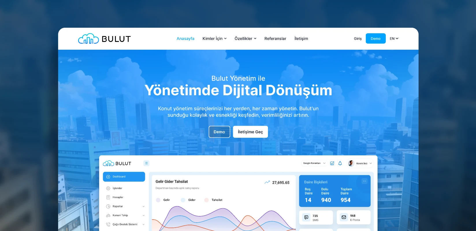
Bulut Yönetim Logo Design.
Updating an existing identity for a digital product world.
We modernised Bulut Yönetim’s logo and visual language to bring its extensive digital services under an updated brand. The logo, colour and typography system were designed to work consistently from website to mobile screens.

Logo
Need.
Bulut Yönetim connected fees, collections, accounting, communications and facility operations in one product. The old logo’s detailed skyline inside a cloud lost clarity at small sizes, while the joined “BulutYönetim” wordmark felt disconnected from the symbol. The brand needed a clearer digital system that preserved recognition.
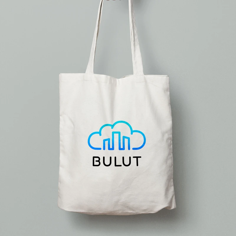
Tote bag
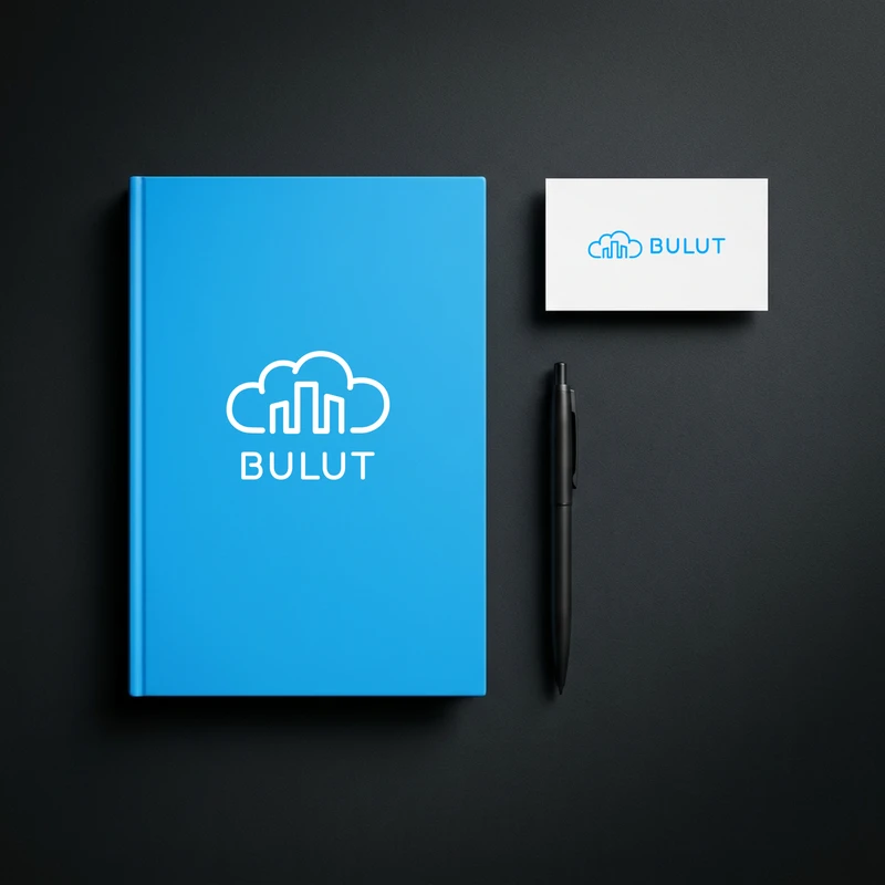
Notebook & business card
Design approach.
We retained the familiar cloud-and-building idea and removed unnecessary detail. Three columns replaced the crowded skyline, improving small-screen recognition. A continuous line of equal weight connected the columns and cloud into one mark.
Rounded lines made the symbol more approachable. We set “BULUT” in spaced capitals and removed the small “Yönetim” text, strengthening the hierarchy between name and symbol. One vivid blue created a cleaner system across backgrounds and screens.
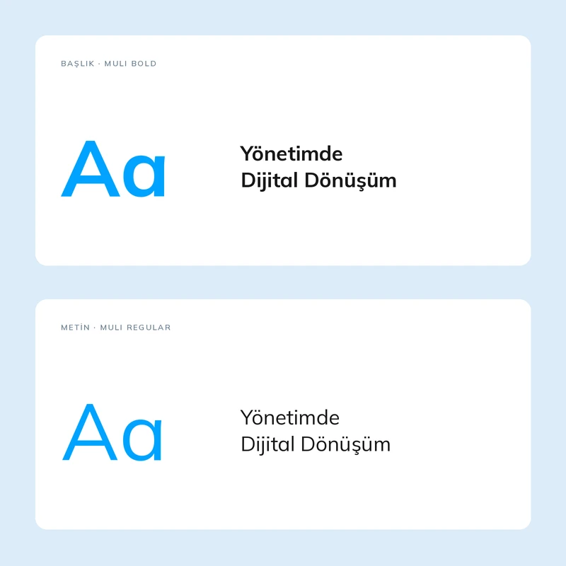
Typography
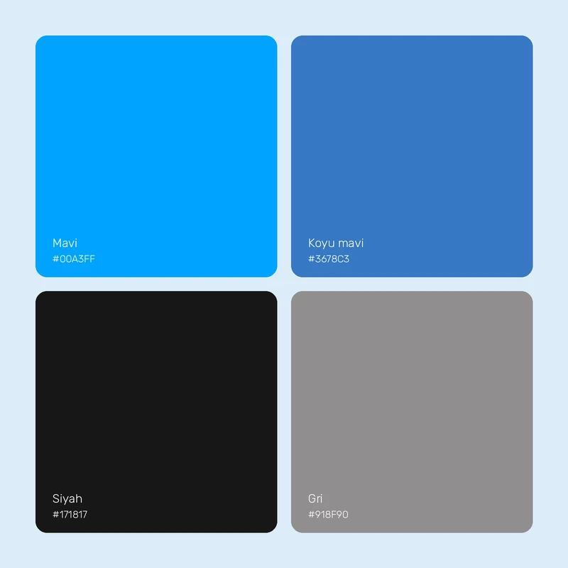
Renkler
The work.
The refreshed logo became the centre of a flexible identity across the marketing site, tablet and mobile. It addressed the old identity’s digital limitations and provided the visual foundation for presenting the SaaS product as a more current, credible brand.