Mikrolo Logo and Visual Identity Design.
Giving data-focused software a distinctive character.
Mikrolo is an all-in-one marketing tool developed by Önado and now positioned as a ‘personal marketing manager’. It combines step-by-step strategies, ad-budget automation, Google Analytics insights and AI-assisted recommendations. We designed a distinctive logo and core visual identity that express its analytical side without feeling mechanical.
Logo
Need.
For a product turning marketing complexity into clear strategies and practical insights, the identity needed to express measurement, focus, guidance and technology across screen sizes. Mikrolo required a flexible logo system connected to its function and distinctive as an independent software brand.
Design approach.
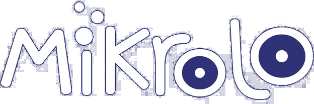
Rather than use an existing typeface, we developed a custom wordmark with soft, continuous lines. Rounded lettering softens the distant tone common to technology brands, while dots inside the ‘o’ forms suggest measurement, targeting and data focus.
The multiplying dots above the ‘i’ and the logo’s flowing rhythm suggest movement from a single data point towards broader insight. The analytical character sits within the typography, without an additional explanatory icon.
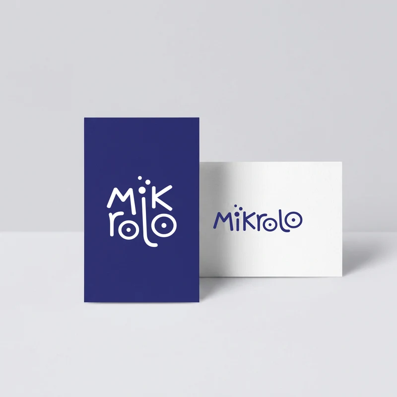
Business card
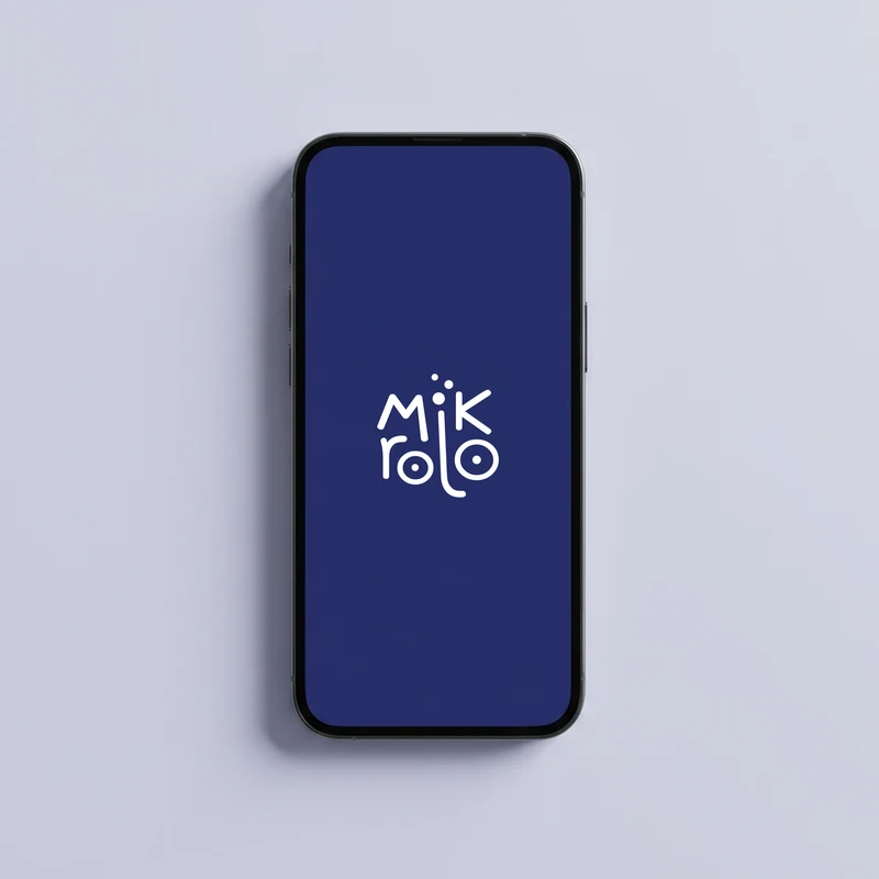
Phone
Two layouts, one identity.
The logo has two main arrangements. A horizontal wordmark works across wide digital spaces, while a compact two-line version preserves recognition in squares, app icons and narrower layouts.
Navy and purple support trust, technology and analytical thinking; a light blue accent adds energy. Positive, reversed and colour versions keep the logo consistent across light and dark interfaces.
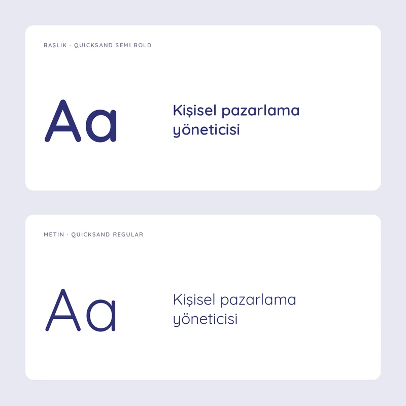
Typography
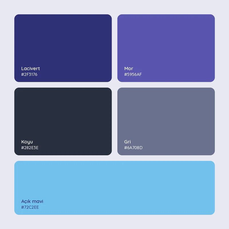
Renkler
Outcome.
Mikrolo’s distinctive, recognisable logo carries measurement and focus directly in its letterforms. Horizontal and compact arrangements give the product a flexible visual foundation for digital use.