KolayOto Logo Redesign.
Bringing fresh movement to a familiar brand.
We designed KolayOto’s first logo when the brand was founded. Eight to ten years later, it needed a more contemporary, refined and dynamic identity without losing recognition. We revisited the wordmark, starting from its purely typographic structure.

Logo
Need.
The original logo had established recognition over many years. The aim was not to erase that history, but to adapt the mark to current digital and physical touchpoints while making its connection to the automotive world more visible.
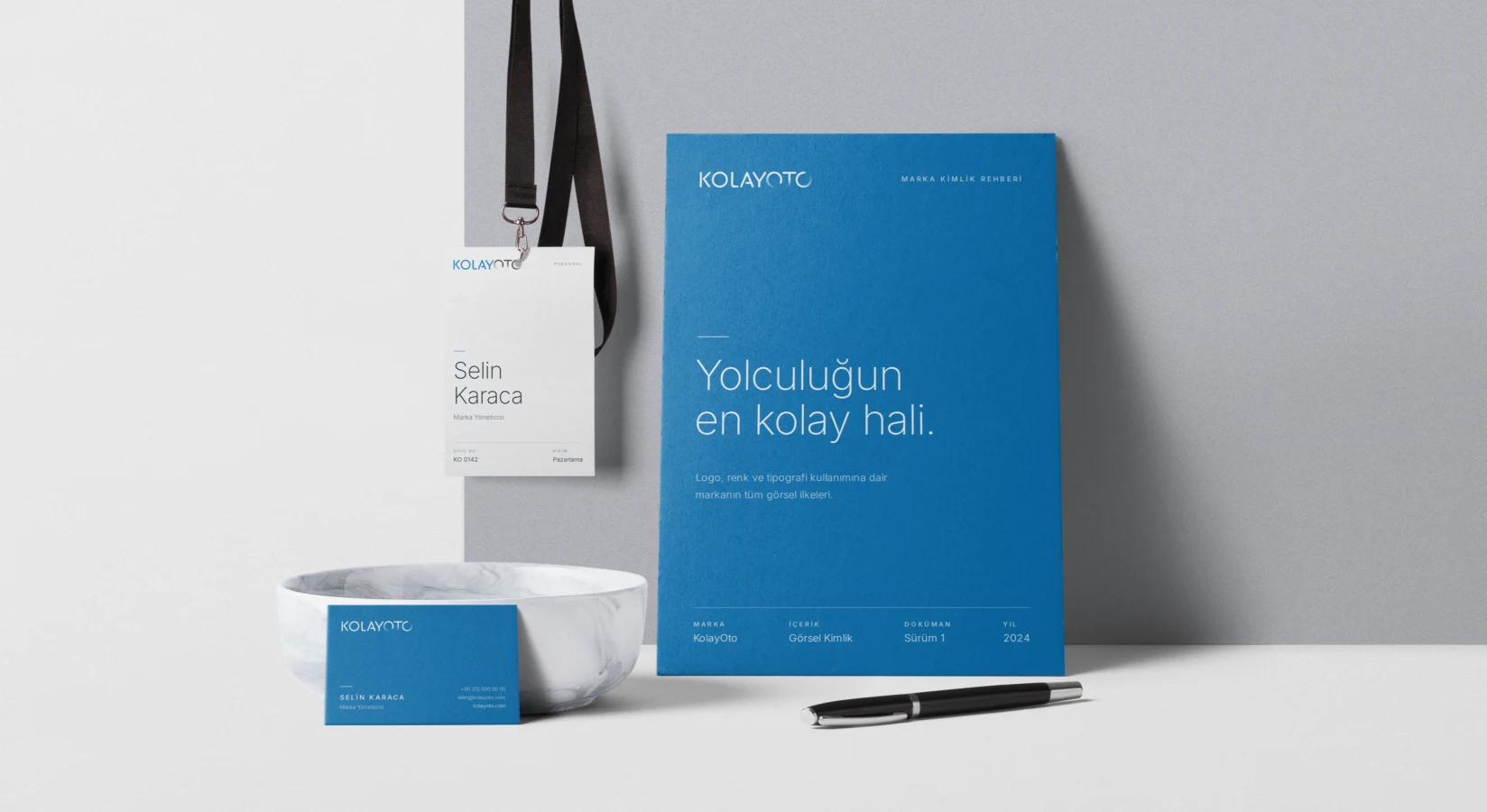
Corporate identity applications
Movement within typography.
Colour and weight distinguish ‘KOLAY’ from ‘OTO’, improving readability. Refined proportions, spacing and strokes give the lettering a lighter, more contemporary structure.
Rather than add a separate automotive symbol, we built the reference into the wordmark. A segmented, trailing transition in the final ‘O’ suggests a rotating tyre. The logo retains its simple typographic character while referring naturally to the brand’s field and movement.
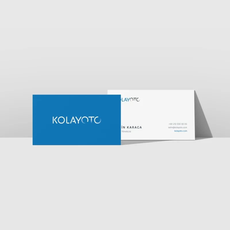
Business card
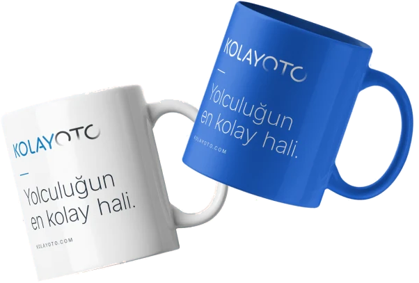
Kupa
Modernising while preserving recognition.
The redesign creates a more refined expression without losing the original’s recognition. Blue and dark grey support associations with trust, technology and motoring, while a new typographic rhythm gives the brand a more elegant, current appearance.
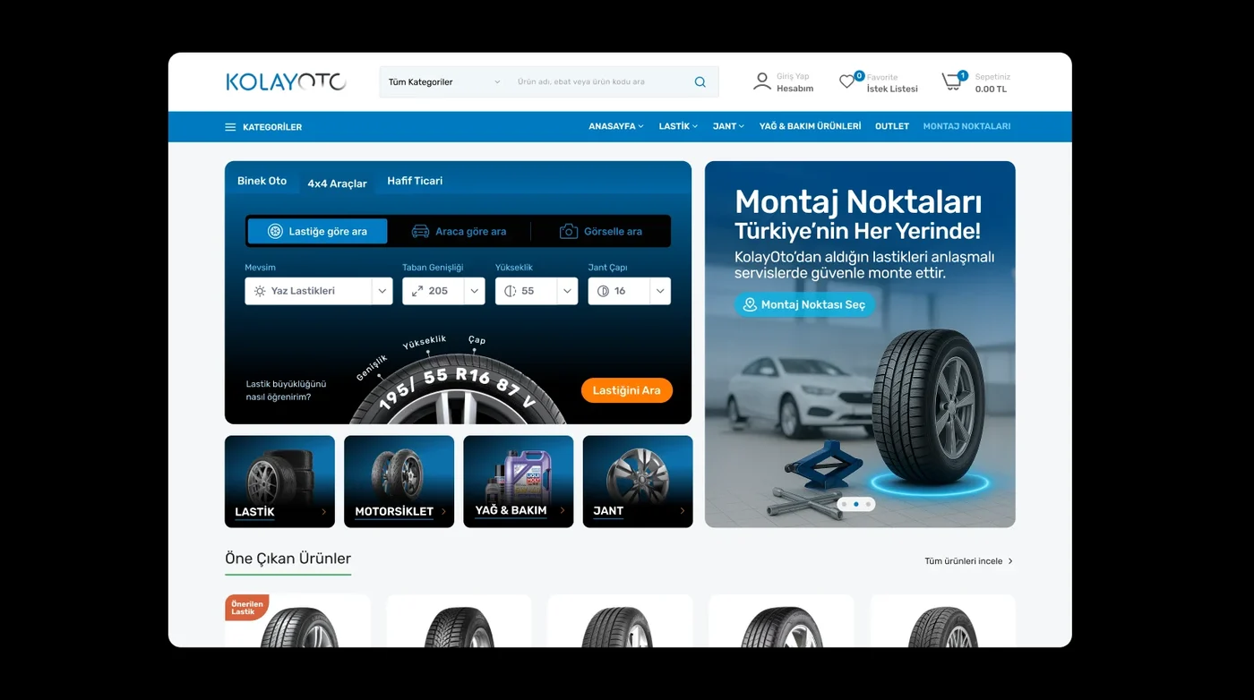
The logo became part of a consistent identity system spanning interfaces, business cards, letterheads, ID badges, pens and mugs. Mulish Bold and a supporting palette extend the visual language across applications.
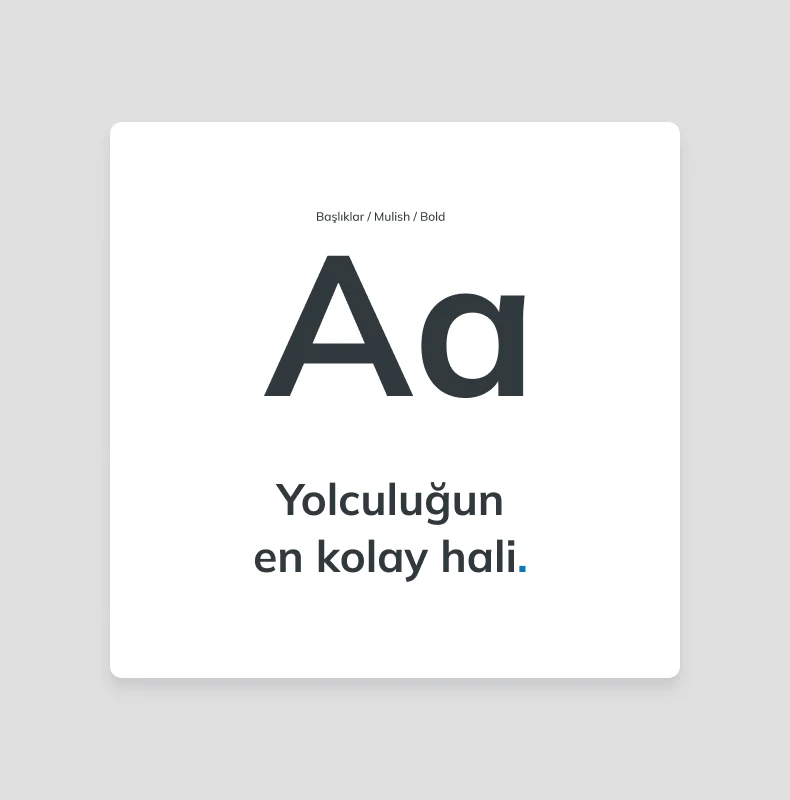
Typography
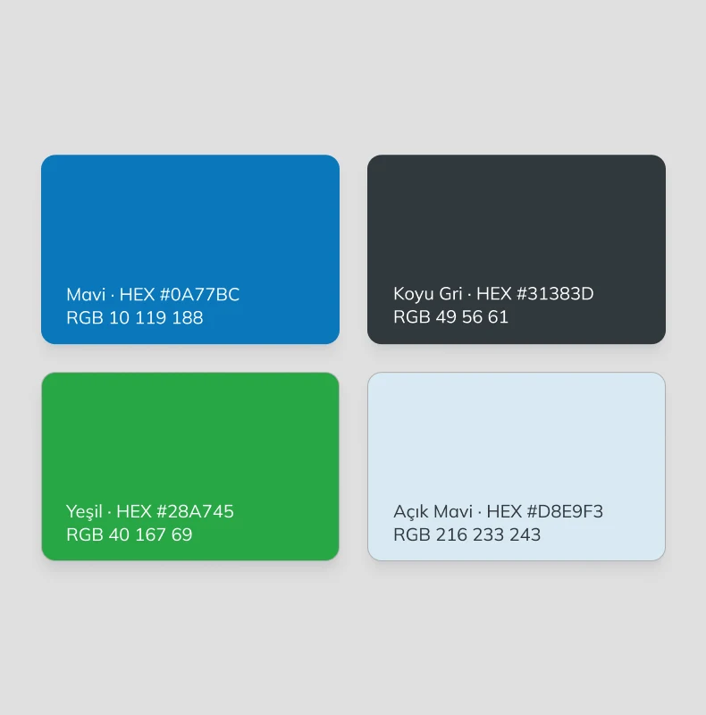
Renkler
Outcome.
KolayOto’s new logo preserves recognition while bringing automotive movement into the lettering itself. The contemporary, refined and dynamic identity provides a visual foundation for the brand’s next phase.