DNext Logo Design.
Modular technology, expressed in one mark.
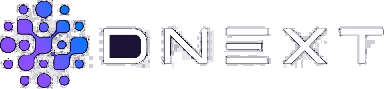
We designed a distinctive logo and visual identity for DNext around independent parts coming together as one system. Distributed points, modular shapes and a sense of forward movement distil the brand’s scalable, forward-looking approach to complex technology into a simple mark.
Logo
Need.
DNext came to us after an earlier identity design process had stalled. The direction did not meet the team’s expectations or offer a clear visual idea that could express the product’s technical strength, modular structure and international ambitions.
The task went beyond drawing a different logo. This advanced technology product needed an identity that enterprise clients could trust, while standing apart from the static, generic language of conventional corporate software brands. The mark had to retain its character in the product interface, app icon, presentations and corporate materials.
Design approach.
We started afresh rather than staying within the limits of the previous design. Across numerous alternatives and visual directions, we explored what technology, connection, modularity and progress meant specifically for DNext.
The chosen mark brings dots and rounded modules of different sizes into a single structure. Each part is distinct, yet together they complete a larger system. A diagonal movement through the centre gives the logo direction, making the ‘next’ in DNext visible.
The widely spaced, geometric wordmark carries the symbol’s technical character in a calm, controlled way. Together, symbol and lettering form a corporate signature; on its own, the mark remains recognisable as an app icon and at small digital sizes.
Purple, blue and lilac gradients against a deep night tone give the identity a distinctly digital character. We paired Archivo’s weight with Space Mono’s technical rhythm to create a typography system suited to both headlines and data-led content.
We extended the identity into brand guidelines, business cards, letterheads, envelopes, notebooks, an app icon and physical applications. The logo became part of a complete system for the brand’s digital and corporate touchpoints.
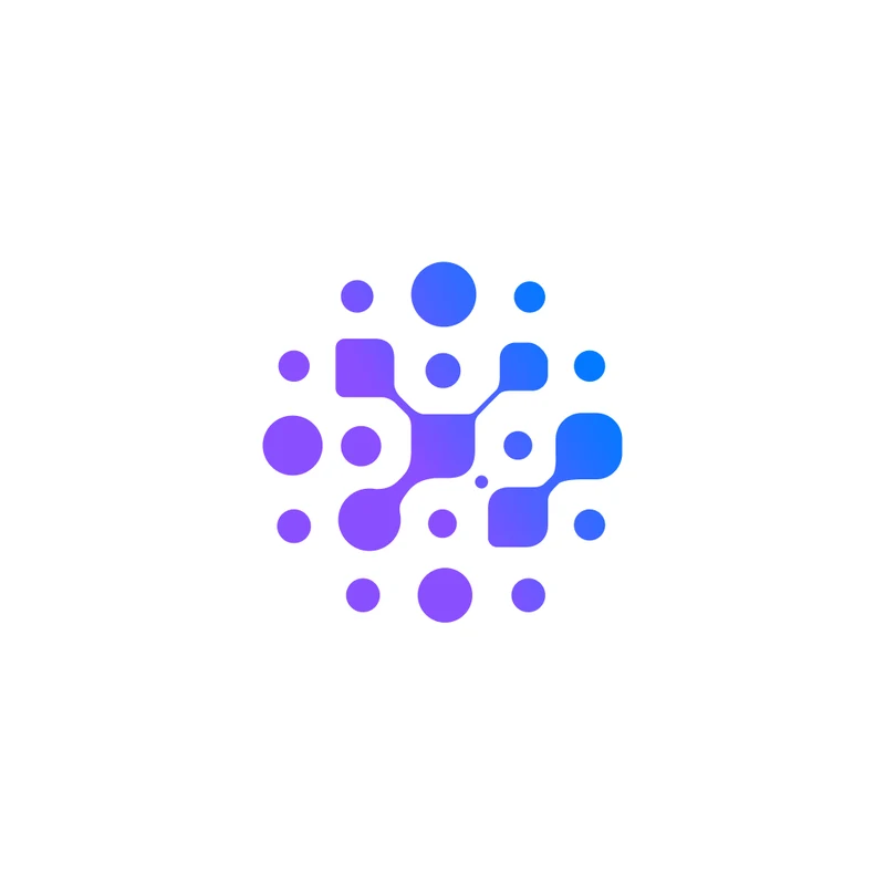
App icon
On a blue background
On a purple background
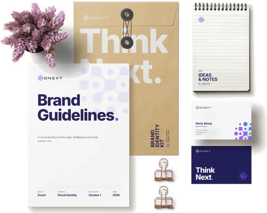
Corporate identity applications
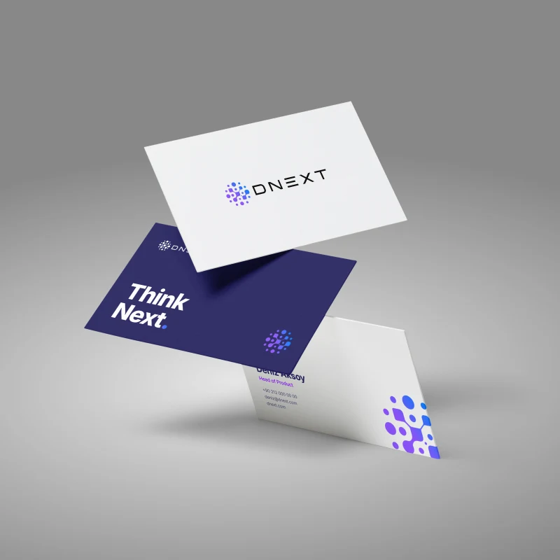
Business card
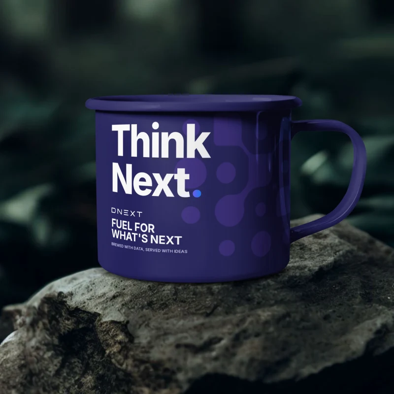
Kupa
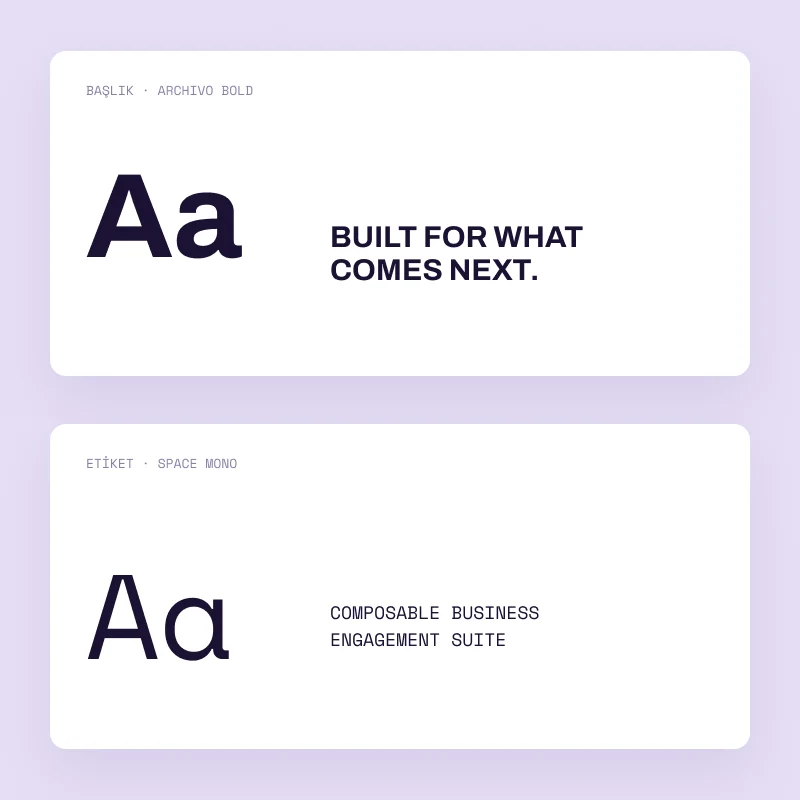
Typography
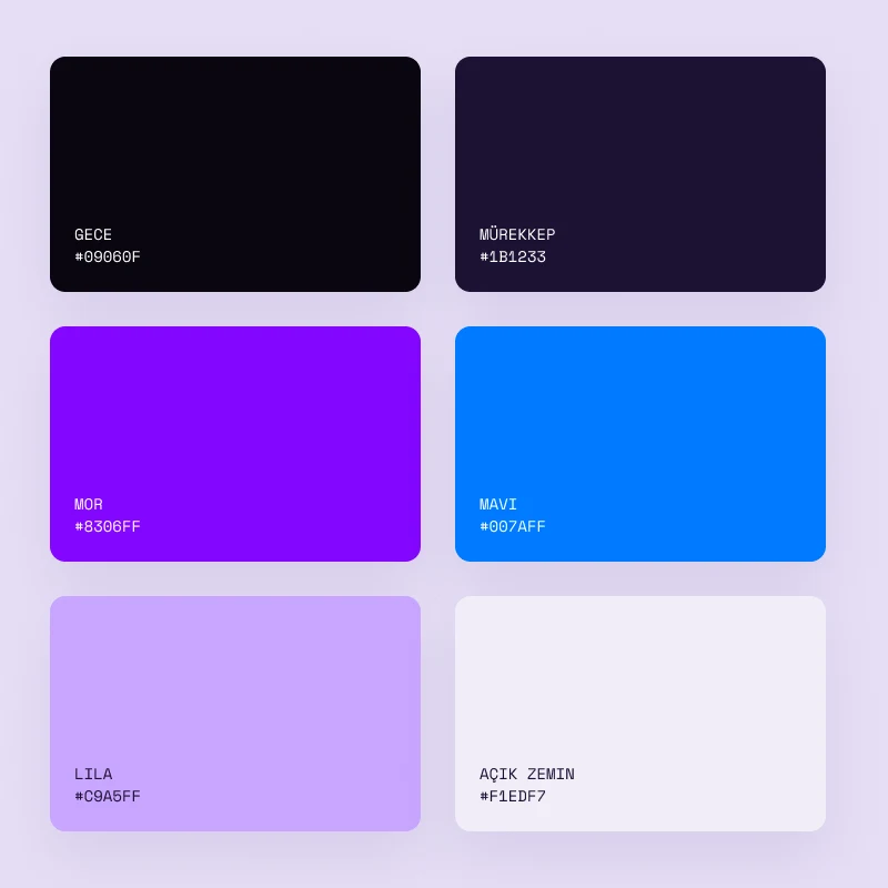
Renkler
The work.
Extensive exploration and joint reviews led to a visual direction that both DNext and our team felt strongly about. The identity expresses a complex enterprise technology product through modularity, connection and forward motion, without relying on technical diagrams.
Tasarladığımız logo bugün de DNext’in ürünlerinde, kurumsal iletişiminde ve uluslararası dijital yüzeylerinde kullanılmaya devam ediyor. Kimlik, daha sonra tasarladığımız DNext web sitesinin de görsel temelini oluşturdu; ancak logo ve marka kimliği ile web sitesi bu portföyde iki ayrı proje olarak ele alındı.