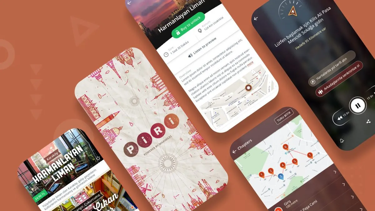
Piri Guide Logo Design.
An identity connecting discovery with mobile life.
We created Piri’s first logo and visual identity when it began as an idea within YGA. Exploring cities through stories became a warm, dynamic system recognisable in mobile interfaces.

Logo
Need.
A credible, lively identity for a new way to travel.
At the idea stage, Piri needed to feel close to culture and storytelling while clearly being a contemporary technology product. Its identity had to remain distinctive on small screens and flexible across cities and content types.
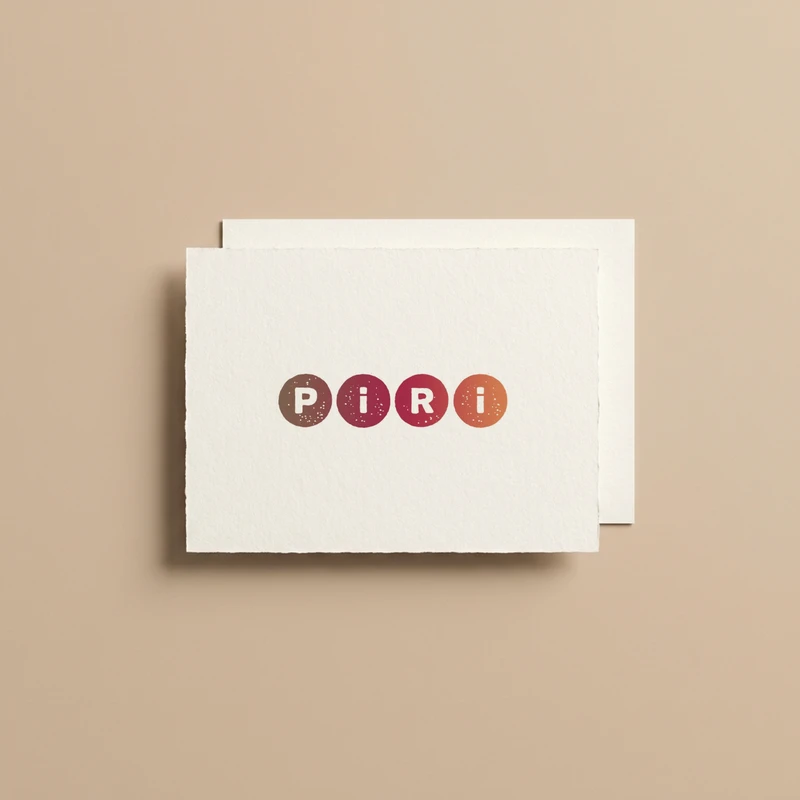
Logo on paper
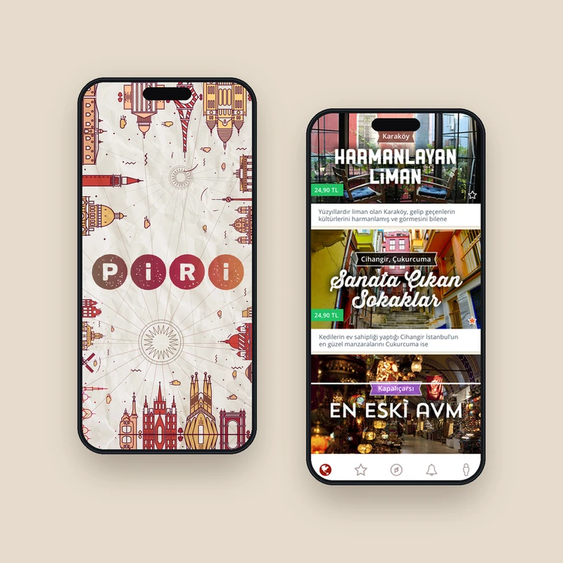
Logo on app screens
Design approach.
A language of discovery through colour, rhythm and type.
We paired a simple Piri wordmark with a vivid colour system. Distinct colours help organise tours, categories and content in the mobile experience, giving the brand an energetic, approachable character.
Open Sans supports readability on small screens and varied content density. We developed logo, colour and typography alongside the app interface so the identity would work in the product, not just in presentations.
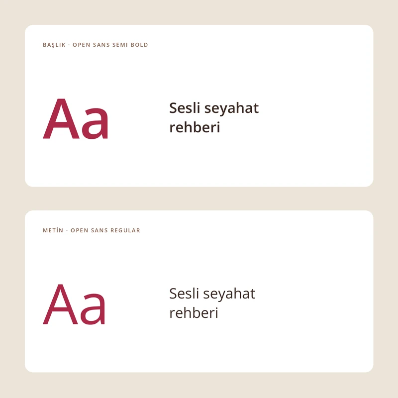
Typography
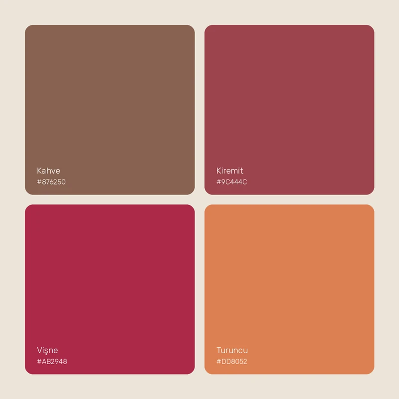
Renkler
Outcome.
The simple, flexible identity was made for digital use, carrying Piri’s ideas of urban discovery, storytelling and movement. In the first app, it connected tour cards, maps and audio guides through one visual language.