Butterfly DXP Logo Design.
An identity expressing transformation for a modular technology platform.
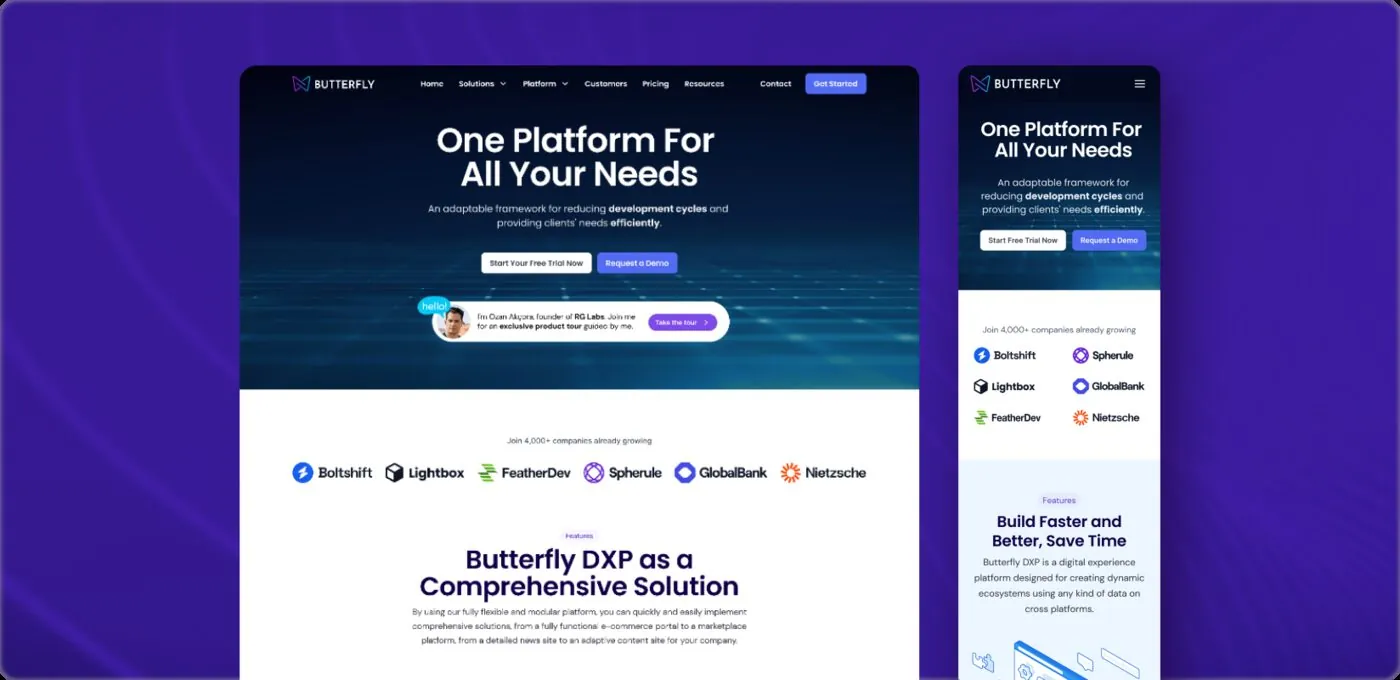
For RGLABS’s Butterfly digital experience platform, we created a contemporary identity that brought flexibility, connection and continuous development into one geometric symbol.
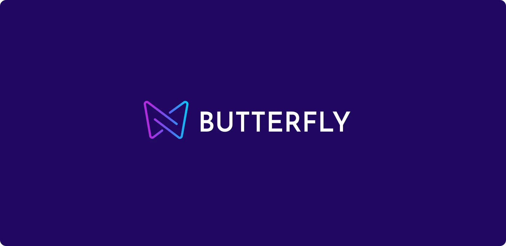
Ana logo
Need.
Butterfly DXP could support headless CMS, commerce, media platforms, content portals and corporate management products on shared infrastructure. The identity needed to reflect that breadth, convey technical credibility and express modularity in a memorable mark.
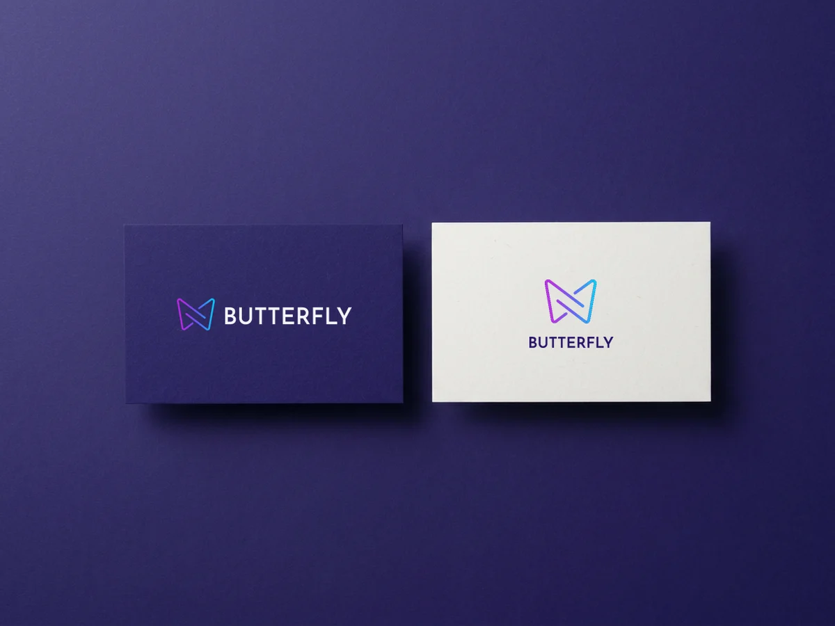
Business card
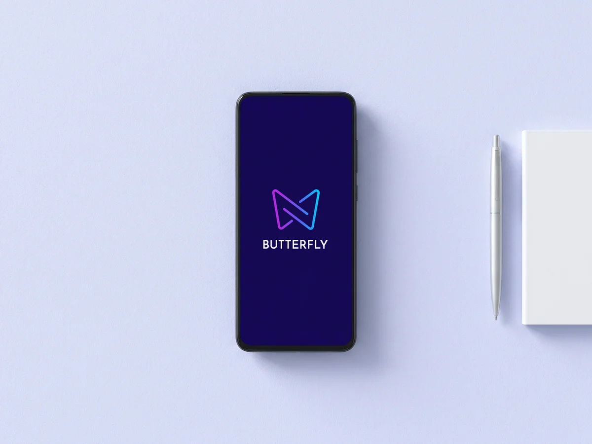
App launch screen
Design approach.
We reinterpreted symmetrical butterfly wings as a modular technology symbol. Connected lines suggested systems, data sources and touchpoints meeting on one platform, while the open geometry reflected flexibility and potential for development.
The symbol’s movement connected transformation, suggested by the Butterfly name, with adaptability. Fine lines felt light and contemporary on screen, while the simple silhouette stayed distinctive at small sizes.
A purple-to-blue transition connected creativity and technology. Deep purple, pale blue and white gave the product a distinct digital character. Poppins brought clear headings, while DM Sans supported longer text.
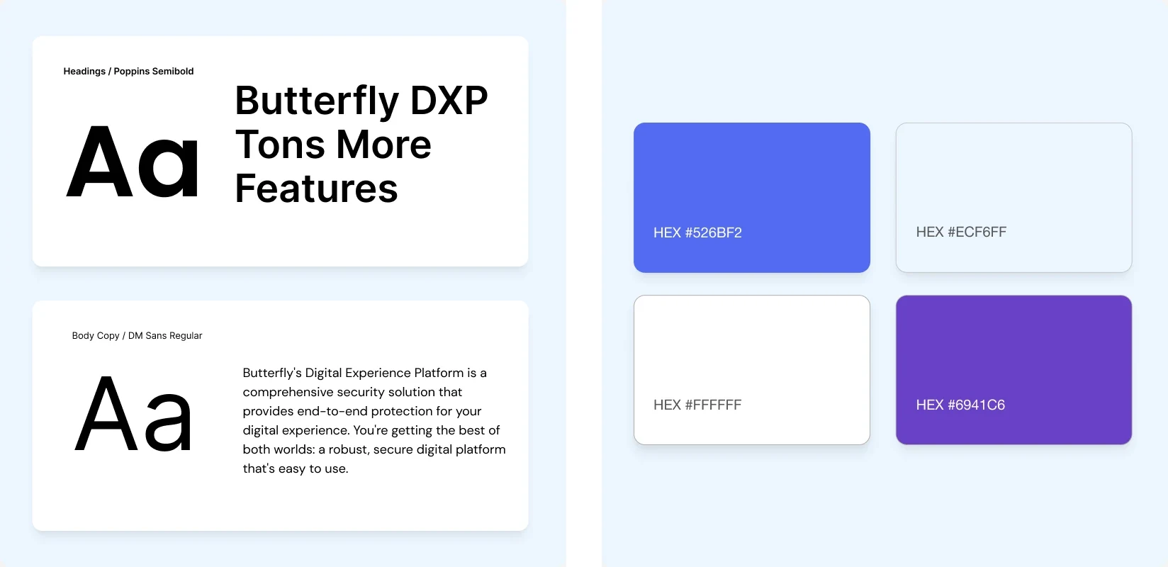
Typography & colour palette
The work.
The flexible identity worked across interfaces, the marketing site, presentations and digital communications. The logo expressed the platform’s versatility through transformation, connection and modularity.