TED Üniversitesi.
A clear web experience for different university audiences.
We designed TED Üniversitesi’s interface around prospective students, current students and alumni. Clear navigation, persistent section menus and visual hierarchy simplify extensive academic and institutional content.
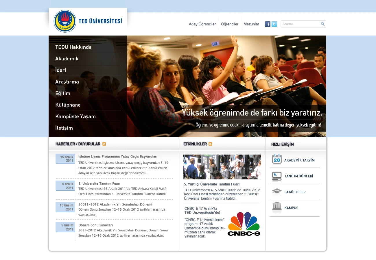
Ana sayfa
Need.
University websites serve people with very different expectations. Prospective students explore programmes and campus life, while students, alumni and academic users often seek direct, task-focused information.
TED Üniversitesi’s expanding content needed a structure that was easy to follow according to audience and current section.
Design approach.
Clear navigation entry points serve prospective students, students and alumni. Faculties, departments, staff, academic information and regulations are grouped under section-specific left menus.
Breadcrumbs and persistent side menus keep visitors oriented. Balanced photography, headings and text make institutional content readable. Shared page patterns allow the design to extend consistently across departments.
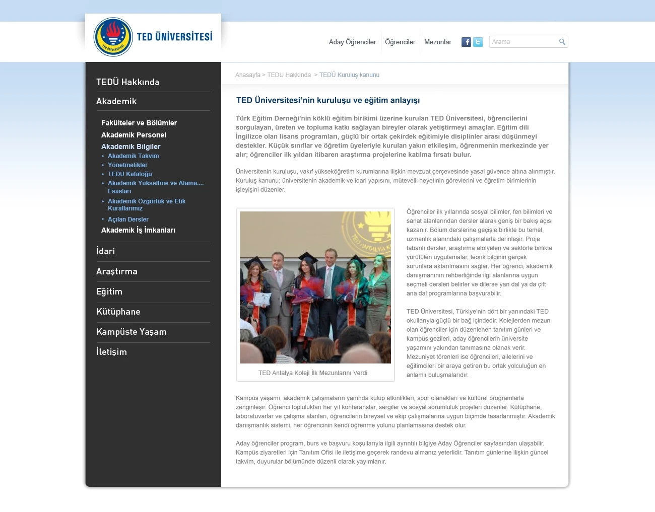
Content page
The work.
The interface directs different audiences to relevant content and organises extensive academic information. We worked through Sibername, not directly with the university, collaborating with a partner whose requirements and quality expectations were clear.
Pars Design handled information architecture and UX/UI. Implemented in its time, the project appears in our portfolio as an early example of work in education.