Exastax Logo Design.
A technology identity that brings clarity at scale.
We expressed Exastax’s position in big data through a simple symbol and a distinctive visual identity, drawing on data flow, connections and scalable systems.

Logo
Need.
As a new business, Exastax needed an identity that reflected its big-data expertise and remained recognisable across touchpoints. The brand had to express scale, speed and engineering capability without appearing complex or inaccessible.
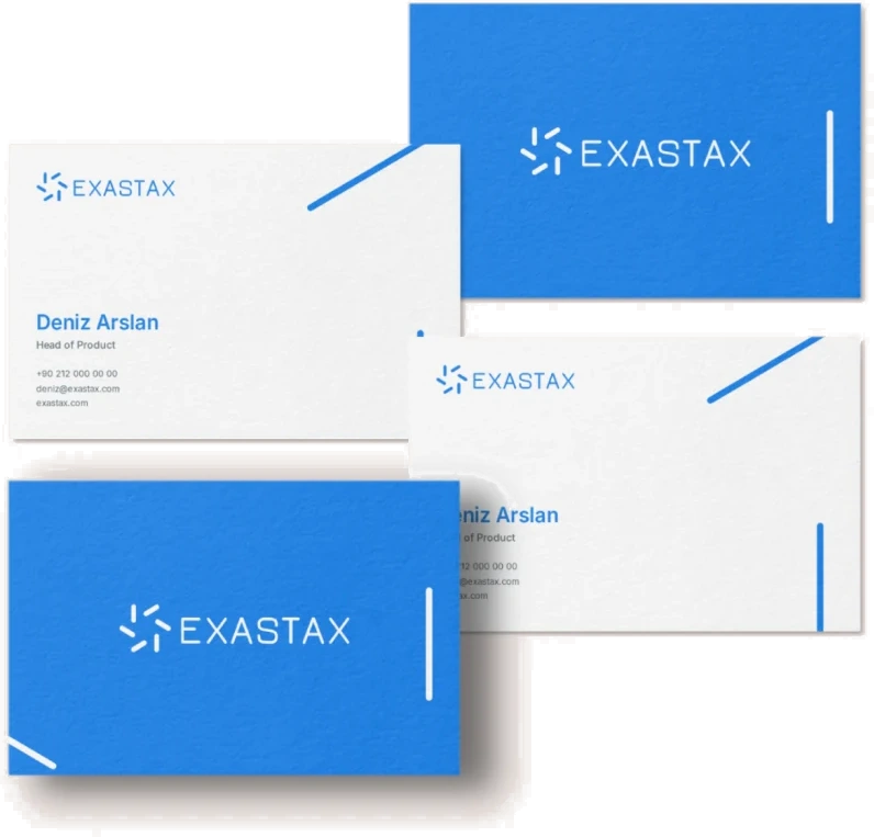
Business card
Design concept.
The name was our starting point: ‘exa’ suggests large-scale data, while ‘stax’ refers to technology stacks. Modular elements arranged around a centre represent distributed data sources, continuous flow and different layers coming together in one system.
Rounded geometry gives the symbol a contemporary, digital character. Its open form suggests movement, growth and expansion. A simple balance between symbol and wordmark keeps the identity consistent in corporate communications and small digital applications.

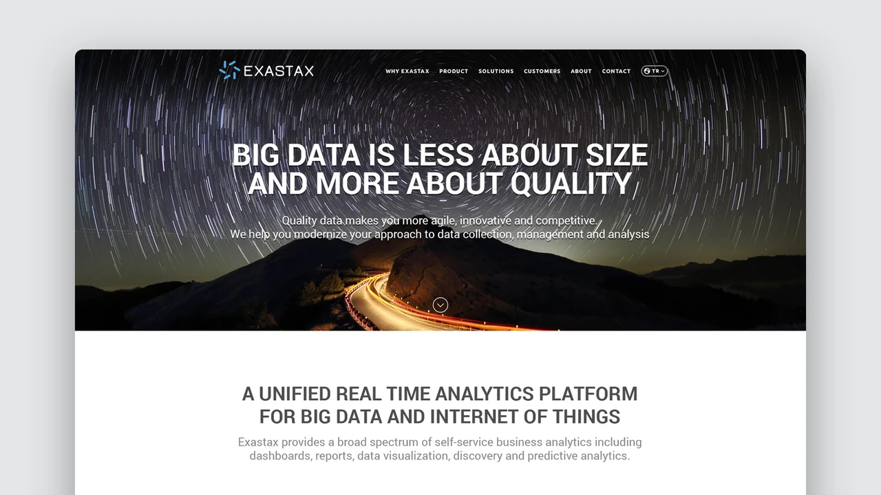
Identity on digital screens
Visual system.
Deep and bright blues express trust, technology and clarity. Pale blue and neutral grey support the main colour, creating a flexible palette. Inter-based typography complements the brand’s technical character with clear, contemporary lettering.
‘Clarity at scale’ sums up the identity’s central idea: as data grows, make information more visible, meaningful and usable rather than adding complexity.
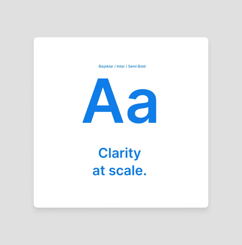
Typography
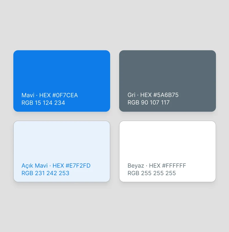
Renkler
The work.
The logo anchors an identity system that holds together across business cards, screens, presentations and product interfaces. The result is a simple, distinctive and lasting expression of Exastax’s technology focus.