EK Mimarlık.
Two letters, one structure.
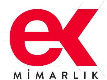
We designed a distinctive logo for EK Mimarlık that carries its name while expressing architectural proportion and structure through simple geometry. Joining ‘e’ and ‘k’ into a single mark created a clear identity that is recognisable across applications.
Logo
Need.
An architecture practice’s identity should support its work rather than compete with it. EK Mimarlık needed a distinctive, lasting mark that could represent projects of different scales while reflecting its technical discipline and design approach.
Looking good on a business card was not enough. The identity needed the same clarity and character across project folders, letterheads, envelopes and digital applications.
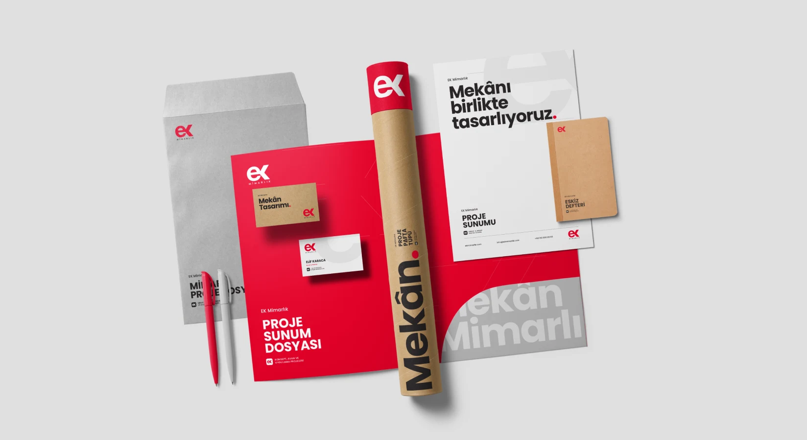
Corporate identity applications
Design approach.
The brand’s two initials were our starting point. We connected the horizontal axis of the lowercase ‘e’ to the centre of the ‘k’, turning two letters into one geometric structure. Rather than sitting side by side, the characters support each other within a single mark.
The horizontal, vertical and diagonal lines recall the axes, junctions and connected components of architectural drawings. The open arms of the ‘k’ give the monogram direction and movement while keeping it distinctive at small sizes.
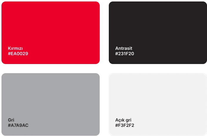
Red brings a strong accent to the identity’s technical, controlled structure. A restrained palette of red, black and white keeps the logo clear across project documents, correspondence and different materials.
We developed the identity across business cards, letterheads, envelopes, folders and office applications. The logo became part of a consistent system for the practice’s everyday touchpoints.
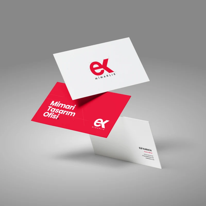
Business card
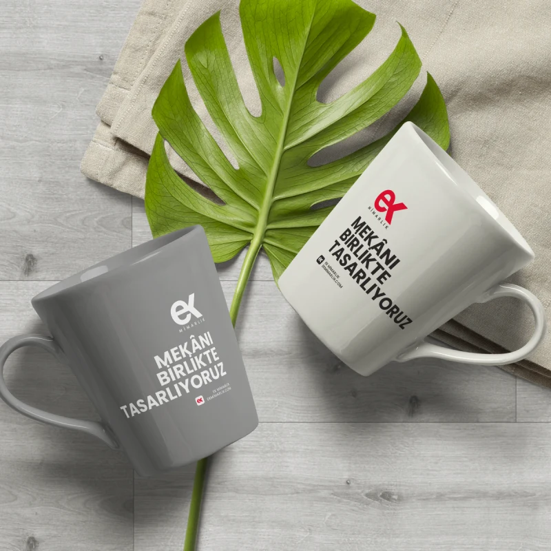
Kupa
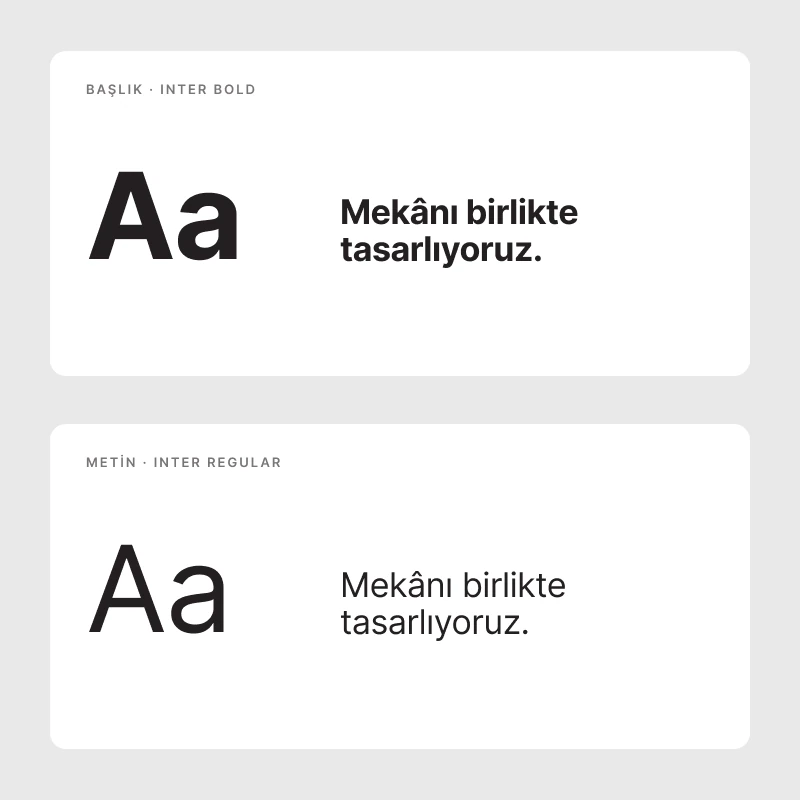
Typography
Renkler
The work.
The result makes the EK Mimarlık name immediately visible, reflecting architectural discipline without familiar building or roof symbols. Simple geometry preserves the mark’s character in both large corporate applications and small digital uses.
Designed in 2018, the logo remains in use on EK Mimarlık’s official website. Its longevity reflects an idea grounded in the brand’s name and practice rather than a passing visual trend.