Aidea Logo Design.
We translated AI’s creative energy into a warm, recognisable brand identity.
For Aidea, an AI learning and content creation platform, we designed a logo and visual identity that connected its technology with creativity and accessibility. A mark centred on the “AI” in its name extended through colour, typography and applications into the digital product.
Logo
Need.
Aidea was being developed as a comprehensive AI platform for turning users’ knowledge into courses, presentations and other content formats. The brand needed to express its advanced technology while remaining approachable.
The task was a flexible identity that suggested AI without familiar robotic imagery, retaining its recognition across the product interface, marketing website, presentations and printed materials.
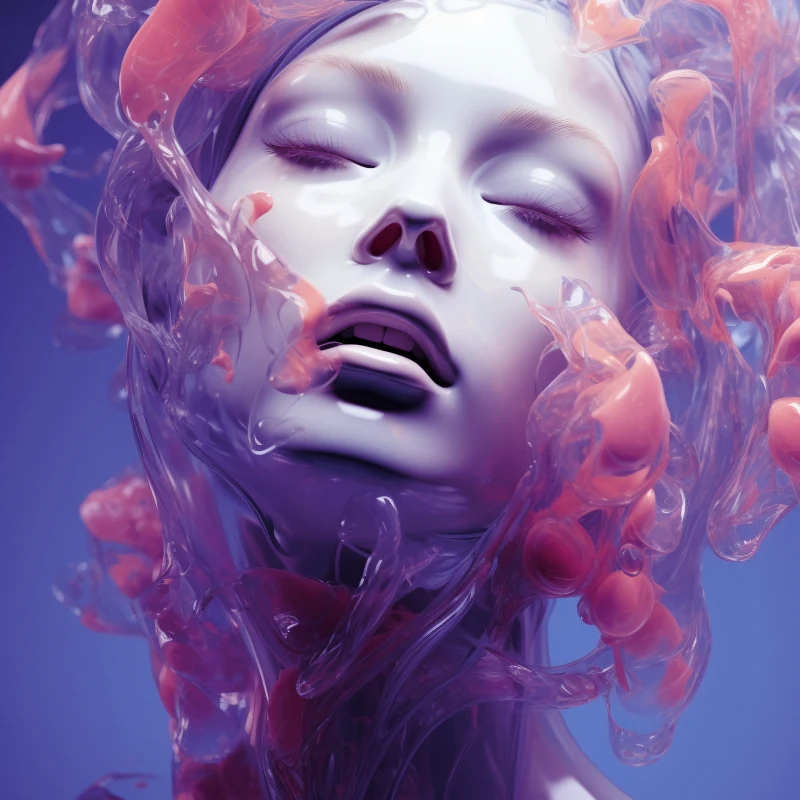
Visual language
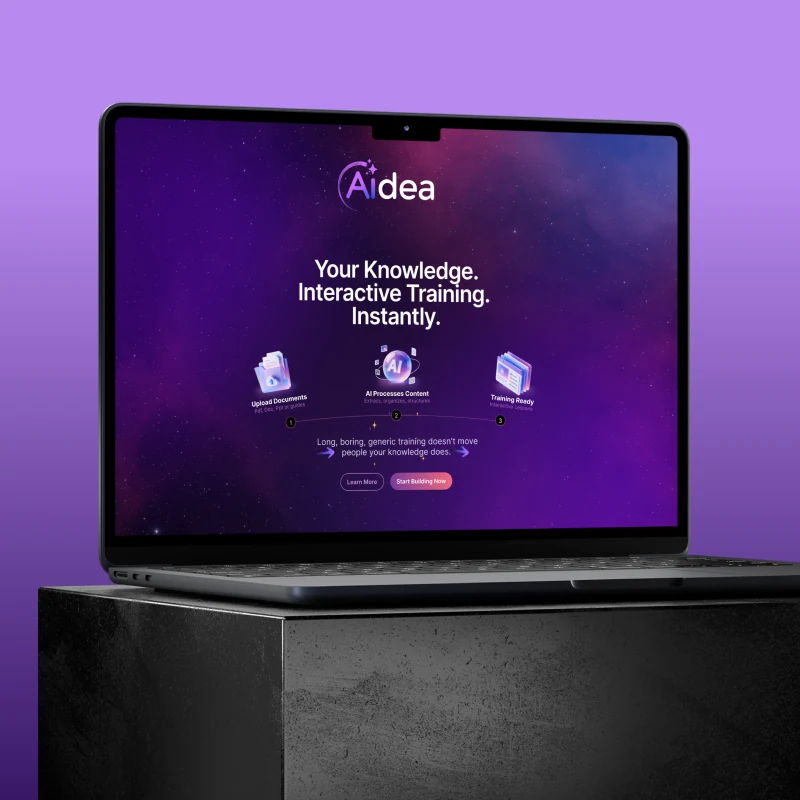
Marketing website
Design approach.
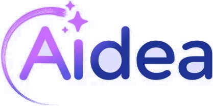
We emphasised the “AI” at the beginning of the name. A flowing orbit around the “A” suggested the continuous movement of processing knowledge and creating new outputs, while small sparks evoked making, discovery and new ideas.
We brought the symbol and name together in one fluid wordmark. Rounded letterforms made the brand feel warmer and more approachable while preserving technical credibility. The logo worked both as a distinctive signature and at small digital sizes.
Indigo and purple formed the core palette, with lilac and coral accents expressing creative energy and content variety. A deep night tone supported dramatic digital applications, while a pale mist colour kept interfaces open and readable.
We chose Inter to create continuity between the product interface, marketing and corporate materials. Clear headings and strong readability supported content of different densities within one visual language.
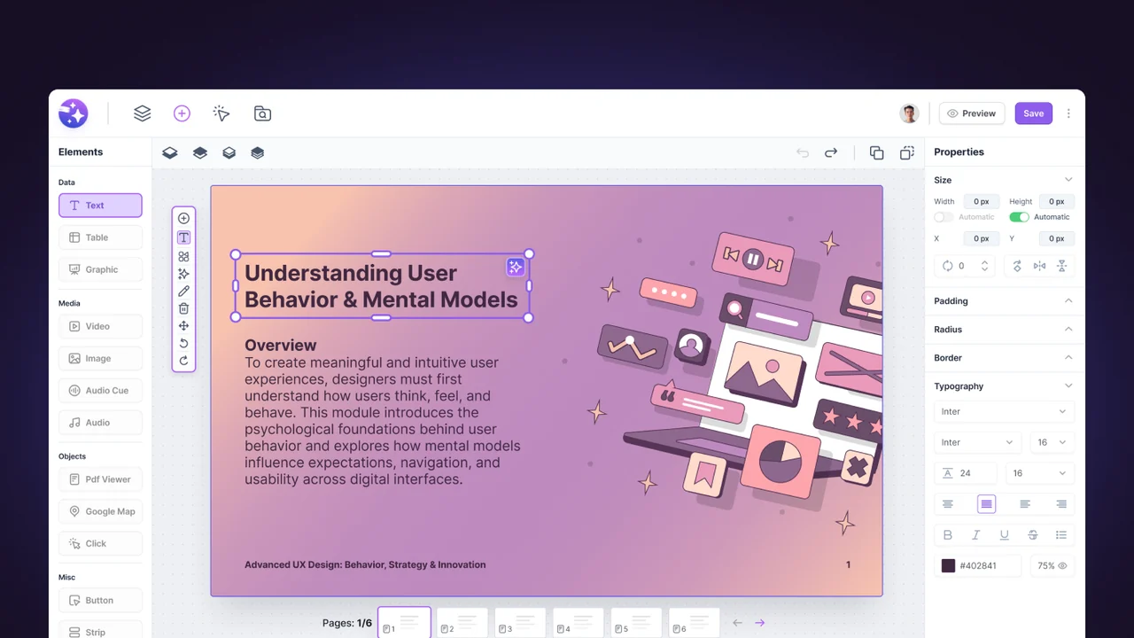
We demonstrated the identity across the marketing website, business cards and branded items to show its behaviour at different scales and on different backgrounds. AI-generated imagery extended the visual world, expressing the brand’s experimental and creative character.
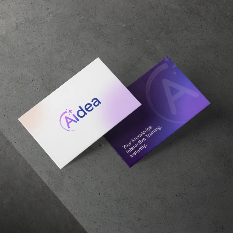
Business card
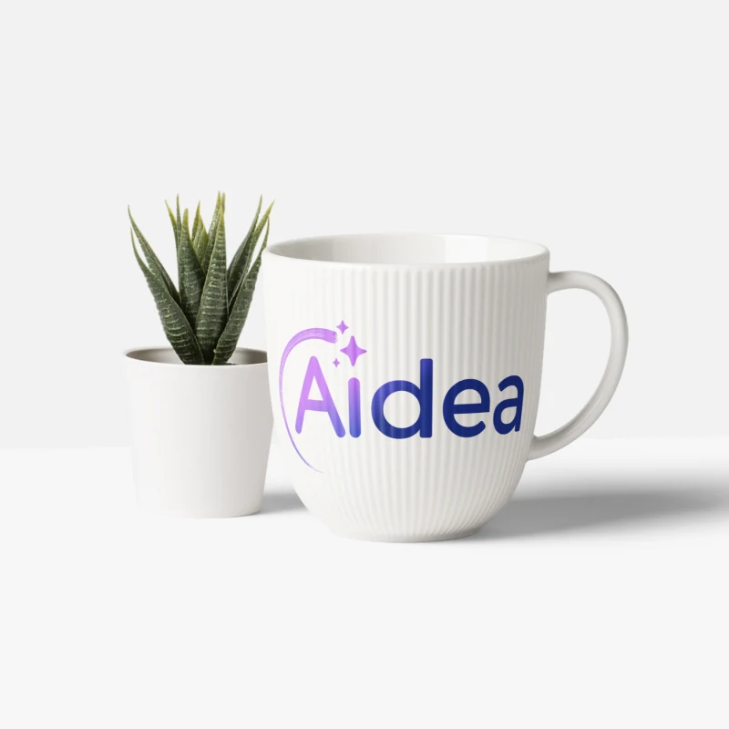
Kupa
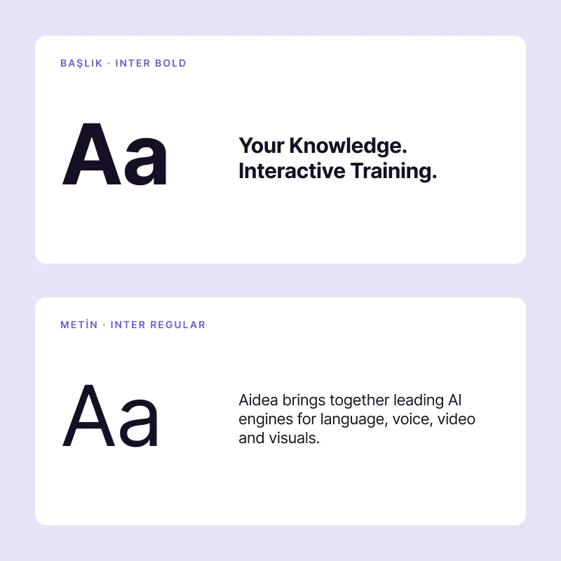
Typography
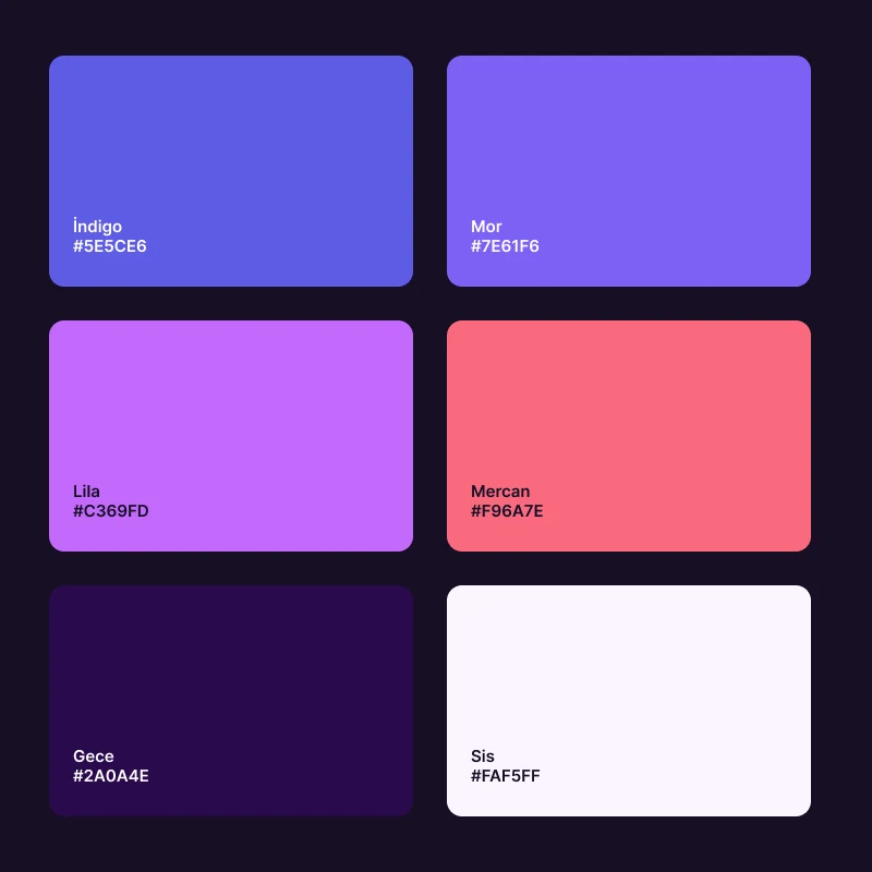
Renkler
The work.
The resulting identity communicated Aidea’s AI capabilities through a creative, energetic and accessible character.
The logo, colour and typography system became the shared visual foundation for the product interface and marketing site, uniting Aidea’s content creation features within one recognisable brand.