Atlas Kırtasiye.
Thousands of products, organised for easier shopping.
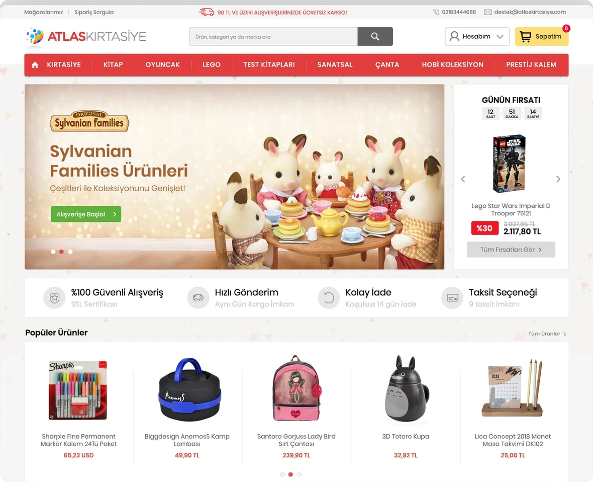
We redesigned Atlas Kırtasiye’s extensive online store with a contemporary shopping experience for its time. Clearer information architecture organised the products and promotions, while one visual system connected discovery through to checkout.
Ana sayfa
Need.
Atlas Kırtasiye offered products for many needs, ages and uses within one store. The existing interface struggled to organise the catalogue and guide visitors to suitable products. Categories, campaigns, product choices and checkout lacked visual and functional consistency.
The task was to make thousands of products easier to discover, bring promotions into view and help users understand their place throughout the shopping journey.
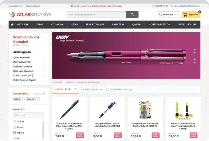
Product listing
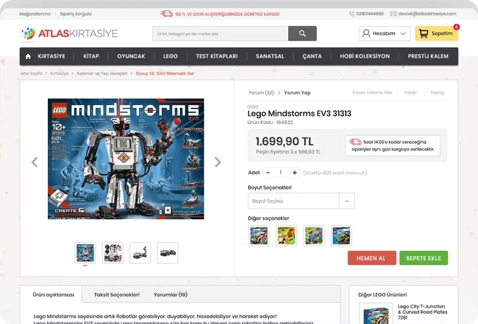
Product detail page
Design approach.
We first reorganised the catalogue through clearer navigation and categories. A modular home-page layout gave promotions, daily deals and popular products space without competing for attention, creating a calmer starting point while retaining the commercial content.
On listing pages, clear filters and scannable categories, prices and product attributes helped visitors narrow a large selection to relevant options.
Product detail pages gave images, price, colour choices, descriptions and video a clear hierarchy. Sections supported both quick browsing and detailed product research.
We redesigned the basket, delivery, billing, membership and account flows using a shared form and component system. A visible basket summary at key steps helped users review products and totals and move through checkout without unnecessary surprises.
Campaign pages and brand sections followed the same visual system. Lively colours, readable Poppins typography and reusable components brought the extensive content into a consistent, contemporary interface.
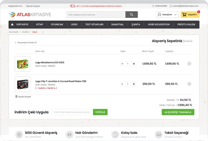
Sepet
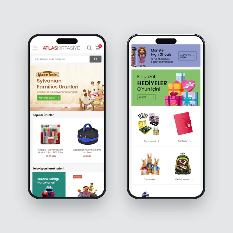
Mobile home screen
The work.
The resulting store presented a broad catalogue without overwhelming users. From the home page and product discovery to details, basket and order forms, the main touchpoints shared one design language and interaction logic.
The new structure made Atlas Kırtasiye’s product variety an advantage for shoppers. It showed how clear information architecture and a simple interface can make dense category and product data easier to use.