What typography means #
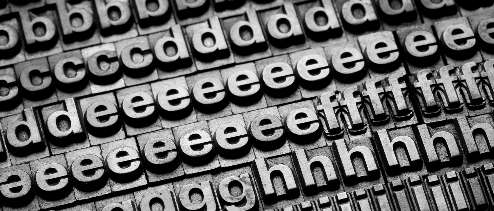
The word comes from the Greek typos, meaning form, and graphia, meaning writing. Today it covers all decisions affecting text’s appearance, from typeface and line length to letter spacing and the relationship between headings and body text.
Typeface and font are often used interchangeably, but are not quite the same. A typeface is a design family; a font is its digital file in a particular weight and style, such as OTF, TTF or WOFF2 for the web. Variable fonts blur the distinction by carrying many variations across axes such as weight and width in one file.
On a printed poster, typography is fixed. In a digital product, the same heading occupies different widths on phones, laptops and large screens. Users can zoom text, switch to dark mode or change system text size. Typography needs to hold up through all of these changes.
Readability is typography’s first job #
Well-set text lets readers focus on content rather than letters. Poorly set text draws attention to awkward line endings and cramped paragraphs. Across presentations and interfaces alike, difficult reading is a quick way to lose attention.
A few practical decisions shape readability:
- Choose a comfortable body-text size and allow browser text enlargement.
- Limit line length. Very long lines make the next line hard to find; very short ones constantly interrupt reading.
- Use more generous line spacing for body text than for headings.
- Provide enough contrast against the background. Grey text on pale grey may look elegant but is unreadable for many people.
Accessibility standards make these decisions measurable. WCAG 2.2 requires at least 4.5:1 contrast for normal-sized text. Its text-spacing criterion requires content to remain intact when users increase line height to at least 1.5 times the font size. Fixed-height boxes and clipped overflow can therefore fail accessibility checks.
Typography establishes information hierarchy #
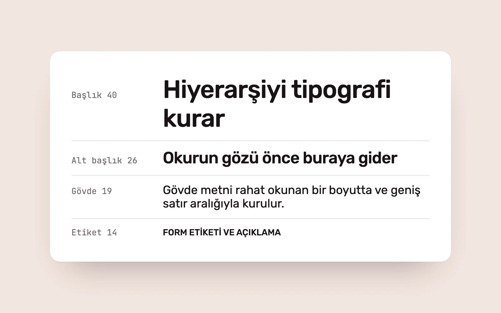
People scan before reading. Differences in size and weight between headings, subheadings, body copy and supporting text guide that scan. Clear differences help users find what they need sooner.
Rather than choosing sizes afresh on every screen, we use a type scale. Material Design 3 defines roles such as display, headline, title, body and label. Role names give designers and developers a shared language. Change a heading value in one place and the whole product updates.
Size is not the only way to create hierarchy. Weight, colour, capitalisation and space also distinguish elements. Using five emphasis techniques on one page, however, blurs the hierarchy because everything competes for attention.
Uppercasing needs care in Turkish interfaces. Without a tr language declaration, the browser may convert i to an undotted I. Check the language setting for uppercase labels, or write the text in uppercase from the start.
Typography carries the brand’s voice #
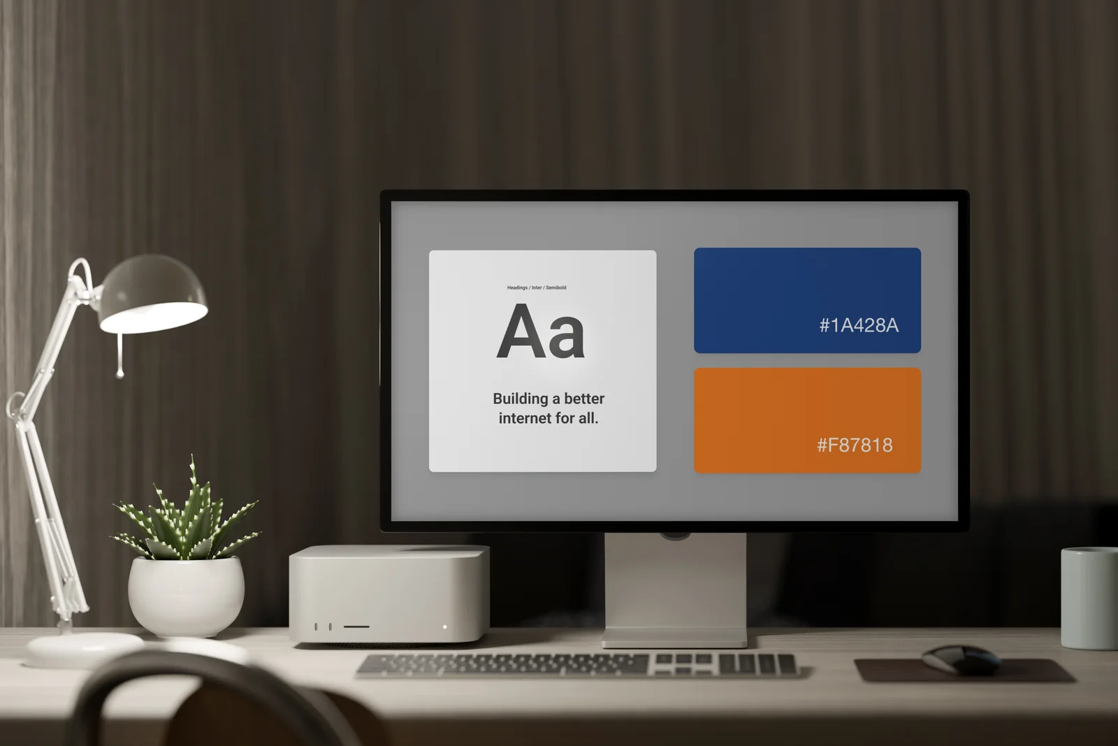
The same sentence takes on different tones in different typefaces. A geometric sans serif can feel clear and technical; a high-contrast serif more editorial and formal. People see a brand’s text more often than its logo, making typography one of identity’s most visible elements.
Consistency is decisive. When the website, app, presentations and social media use one typographic system, people recognise the brand across channels. When each channel adopts its own fonts and scale, that recognition fragments.
Check licensing when choosing fonts. A desktop licence may not cover website or mobile-app use. Openly licensed libraries reduce this risk; a bespoke or less common typeface can make the identity more distinctive. Making the budget–distinctiveness trade-off deliberately at the start avoids later redesign costs.
The technical side of web and app typography #
Typography affects performance too. Each weight and style means another file. Four weights, two styles and two families can make fonts some of a page’s heaviest resources, delaying its first appearance.
- Load only the weights you actually use, and prefer WOFF2 on the web.
- If many weights are needed, one variable font may cover the range at a lower cost.
- Ensure the subset includes Turkish characters such as ğ, ş, ı and İ. Missing glyphs fall back to a system font and make text look patched together.
- Choose font-display deliberately so text does not remain invisible while the font loads.
Mobile users can change text size in system settings. Apple’s Human Interface Guidelines recommend layouts that adapt to Dynamic Type. Checking only the default size misses screens that break for people using larger text.
Building a product typography system #
Teams that leave typography until a final font choice often repeat the same decisions on every new screen. We treat it as an early design-system foundation, working in this order:
- Review the content. Start with the longest heading, densest table and smallest label.
- Choose one or two families and test them with real content and Turkish characters.
- Define a role-based type scale and store its values as design tokens.
- Test contrast, enlarged text, dark mode and small screens.
- Share the rules with the whole team in a short document.
This reduces decisions whenever a page or feature is added. As the product grows, text follows the same logic and the brand speaks in the same voice on every screen.
Sources #
- Typography, Material Design 3; role-based type scale: display, headline, title, body and label
- Understanding Success Criterion 1.4.3: Contrast (Minimum), W3C WAI; minimum 4.5:1 contrast for normal text
- Understanding Success Criterion 1.4.12: Text Spacing, W3C WAI; preserving content when line height reaches 1.5 times the font size
- Typography, Apple Human Interface Guidelines; Dynamic Type and scalable mobile text