
Adding an image to a page or presentation is easy. Explaining its purpose is harder. Nielsen Norman Group’s eye-tracking research shows that users look at informative images but skip generic decoration. The distinction between decoration and communication is therefore not a matter of taste.
Decoration versus communication #
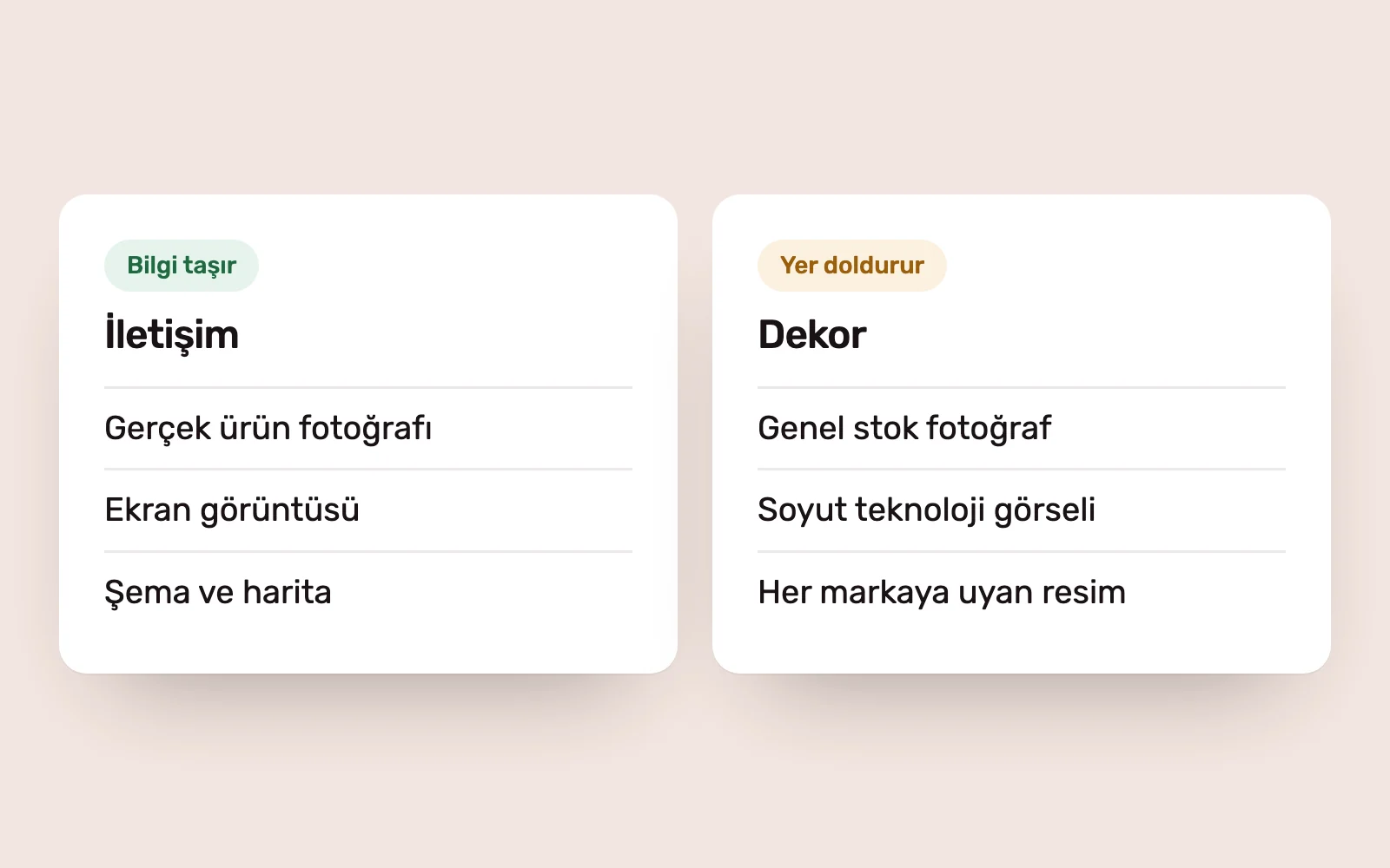
An informative image answers a reader’s question: what does the product look like, who is the team, how does the process work, what does the outcome look like? Actual product photographs, screenshots, diagrams, maps and photographs of the real team belong here.
A decorative image fills space. Businesspeople shaking hands, a smiling call-centre worker in a headset or an abstract technology image could appear on any company’s page. If the company behind the image makes no difference, the image says little about the brand.
Decoration has its place. A texture that gives a section break some breathing room or an abstract background in the brand’s colours can work. The problem is using decoration where information is needed.
Three questions to test an image’s purpose #
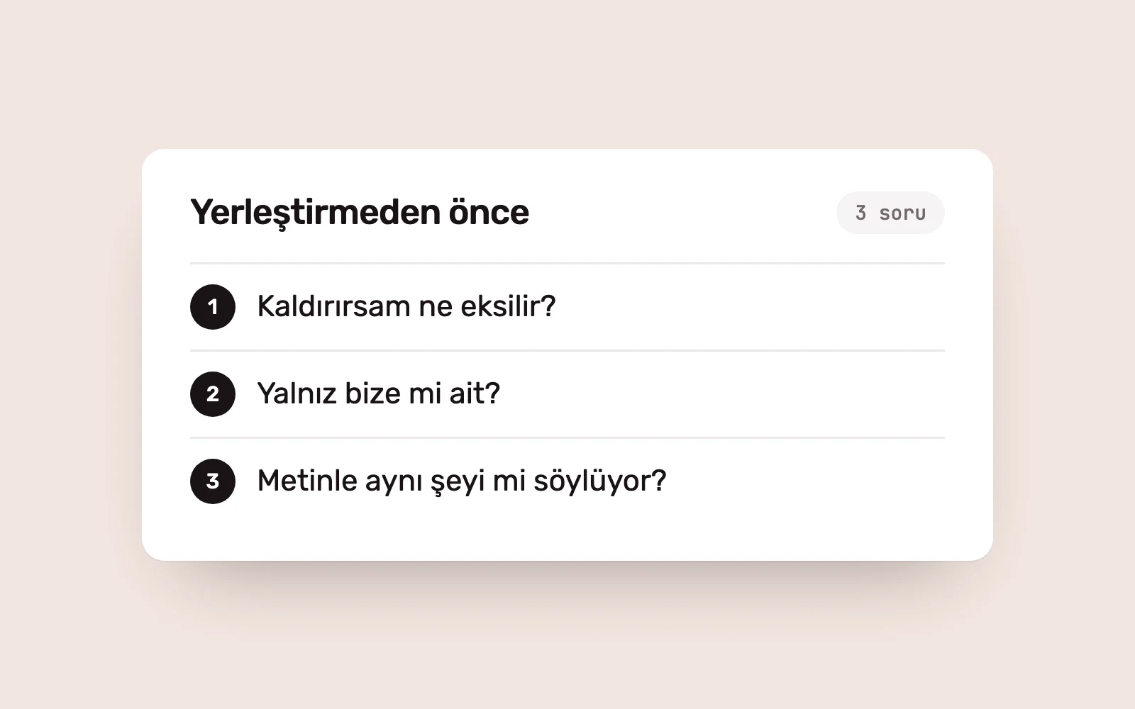
Before placing an image, ask three questions.
- What would be lost if I removed it? If the answer is “nothing”, it is decoration. It may stay, but its prominence and space should reflect that role.
- Is it specific to us? An image that could appear on another brand’s page is not distinctive.
- Does it agree with the accompanying text? If the copy promises speed while the image shows a static office, neither message feels convincing.
These questions apply equally to photography, illustration, icons and charts.
Visual language is part of identity #
A collection of well-chosen images does not automatically make a coherent brand. Consistency comes from rules: lighting, framing and colour treatment in photographs; how people are shown; the line and colour style of illustrations; and the grid used for icons.
These rules belong to the identity system as much as the logo, colour and typography, and need illustrated examples in the guidelines. Without them, each team and supplier follows personal taste, and the brand soon takes on different faces. We define visual language within our Brand and Identity services, including its digital use. We explain how guidelines stay current after handoff in living brand guidelines.
Visuals in sales and corporate materials #
Presentations, proposals and catalogues are where visuals are most often used as decoration. A stock photo on every slide makes a deck longer, not more persuasive. In sales materials, visuals have three jobs.
- Provide evidence: a real product image, a photograph of completed work or a screenshot.
- Explain: a diagram or chart that makes a process, structure or comparison clear at a glance.
- Save time: a layout that communicates the main point without requiring a long read.
Removing an image that does none of these makes the story stronger. For materials to be reusable, templates need defined image areas: the type of image, aspect ratio and source for each page. Sales and Corporate Materials projects include templates with these rules.
AI-generated images #
AI tools have made image production faster, and decoration easier to produce. The same three questions apply to generated images, with two additional checks.
First, accuracy: an image that misrepresents a product, location or team damages trust when discovered. Use real images where evidence is needed. Second, consistency: if each generation produces a different style, the visual language fragments. Direct the tool using the visual rules in the brand guidelines.
The same distinction shapes accessibility and performance #
The difference between information and decoration matters technically too. Informative images need text alternatives that convey their information. Decorative images should have empty text alternatives, so screen reader users are not burdened with unnecessary descriptions.
Every image also has a performance cost. A large photograph with no information slows the page without offering anything in return. Images need appropriate dimensions and modern formats, but the first question remains: does this image need to be here?
Sources #
- Photos as Web Content, Nielsen Norman Group; findings that users attend to informative images and skip filler
- Images Tutorial, W3C Web Accessibility Initiative; text alternative rules for informative and decorative images
- Learn Images, web.dev; image performance and choosing the right format