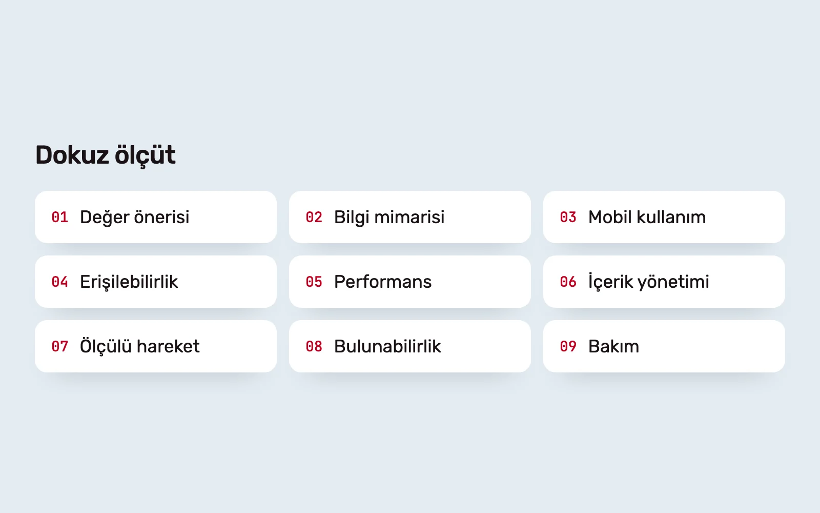
Corporate websites are often judged by appearance. But visitors arrive to do something: understand a company, evaluate a product or service, or get in touch. These nine criteria examine how easily they can do that. For each, we explain what we check and what visitors experience when it falls short.
1. A clear value proposition #
The first screen of the home page should answer three questions: what does the company do, whom does it serve, and what can the visitor do next? A simple test is to show it for a few seconds to someone unfamiliar with the company and ask what they understood.
An unclear value proposition forces visitors to browse several pages just to understand the business. Generic opening copy could belong to any company and does little to build trust.
2. Information architecture and navigation #
The menu should follow visitors’ questions, not the organisation chart. Labels need to be clear and predictable, with each page showing where the visitor is. Hiding navigation behind a hamburger icon on wide screens makes the options invisible.
Ask: how many steps does it take to reach the three most sought-after pieces of information, without hesitation? With weak information architecture, even good content cannot be found.
3. Mobile use #
Google uses the mobile version when indexing sites. Content missing on mobile is also missing from search. Responsive design should therefore be more than a compressed desktop page.
Establishing heading hierarchy, content order and calls to action on a phone first, then adapting to wider screens, produces a stronger result. Check whether touch targets are large enough, forms are usable on phones and tables and long text remain readable.
4. Accessibility #
Accessibility is a starting point for design decisions, not a final check. WCAG 2.2 covers text contrast, keyboard navigation, visible focus, image text alternatives and form labels.
Ask: can someone use the entire site with a keyboard, and does a screen reader follow the page in a meaningful order? Without this, some people cannot use the site at all. In some countries and sectors, accessibility is also a legal requirement.
5. Performance and Core Web Vitals #
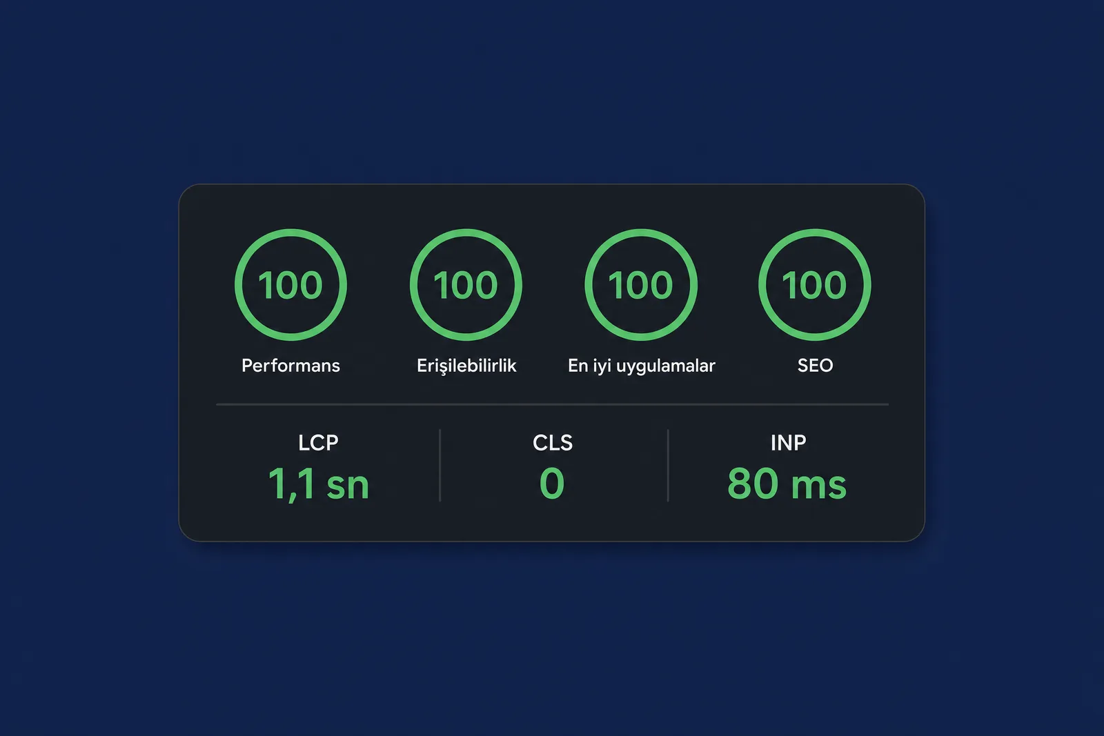
Google’s three core metrics cover loading of the largest content element (LCP), layout shifts during loading (CLS) and responsiveness to interaction (INP). Track them over time using real user data, not only on launch day.
On a slow page, visitors may leave before seeing the content. We discuss performance bottlenecks and a pre-launch checklist in our Lighthouse article.
6. Content management #
Who will update the content after launch, and with which tools? If the CMS is not built around the content team’s real work, updates either do not happen or require a developer every time.
Check whether page templates cover the variety the team needs, uploaded images are processed automatically and new pages can be added without breaking the design. When design uses placeholder copy, these problems often surface only after launch.
7. Purposeful motion #
Motion helps when it guides attention or explains a change: a menu opening, a task completing or a page transition. Decorative animation adds to loading time and distraction.
Ask: would removing the animation hide any information? If not, it is unnecessary. Respecting the operating system’s reduced-motion preference is part of this criterion too.
8. Search visibility #
Findability is not a layer added after launch. Every page needs a meaningful title, description and one main heading. URLs should be consistent, and moved pages redirected. Structured data and a sitemap help search engines interpret the content correctly.
One of the most costly redesign mistakes is leaving old URLs without redirects. Search visibility built over time can be lost on a single release day.
9. Maintenance and longevity #
A site is at its best on handoff day. What follows depends on the arrangement: who controls the domain, hosting and source code? Who owns updates and backups? Who reviews scripts added later?
Without clear answers, the site gradually slows down, links break and content ages. Consistent components and a documented maintenance plan let it evolve without another redesign.
Using the criteria together #
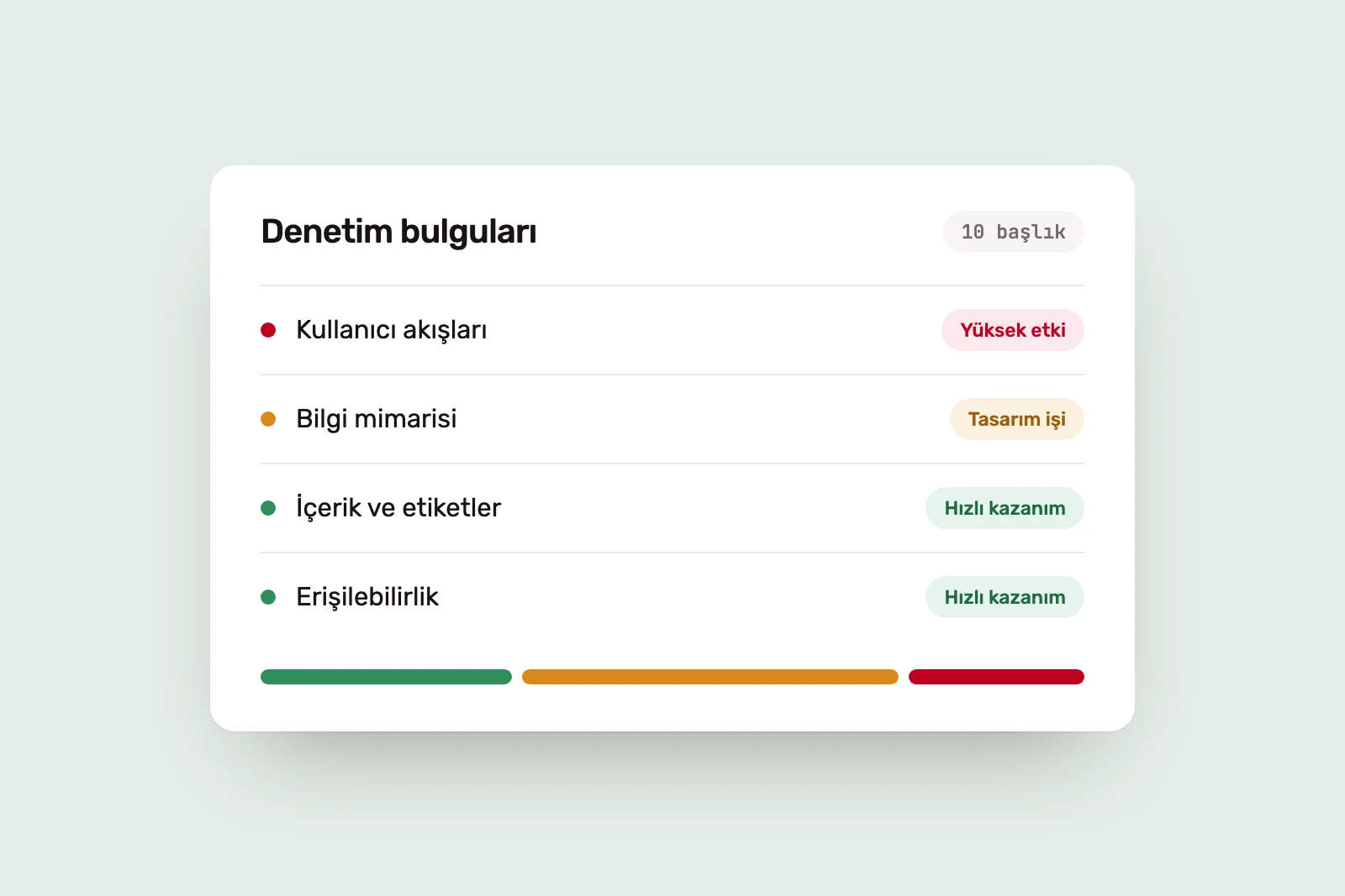
These nine criteria are a priority list, not a scorecard. For a new site, the sequence is usually as above: first what it says and how people find it, then how it works, then how it is maintained. For an existing site, start with the weakest link.
When content, design and development work separately, the result can look strong yet be difficult to use or manage. We address these criteria together in our Web Design and Development work before launch. To understand where an existing site is struggling, a Digital Experience Audit is a better starting point.
Sources #
- Mobile-first Indexing Best Practices, Google Search Central; indexing based on the mobile version
- Menu-Design Checklist: 17 UX Guidelines, Nielsen Norman Group; a navigation and menu design checklist
- Web Content Accessibility Guidelines (WCAG) 2.2, W3C; accessibility success criteria
- Web Vitals, web.dev; definitions of LCP, CLS and INP
- prefers-reduced-motion, MDN Web Docs; the reduced-motion preference