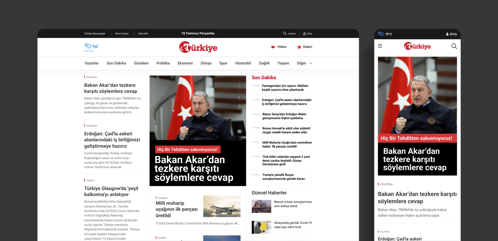
Karar Gazetesi.
Designing a new newspaper’s identity and digital publishing experience from scratch.
We designed Karar Gazetesi’s logo and comprehensive news website as it prepared to launch. The newspaper’s editorial character became a distinctive identity, supported by a shared system spanning headlines, articles, photo and video galleries, and mobile reading.
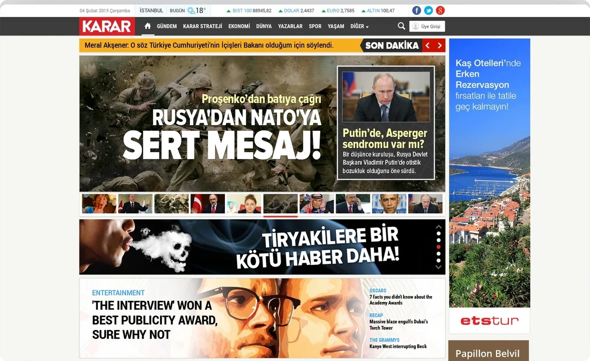
Ana sayfa
Need.
Karar was preparing to launch as a new newspaper with no established digital structure. It needed a clear, authoritative logo and a flexible website capable of presenting different types of news as priorities changed throughout the day.
Politics, business, world news, sport, culture and lifestyle needed to sit alongside breaking news, columns, photo galleries and video. Advertising and live information services also had to fit without compromising readability.
Information density was not the only design challenge. A large group of writers, editors and managers was involved in decisions. We needed to understand their different expectations, establish shared priorities and bring them together around a coherent design.
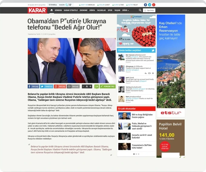
News article
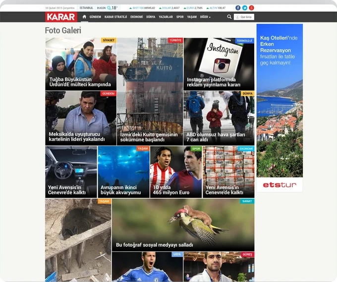
Photo gallery
Design approach.
We created a simple, recognisable and authoritative logo, then extended its character into the website. Consistent typography, spacing, colour and imagery keep the news itself in focus.
Modular homepage blocks give the main story prominence while adapting to a fast-changing news cycle. Story strips, categories and sidebars form a flexible structure that editors can reprioritise as events develop.
Article pages organise headlines, images, text, sharing and related content around reading. Photo and video galleries have format-specific layouts. Sports standings sit alongside sports coverage, while current services such as weather appear in the header.
We did more than shrink the desktop content for mobile. Headlines, story lists, category menus, galleries and articles were reprioritised for smaller screens, giving readers direct access without overwhelming them.
We worked directly with a group of around 10–12 writers, editors and managers. Prototypes and design alternatives made different views tangible, helping decisions move from personal preferences towards shared publishing needs.
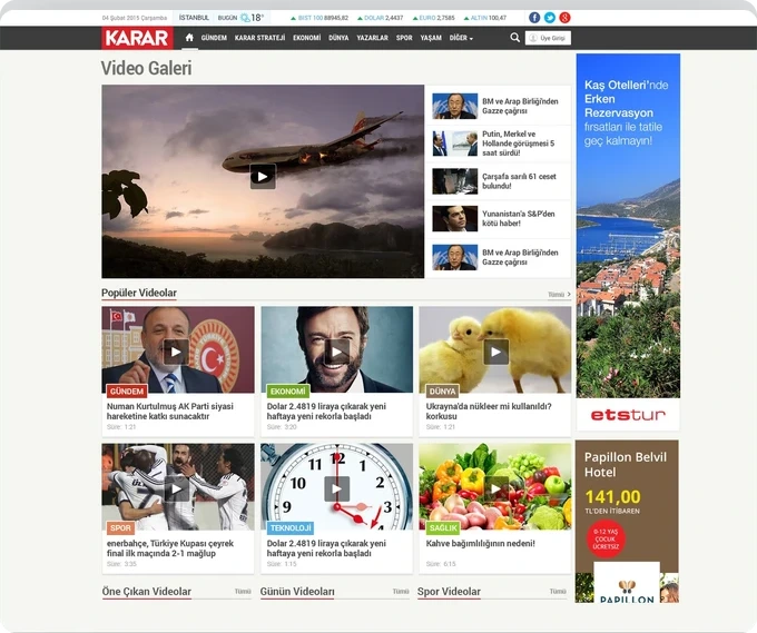
Video gallery
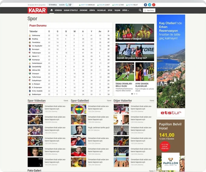
Spor
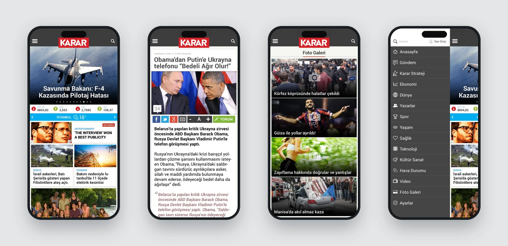
Mobile screens
The work.
The result is a comprehensive news website expressing Karar Gazetesi’s identity and editorial approach as one digital experience. The logo, desktop interfaces and responsive mobile layouts share a publishing language.
The design was implemented and used for years. The project is an important example in our portfolio of maintaining design coherence while bringing many stakeholders’ views into a working publishing system.