Art International.
An experimental digital interface with the spirit of an art fair.
We designed an Art International website that brought the fair’s visual character online. Vertical navigation, strong typography, raw textures and layered panels gave content and interface a shared curatorial language.
Ana sayfa
Need.
A practical guide and a distinctive digital exhibition space.
The international art fair’s website needed to hold visitor information, participating galleries, the programme, archives, press and applications in one structure. A standard event template would not have expressed Art International’s contemporary, experimental character.
Information had to stay accessible while the digital experience felt like part of the fair. The interface needed to work as a guide and express the event’s bold visual world from the first encounter.
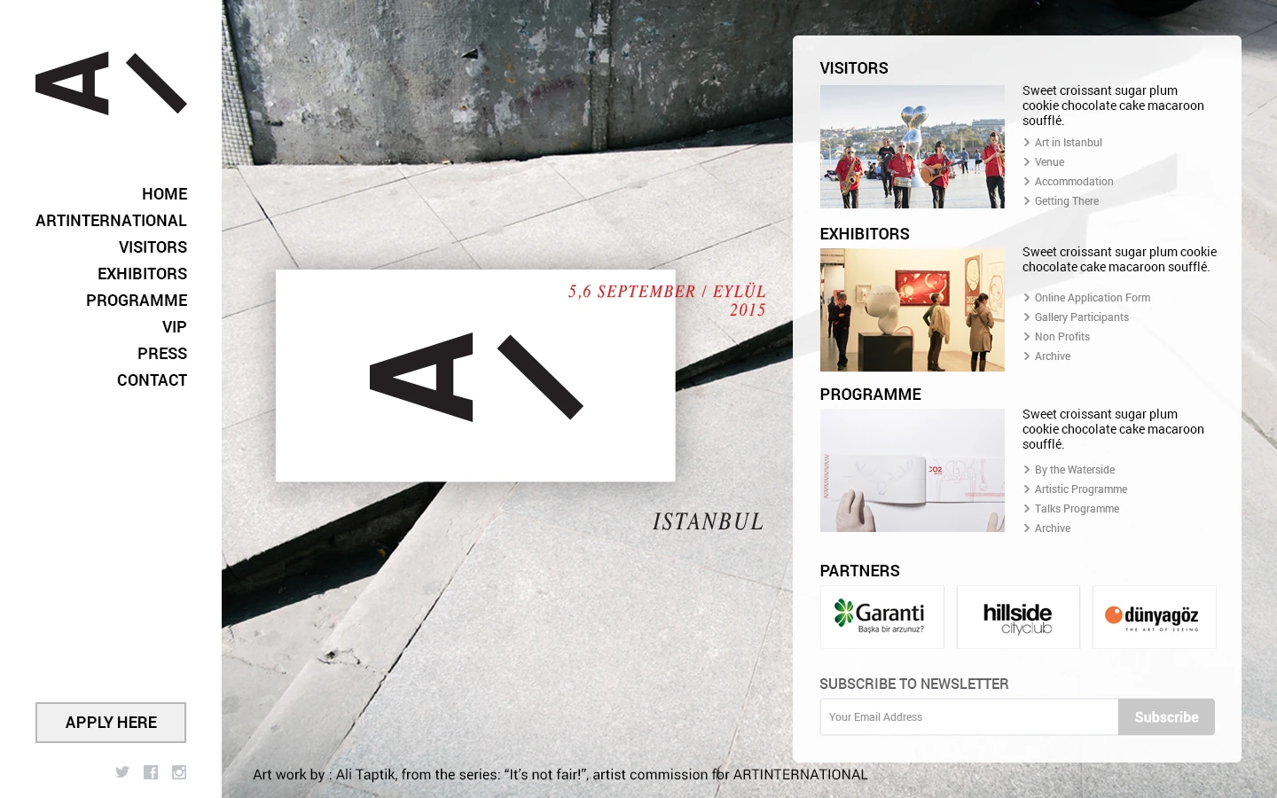
Expandable navigation panel
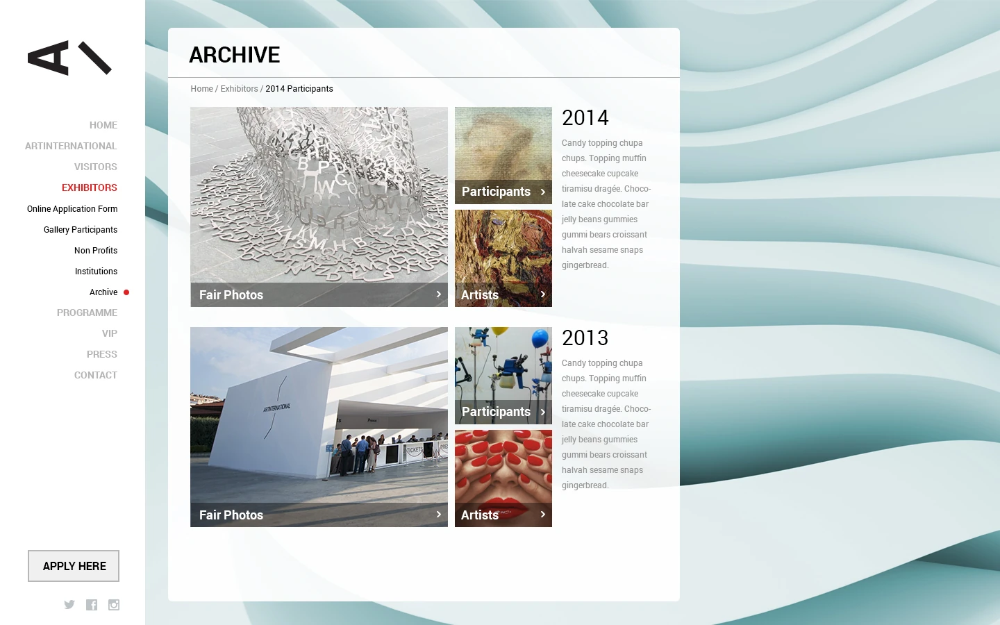
Archive
Design approach.
Navigation became part of the composition.
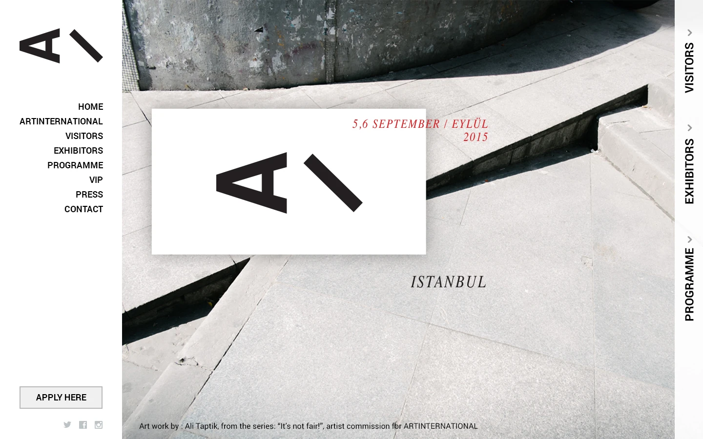
We treated the home page as a large visual surface. A photograph of a concrete-textured space, restrained black-and-white typography and vertical menus along the edges created a strong first impression.
Vertical menus opened visitor, participant and programme content in a layered panel from the right. The main composition stayed in place, allowing users to explore without losing context.
Participating galleries appeared in an alphabetical, scannable structure. Previous years became an active archive with photography and artist links. Fair images used a generous grid, while press content followed an editorial layout that highlighted publication covers. Functional areas such as applications retained the same visual language.
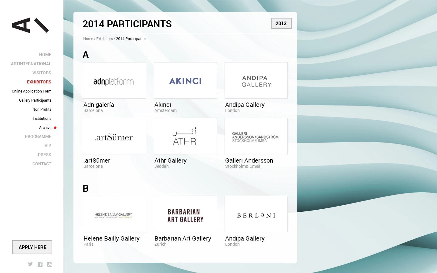
Exhibiting galleries
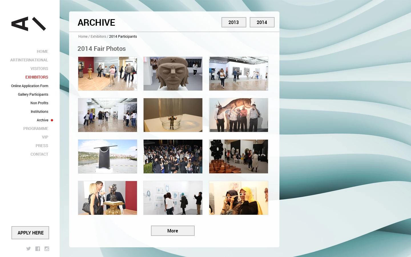
Fair photography
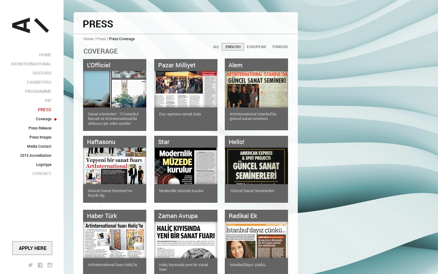
Press
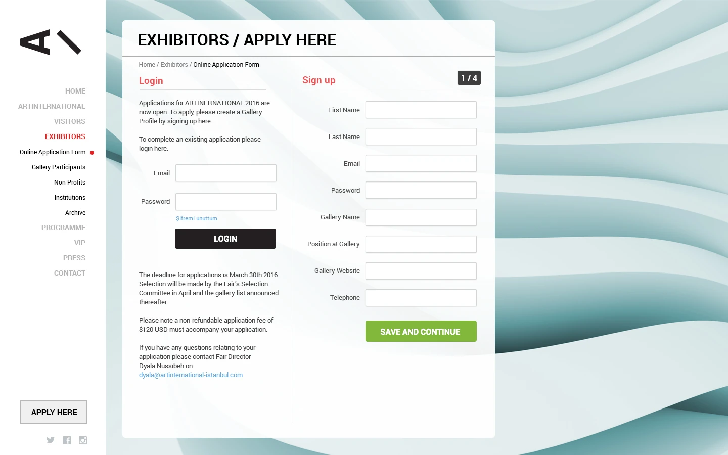
Exhibitor application
Collaboration.
Working with an international team.
The project came through Guns of Marketing. We met directly with the fair’s international representatives to review needs and content structure. Pars Design delivered information architecture, UX and web interface design; frontend, CMS and software development were outside our scope.
Outcome.
An experience that challenged the event website conventions of its time.
The website brought visitor information, the programme, galleries, past editions, photography, press and applications into one distinctive experience. Its independent interface identity expressed Art International’s artistic position online.