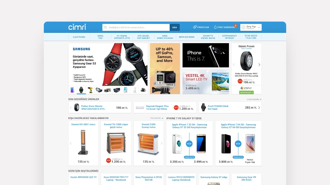
Cimri Mobil.
Making thousands of products and prices comparable on mobile.
We redesigned Cimri’s discovery and price comparison experience for mobile. Search, filters, seller prices and specifications became a clear flow supporting decisions on a small screen.
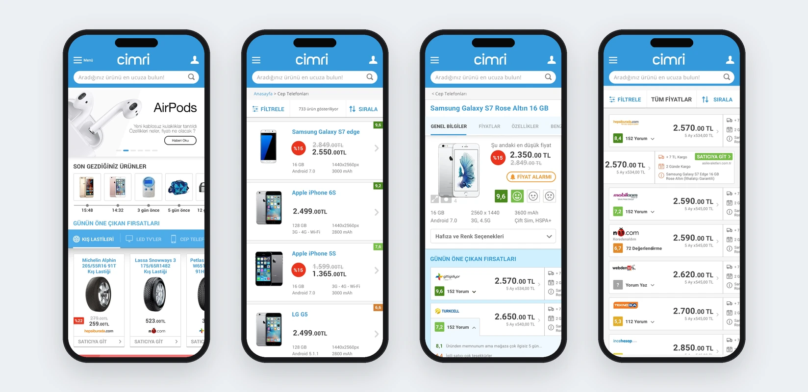
Home page, product listings, product details and seller prices
Need.
Price comparison involves many products, specifications, sellers and filters even on desktop. Moving that density unchanged to mobile risked extra steps and long blocks of information.
Cimri Mobil needed a consistent structure for finding products, narrowing results, assessing seller prices and comparing alternatives.
Design approach.
We reconsidered mobile scenarios from the ground up. Campaigns, recently viewed products and offers became accessible home-page blocks. Category navigation progressed without taking over the screen, while search with autocomplete became central to discovery.
Listings prioritised price, discounts and decision information. Brand and specification filters were divided into manageable mobile steps. Product details connected imagery, seller prices and features, while a dedicated comparison experience retained selected products and showed technical differences side by side.
We worked closely with Cimri’s marketing, sales and software teams. Our scope covered information architecture, user scenarios and mobile UX/UI; Cimri’s technical teams developed the product.
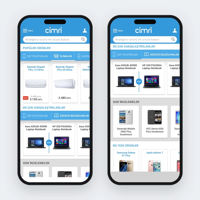
Popular products and comparisons
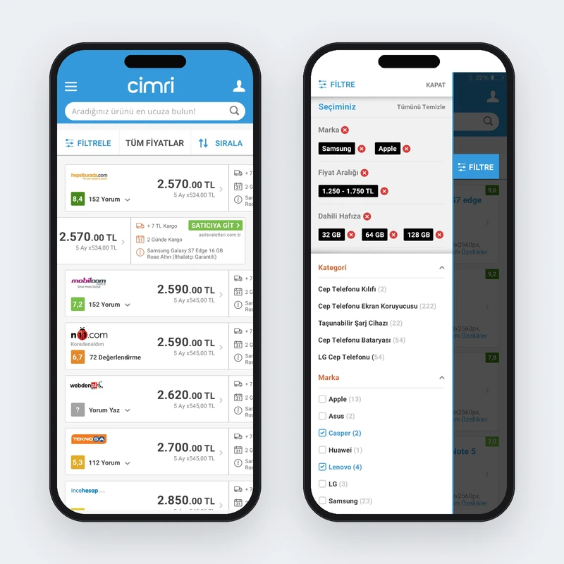
Seller prices and filtering
The work.
The mobile web experience turned extensive product and price data into a clearer decision journey. Search, categories, listings, filters, details, seller prices, specifications and comparisons shared one mobile system.
This was a separate second project within our long collaboration with Cimri. We reconsidered small-screen priorities, behaviours and decisions rather than making a simple responsive adaptation of the main website.