Cimri.
A comparison experience that helps people choose among thousands of products.
We comprehensively redesigned Cimri’s high-traffic website around discovery, filtering, price comparison and decisions. Information architecture and user scenarios simplified complex data into a comparison system that worked consistently across categories.
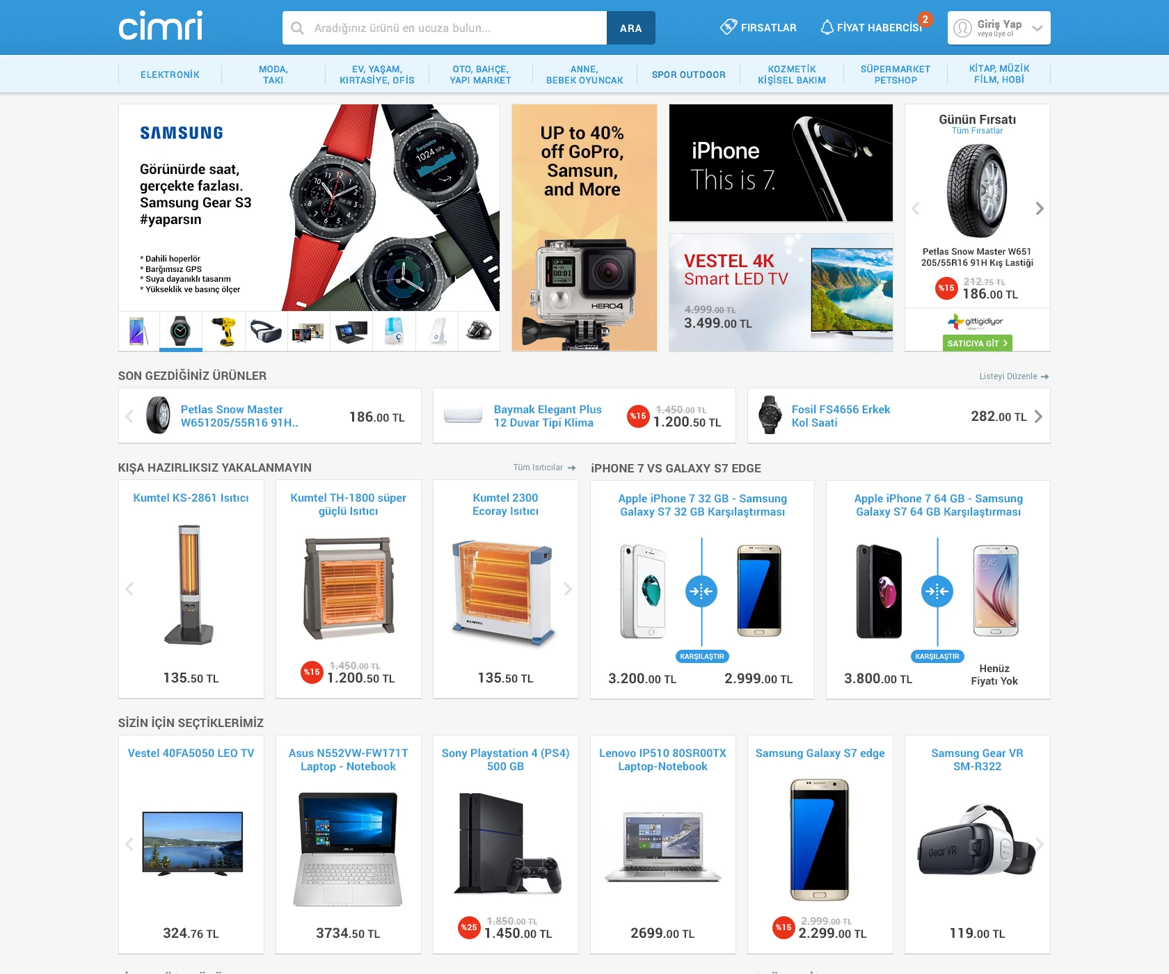
Ana sayfa
Need.
Cimri brought thousands of products, specifications and prices from different stores into one experience. When Pars Design joined, the interfaces struggled with that density and made discovery, filtering and comparison unnecessarily complex.
On a high-traffic platform, each decision mattered. Users needed to find products quickly, assess alternatives with the right information and compare prices easily.
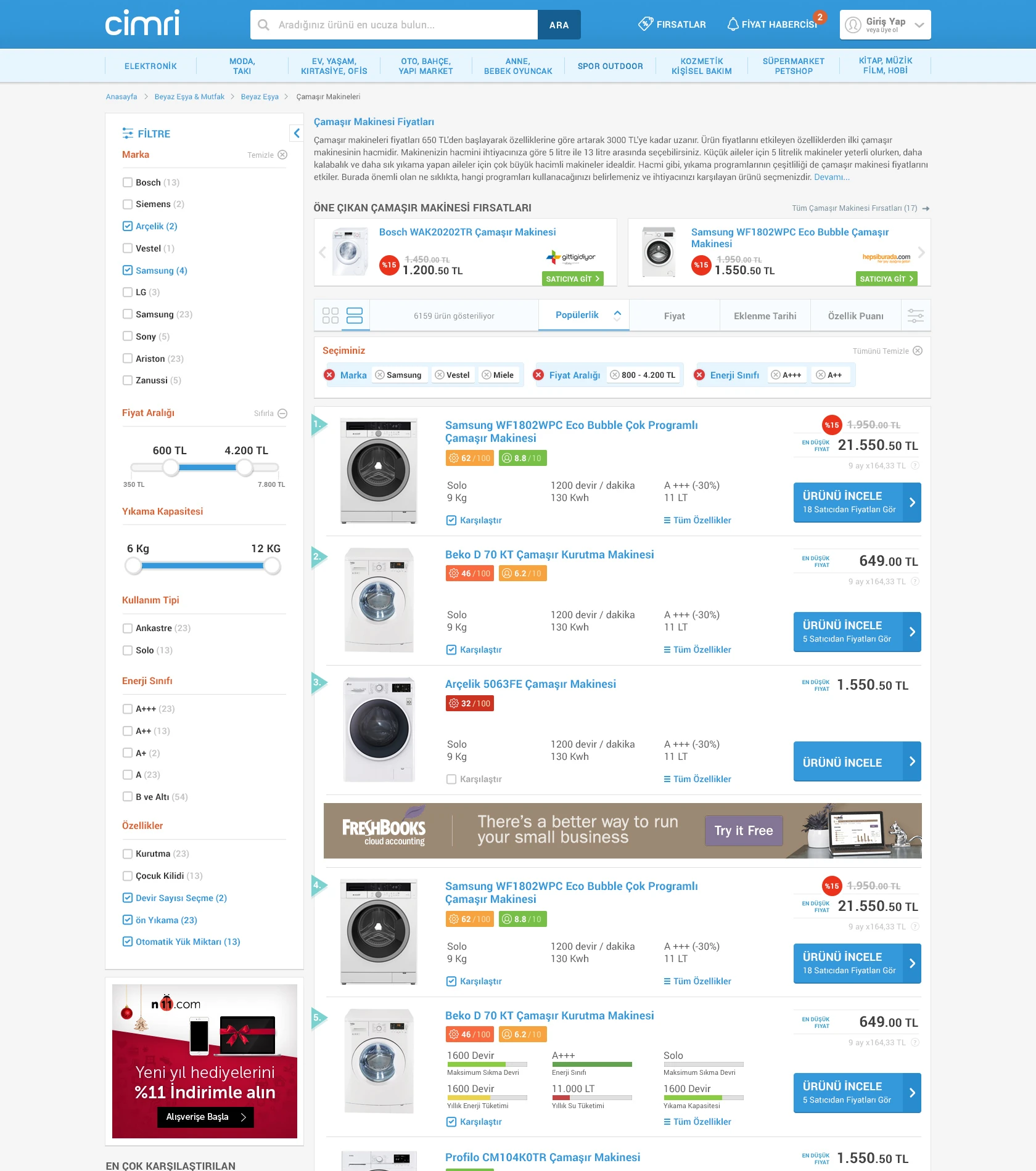
Product listing
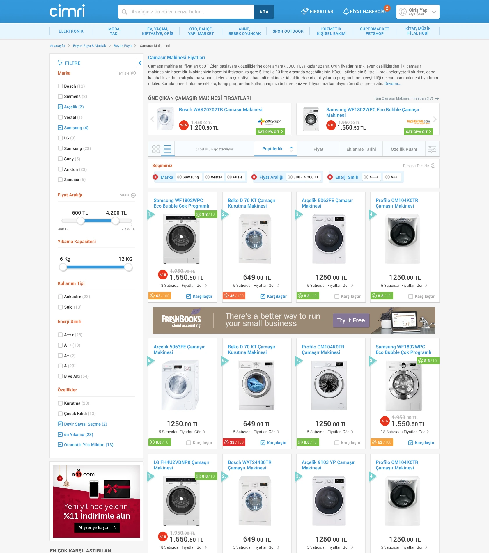
Grid view
Design approach.
We began with user scenarios and information architecture, simplifying the journey from home page to categories, filters, product details and comparison.
Shared behaviours stayed familiar across product categories. Specifications were grouped to support decisions, with seller prices, reviews and alternatives visible at the right moment. Selecting and comparing products side by side became part of the main experience.
We worked closely with Cimri’s marketing, sales and software teams, considering business goals, technical limits and user needs together to make practical decisions for a large web product.
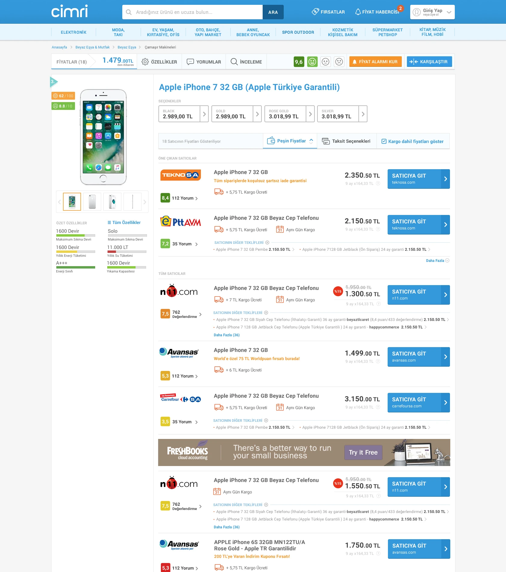
Product detail page
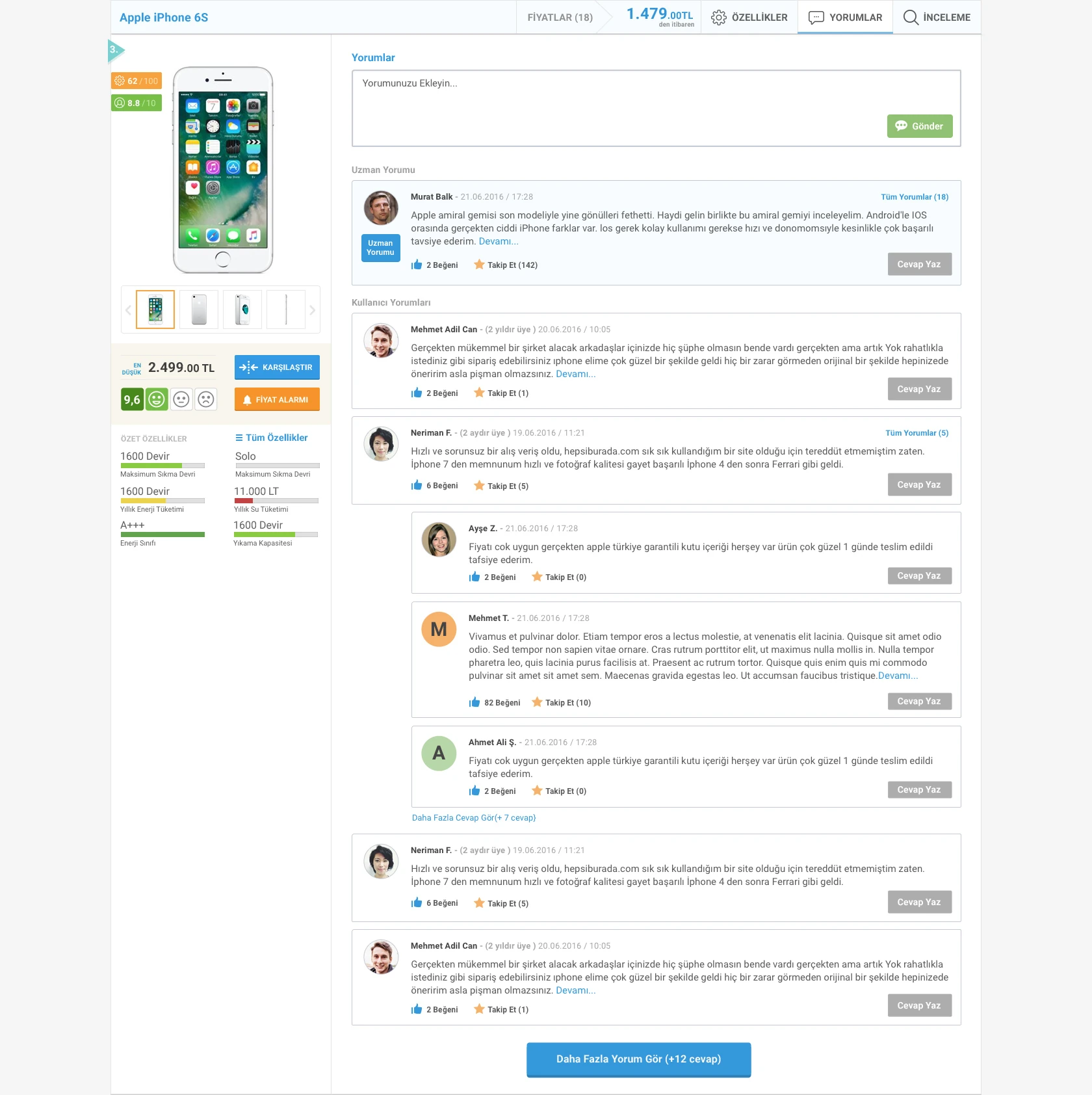
Product reviews
The work.
The result was a simpler comparison experience for a vast product and price dataset. Home page, listings, filters, details, reviews and comparisons were redesigned as one system.
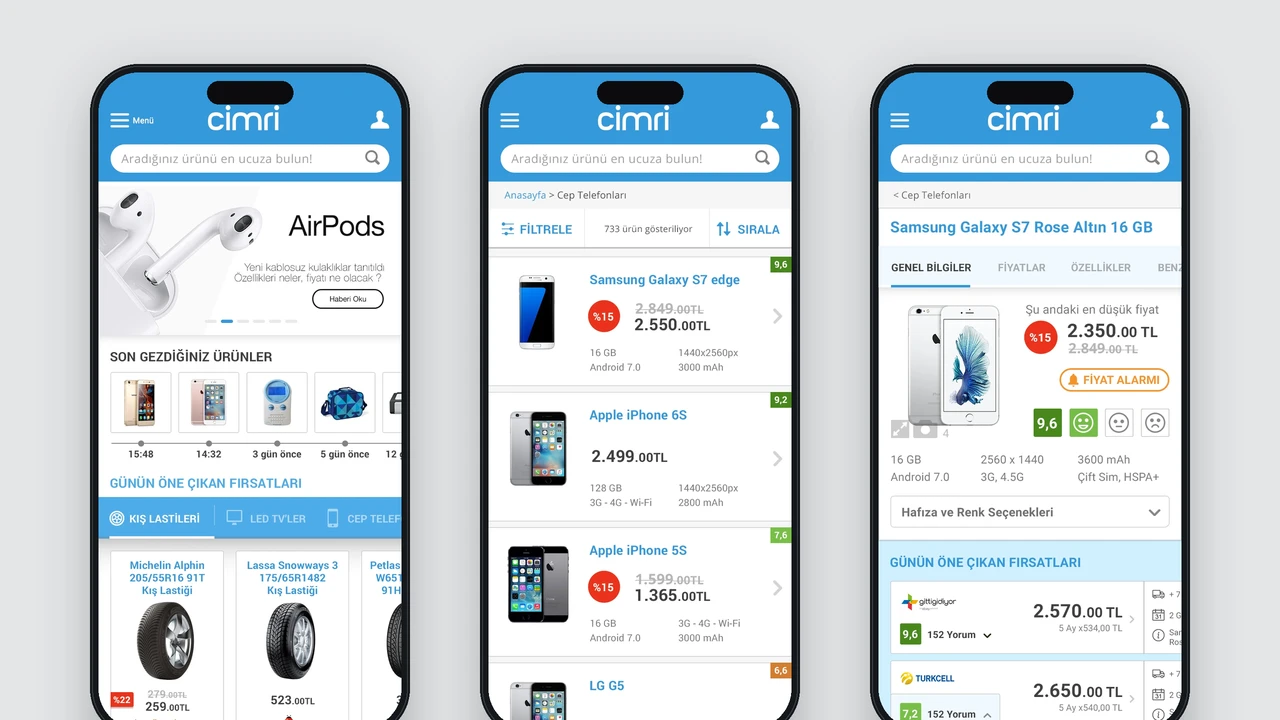
The design was used for a long period, and we created further interfaces as the collaboration continued. Mobile became a separate project extending this work.