Axess Kredi Kartı.
A new structure for Axess’s world of offers.
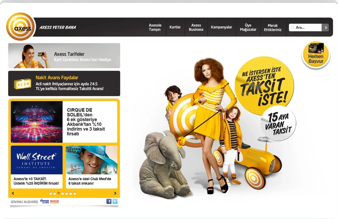
We redesigned the Axess website’s UX and interface. Cards, offers, participating stores and rates came together in a visual, adaptable structure that was progressive for its time.
Ana sayfa
Need.
Making extensive product and promotional content easier to discover.
Axess’s digital presence brought card types, offers, participating stores and financial product information into one place. This extensive content needed a clearer hierarchy so users could find information quickly.
The new experience needed to retain Axess’s energetic character, explain products clearly, make offers easy to explore and work consistently from desktop to mobile web.
Design approach.
We rebuilt the information architecture around users’ core needs: understanding cards, exploring offers, finding stores and comparing benefits. Visual cards, category filters, icons and clear actions made the content easier to scan.
A modular home page highlighted offers and core product groups. Cards such as Axess Business and Carrefour Axess were explained in their own contexts, while a shared design system kept the family consistent.
Offer listings and detail pages became the centre of discovery. Store search combined alphabetical selection with sector categories, while a visual comparison structure placed rate options side by side.
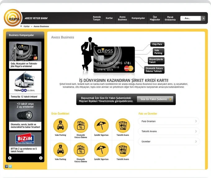
Axess Business
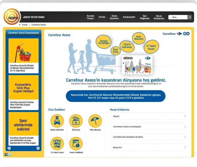
Carrefour Axess
Mobile website.
Reprioritising desktop content for smaller screens.
We designed the mobile website throughout. Offer lists, card introductions and detail pages were reorganised around small-screen use rather than simply reduced in size.
This work is a responsive website, not a mobile app. Desktop and mobile views are adaptations of the same Axess site.
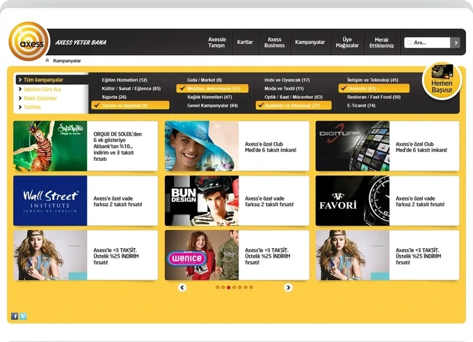
Kampanyalar
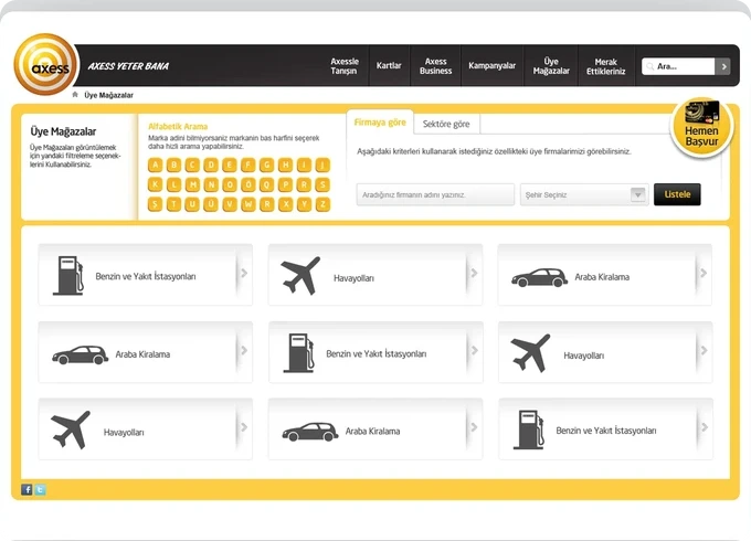
Participating stores
Outcome.
The resulting experience made Axess’s extensive products and offers clearer while retaining its brand character. Although the design reflects its period, content cards, category-led discovery, modular pages and mobile adaptations represented a progressive approach in 2011.