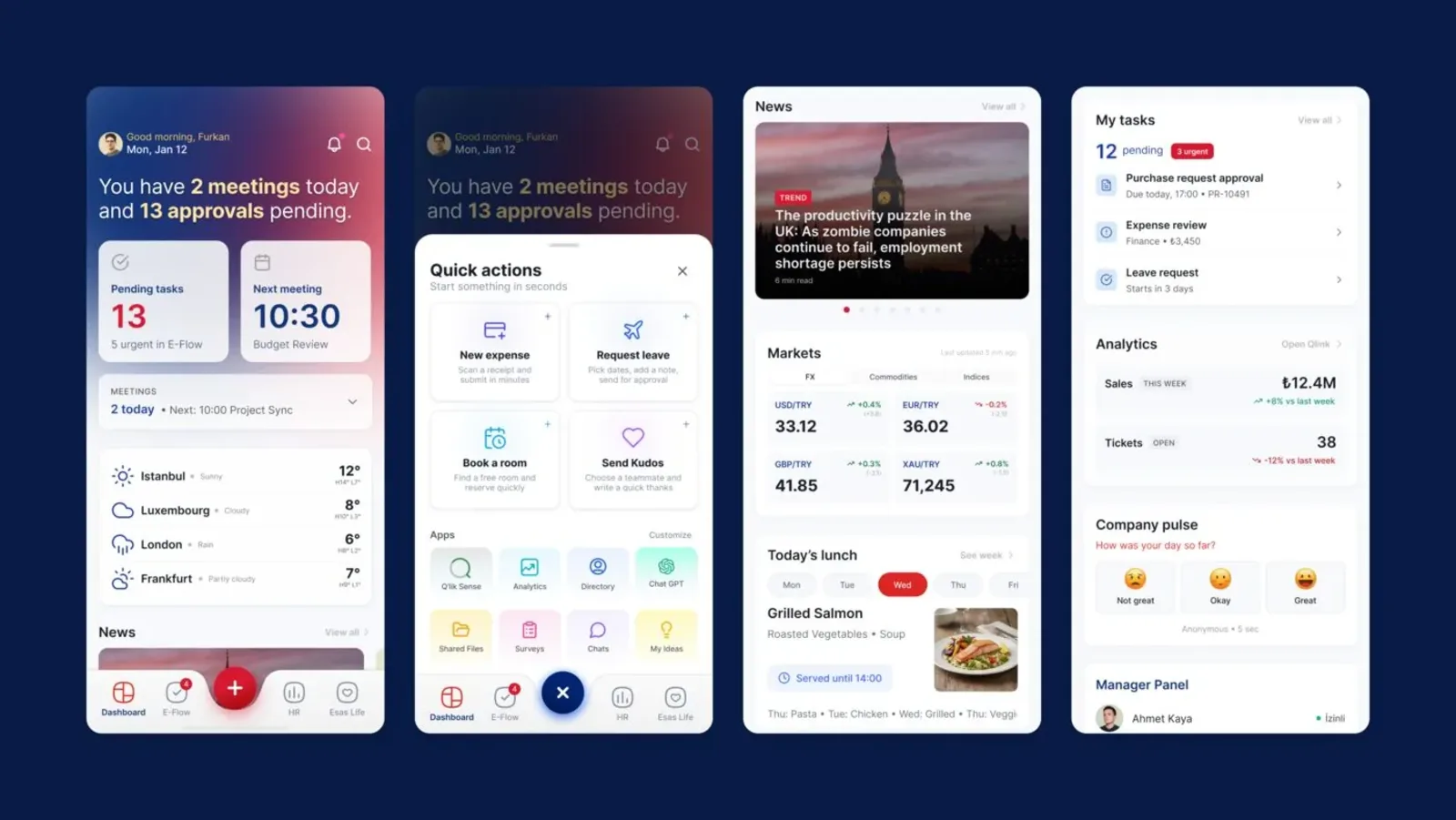
Esas Holding’s employee app brings meetings, approvals, HR tasks and workplace social life into one mobile experience. This article explains the decisions behind bringing five different modules into one navigation system.
Where we joined the project #
When we joined, backend work was complete but frontend development had not begun. That defined our task: the functions worked, but how to present them to users was still undecided.
We established the structure before drawing screens. We decided where information would live, how functions would be grouped and how users would move between tasks. Our scope covered information architecture, user flows and interface design.
The home screen: a daily summary, not a module list #
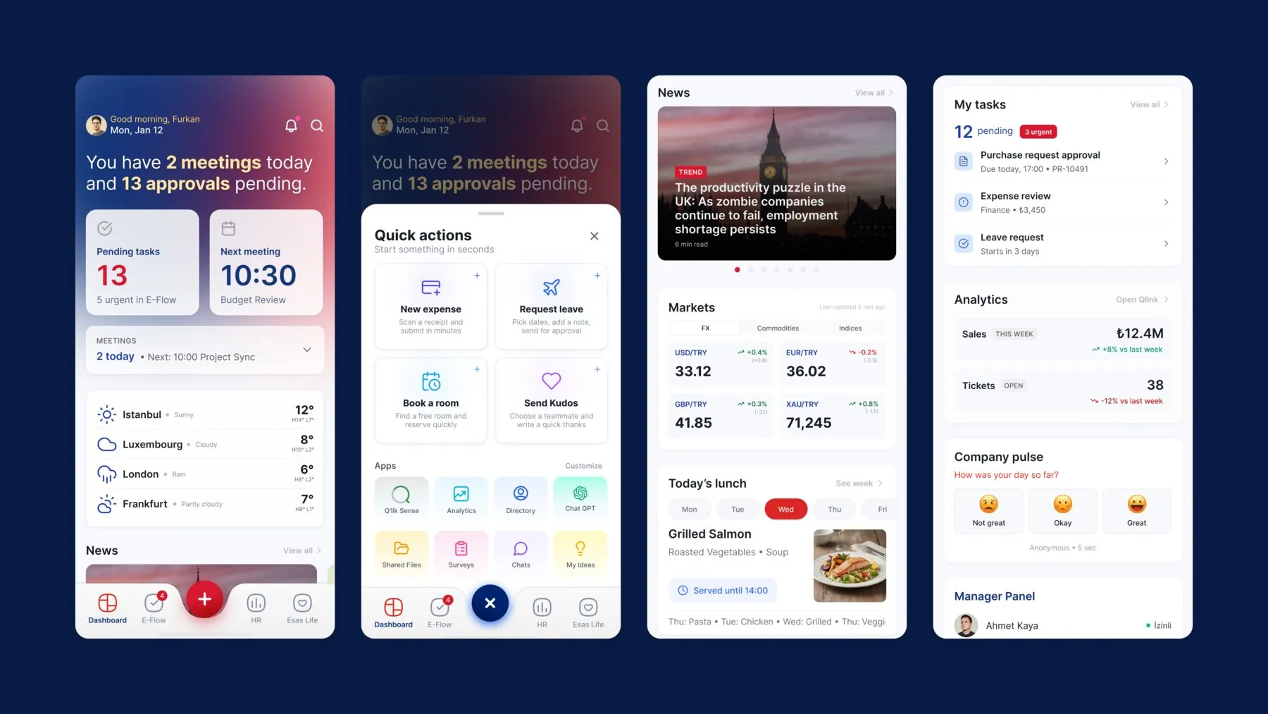
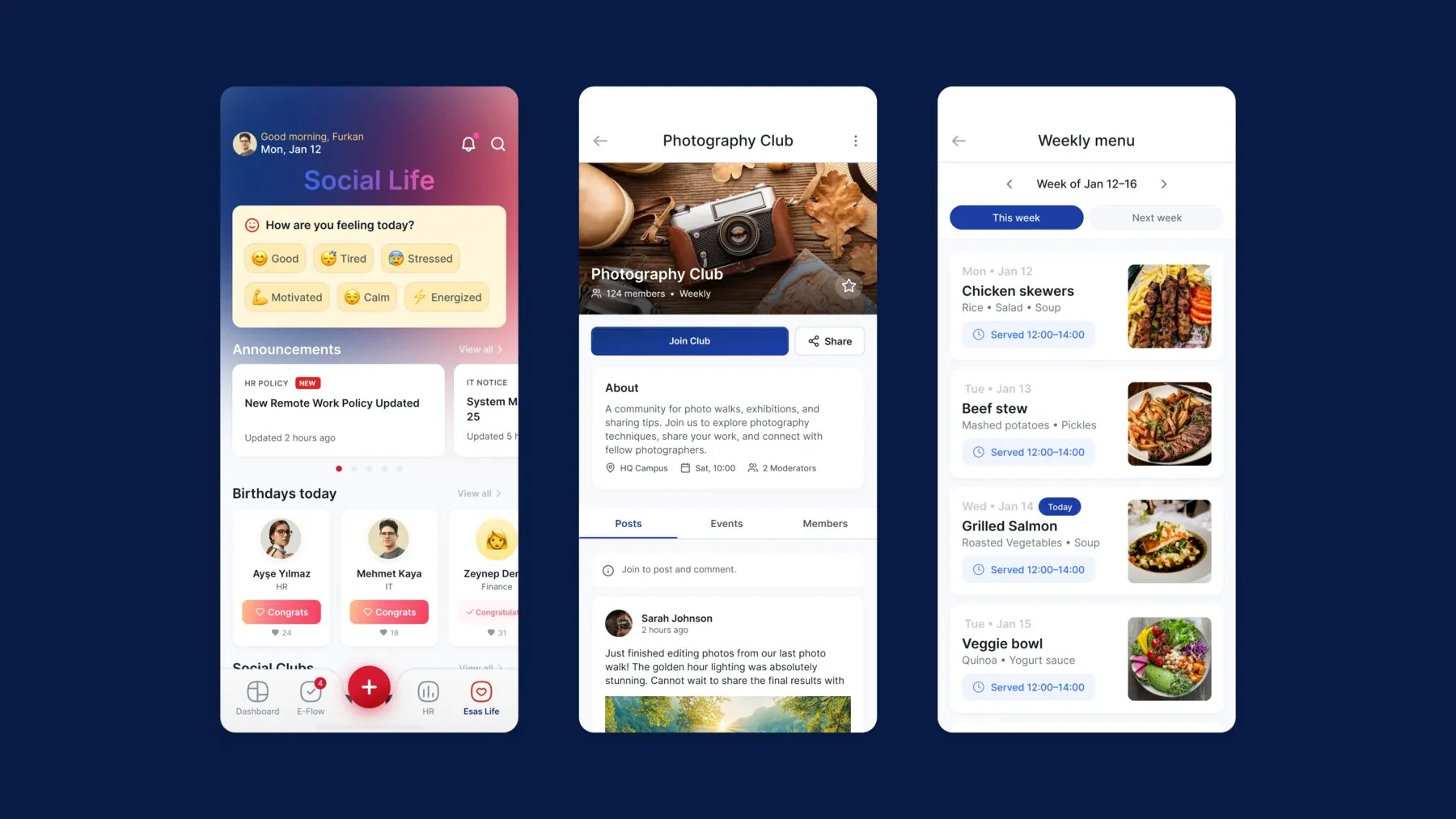
Our first decision concerned the home screen. An icon grid of modules is the easy option, but it makes users decide which module to open every time. Instead, the home screen summarises the day: meetings, pending approvals and daily information in one place.
Quick actions followed from that decision. Frequent tasks can be started from the home screen without opening a module. Modules sit one level below, available when users need more detail.
Five modules, shared patterns #
The app’s modules serve different purposes:
- Meetings: the day’s meetings and follow-up.
- E-Flow: task screens bringing together work, approval steps and related documents.
- Human resources: leave requests and personal information.
- Esas Life: clubs, daily menus and workplace social life.
- Management screens: dashboards for financial and organisational indicators.
The way to accommodate this variety was not to invent an interface language for every module, but to identify shared patterns. We established consistent navigation across modules, so a way of working learnt in one applies to the others.
Why navigation comes first #
Information architecture and user flows were at the heart of the work. We planned the daily summary, quick actions and relationships between modules together. From meeting follow-up and approvals to leave requests and company news, the whole app shares one consistent navigation structure.
There is a reason for that order. In a multi-module internal app, the problem is rarely a single screen; it is the transitions between screens. Without an agreed navigation structure, each new module brings its own logic, and the app gradually becomes a collection of disconnected tools. We explore this more broadly in how good UX affects internal operations.
Today #
Esas App is in use today. We continue to support new needs and additions, fitting new functions into the established navigation structure.
Building a similar structure from scratch or within an existing product is part of our UI/UX design service.
Sources #
- Esas App project page; screens and scope