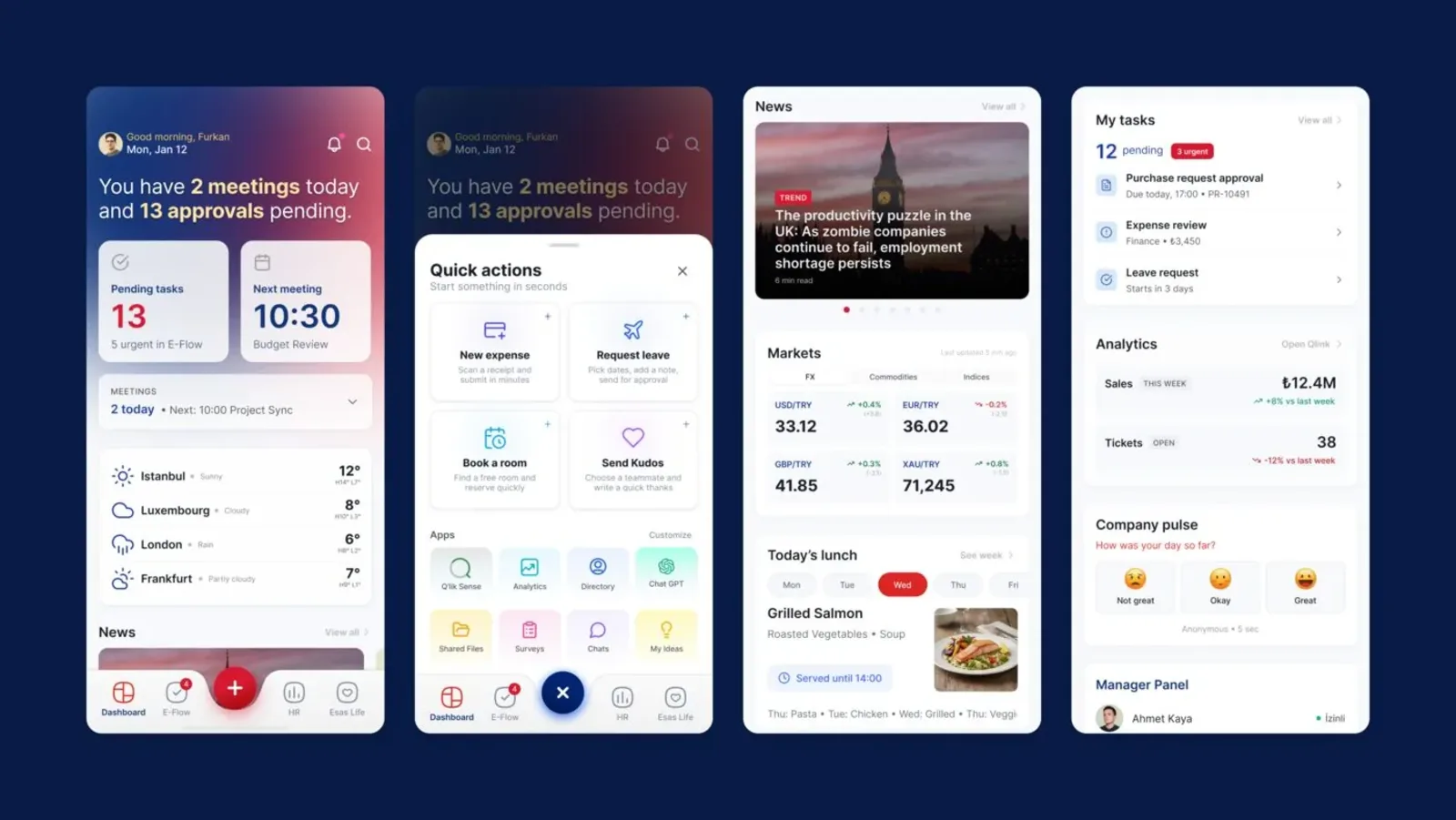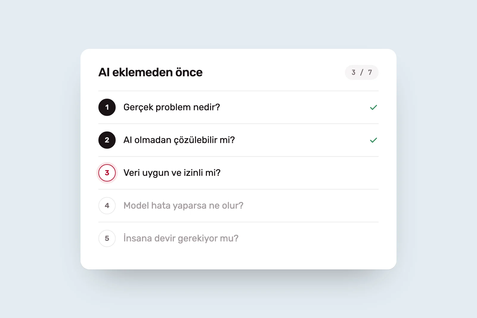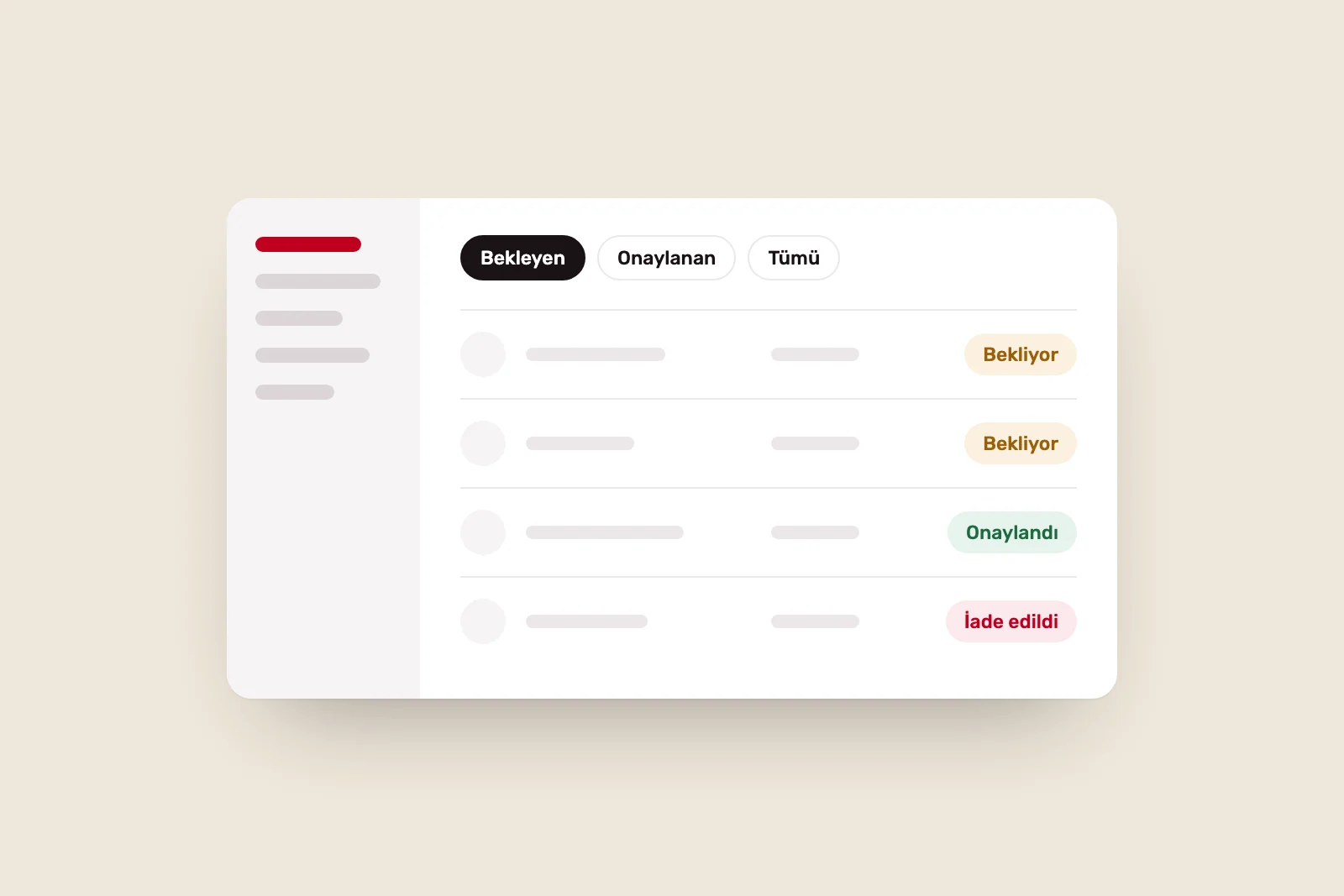
In consumer products, a poor experience has a clear consequence: users delete the app. Internal software offers no such exit. Employees open the same screen and take the same extra step every day, eventually creating their own workaround: an Excel file, a notebook or a message to a colleague.
That is why internal software design should be evaluated through the flow of work, not satisfaction alone. These eight areas show where design decisions affect operations.
1. Breaking complex tasks into steps #
Business software is complex not because of the number of screens, but because roles, permissions, data and exceptions meet in one system. Putting a long process on one screen asks users to consider everything at once.
Dividing a task into steps, asking for one decision at each stage and showing progress can help reduce errors and abandoned work. Follow the real sequence of the job, not the database structure. For simple, frequent tasks, do the opposite: provide shortcuts rather than more steps.
2. Time spent finding information #
Part of an employee’s day is spent not doing the job, but finding what they need to do it: a record’s status, the latest document or someone’s contact details.
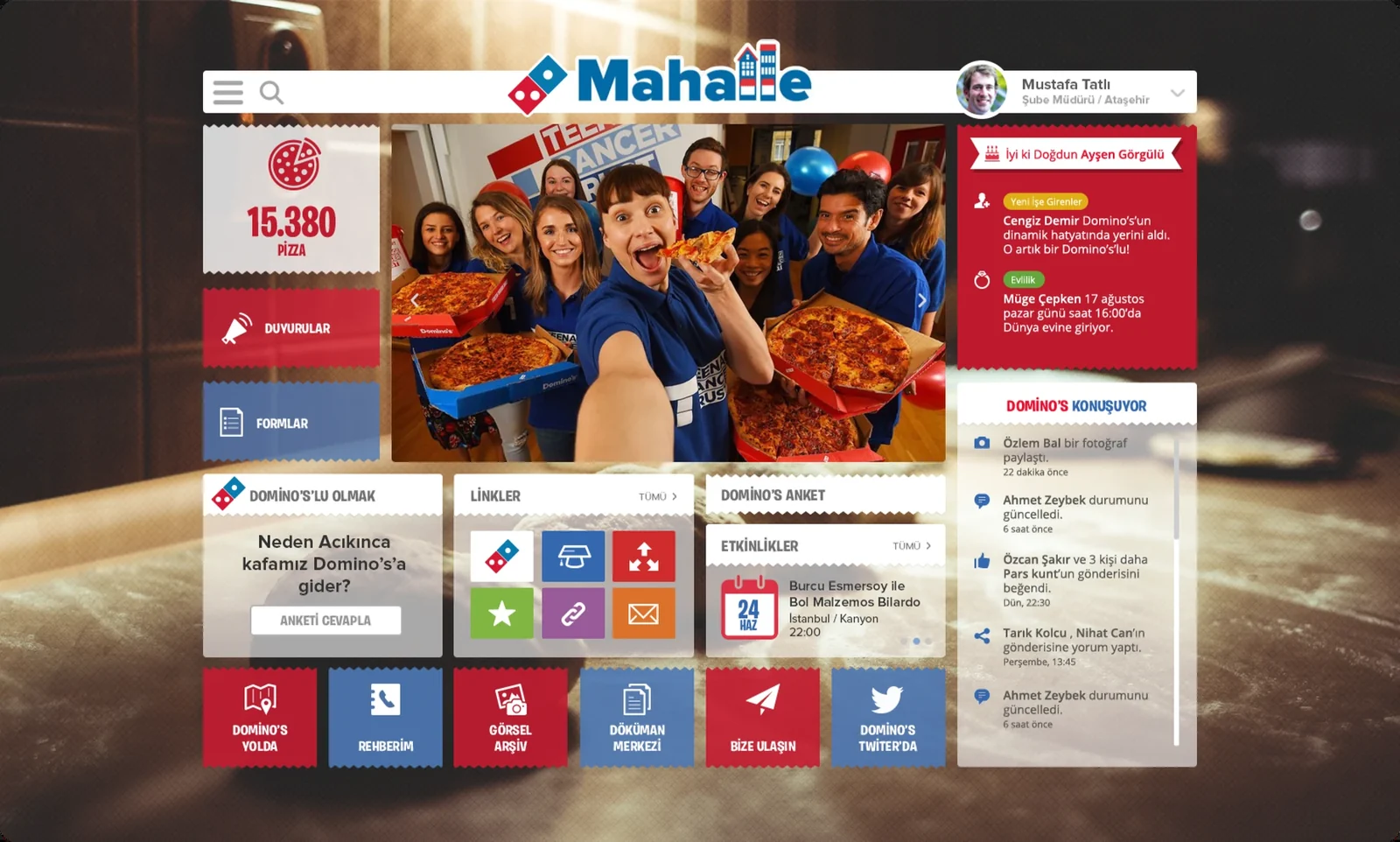
Navigation built around employees’ daily tasks rather than the organisation chart shapes that time. In the Mahalle intranet we designed for Domino’s, we first analysed the extensive content and functions, grouped them by related needs, and built navigation around employees’ tasks and decision points.
3. Search and filtering #
As data grows, menus alone are not enough. Users rely on search and filters. Good search tolerates typos, groups results by type and remembers recent searches. Good filters keep active criteria visible, clear in one action and allow common combinations to be saved.
If users rebuild the same filter every morning or export a list to filter it elsewhere, they are manually filling a gap in the software.
4. Role-specific needs #
Field employees, head-office specialists and managers open the same system for different reasons. Showing everyone the same screen makes each person work through information they do not need.
For Türk Kızılay’s QRed platform, we began by separating existing functions, user roles and connected operations, then reorganised modules around task-led information architecture. The aim was to let different users reach their own tasks directly. Roles are not only about permissions; what each role sees on opening the app is also a design decision.
5. Error prevention #
An error in internal software can mean an incorrect record, payment or shipment, often taking someone else’s time to fix. Make mistakes harder to commit rather than simply reporting them afterwards.
- Prevent invalid input through field formats and selection lists.
- For high-impact actions, show how many records will be affected and ask for confirmation.
- Offer undo wherever possible.
- Explain what went wrong and how to fix it.
6. Data-heavy screens #
Tables, indicators and reports are natural parts of business software. The issue is not the volume of data but unclear priorities. Identify the decision users come to the screen to make, arrange data around it and reveal detail when needed.
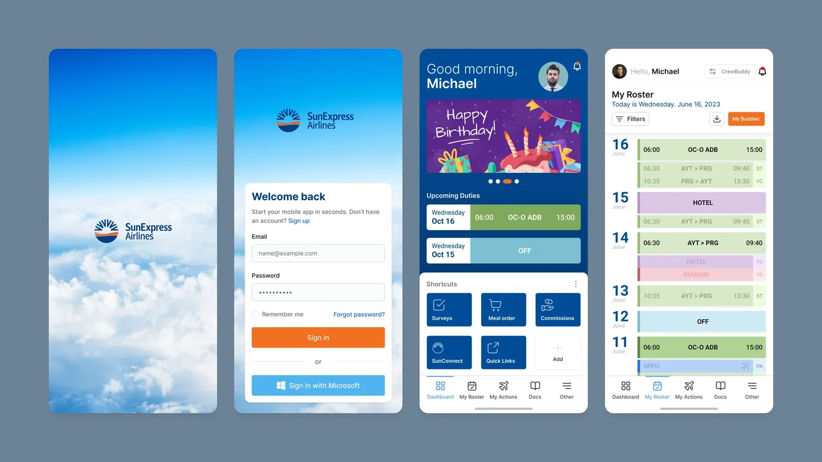
This matters even more on mobile. In Crew Connect, designed for SunExpress flight crews, we prioritised duty and flight information on the personal home screen and linked to details in related screens, creating a readable mobile structure. We discuss tables, progressive disclosure and state design further in data-heavy interfaces.
7. Reducing training needs #
If software requires lengthy training and a thick manual, some of the work the design should do has been passed to the user. Consistent patterns, clear labels and brief explanations in context bring learning into the product.
Consistency matters here. If a way of working learnt in one module applies in another, users can explore new modules independently. In our article on Esas App, we explain how we brought different modules into one navigation structure.
8. How design decisions shape operations #
The order of fields on an approval screen affects how quickly approval is given. A list’s default sort determines which work is handled first. A notification’s recipient changes where work waits. These may look like interface details, but each is a business rule.
Design, development and operational decisions therefore cannot be made separately. The person designing the screen needs to understand the work, and the person doing the work needs to understand what the screen enables.
How to measure impact #
We have deliberately avoided claims such as “this much faster”. A number like that means something only if the original situation was measured. Before redesign, establish baselines for a few critical tasks: completion time, errors and corrections, support requests, and workarounds outside the software.
Repeat those measurements after release, and improvement becomes evidence rather than a claim. For products without measurement, this is often the first step. Our SaaS and business software service considers internal software together with UX, technical architecture and development. To understand where a live product is causing difficulty, a Digital Experience Audit is a useful starting point.