Salt Commerce Logo Design.
A simple brand mark for complex multichannel commerce.
We designed a simple, contemporary logo for Salt Commerce that expresses its e-commerce technology focus. A clear visual signature retains its identity across screens, software interfaces and promotional materials.

Logo
Brand context.
Salt Commerce was developed to bring sales from websites, social media and marketplaces into one operation. It connects inventory and warehousing, order picking, indexing for product discovery and returns management within the same system.
Rather than describe every feature, the identity needed to convey a reliable, organised and scalable software brand.
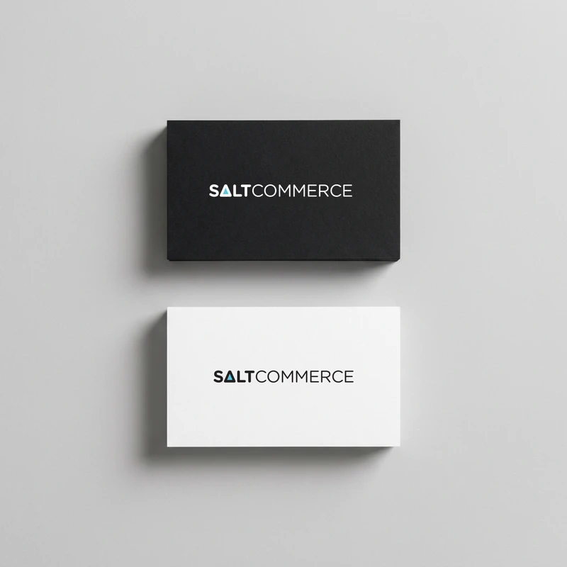
Business card
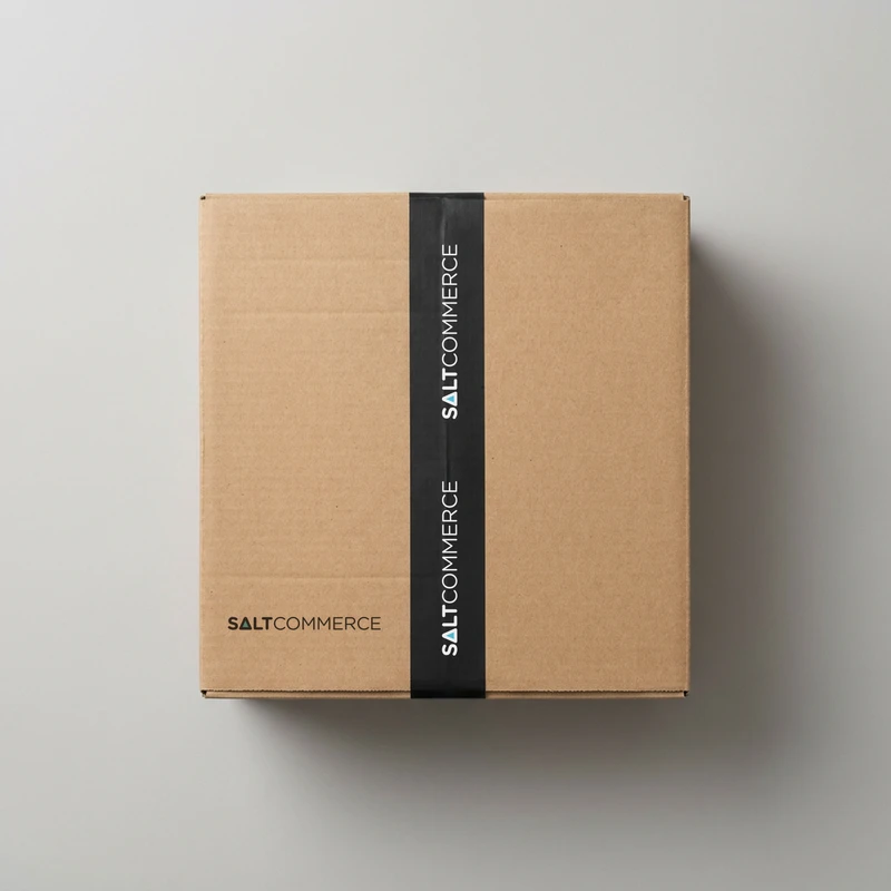
Kargo kutusu
Design approach.
We developed the logo with a digital-first approach. A simple form and readable wordmark remain clear from small interface spaces to large promotional applications.
A triangular detail adds a small visual twist within the simple form. Its geometry gives the logo direction, movement and a technical rhythm, remaining distinctive at different sizes.
We conceived the identity as a recognisable visual framework that would not compete with dense product screens. Patterned and coloured applications demonstrate how the logo retains its character in different digital contexts.
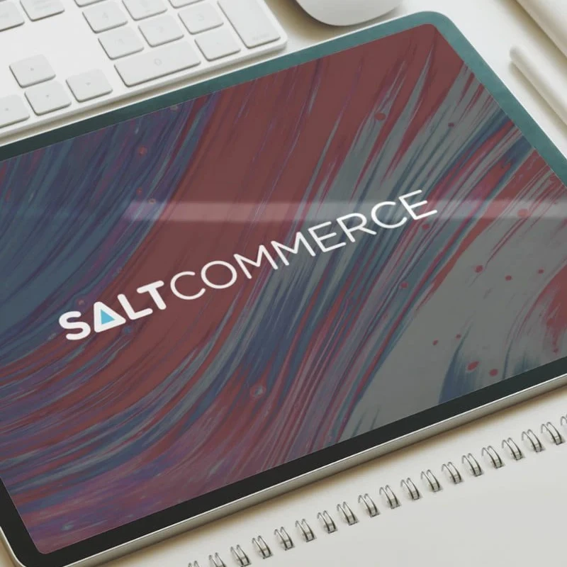
Logo on a tablet screen
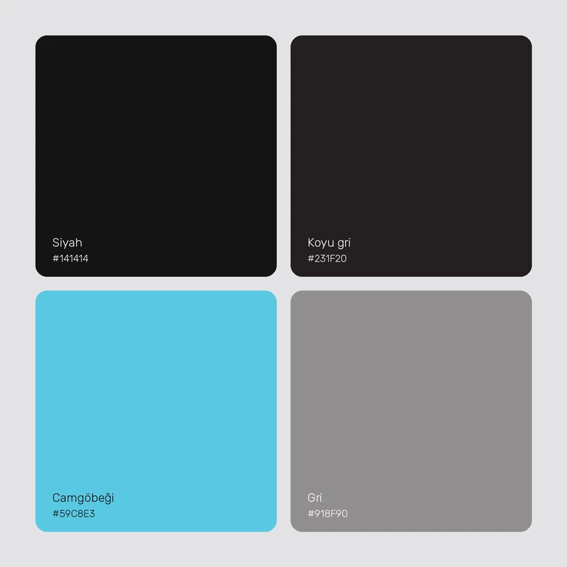
Renkler
The work.
The flexible logo expresses Salt Commerce’s multichannel software through a simple technical language. It gives an extensive product a recognisable presence across media.