RGLABS Logo and Visual Identity Design.
A simple, lively identity for a technology company.
RGLABS developed digital products and software. We designed an identity that expresses technical capability without feeling distant or complex, with a strong digital presence and consistency across applications.

Logo
Need.
A software identity depends not only on looking technical but on adapting to different products and touchpoints. RGLABS needed a flexible system that felt clear, current and credible while remaining distinct on screen.
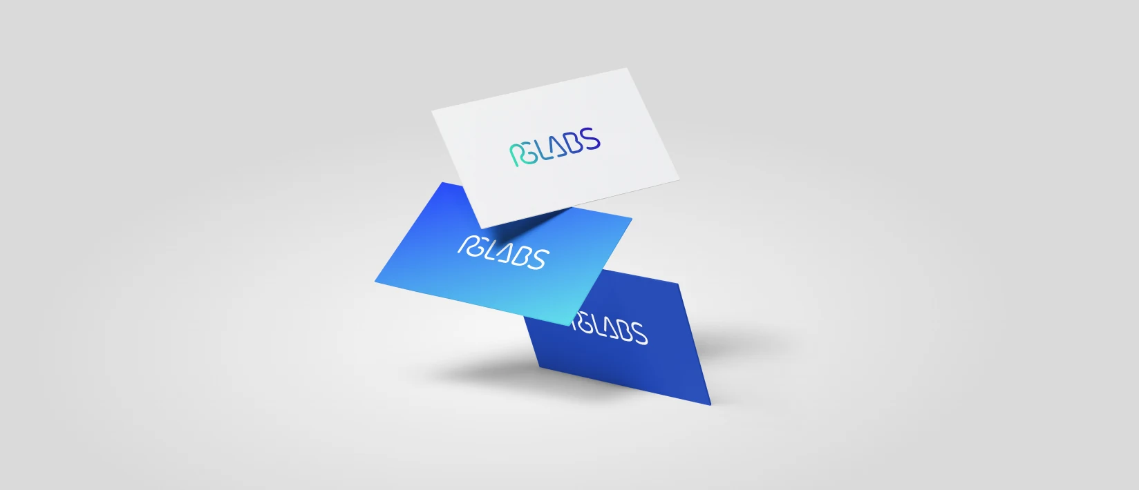
Business card
Design approach.
The logo turns RGLABS into a compact, flowing wordmark. Closely connected letters suggest the cohesion of software development, while simple geometry expresses its technical character.
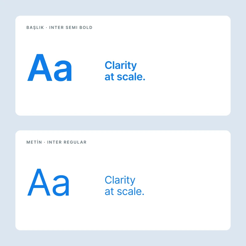
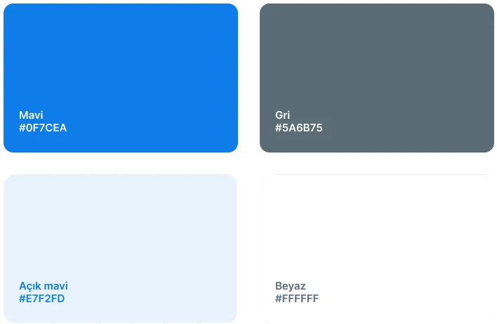
We extended the identity beyond one colour with light blue, turquoise, purple and pink. The palette adds energy and approachability while preserving credibility. Inter provides a readable, scalable typographic foundation for digital interfaces.
Kupa
Tablet
From digital to physical applications.
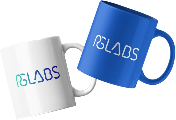
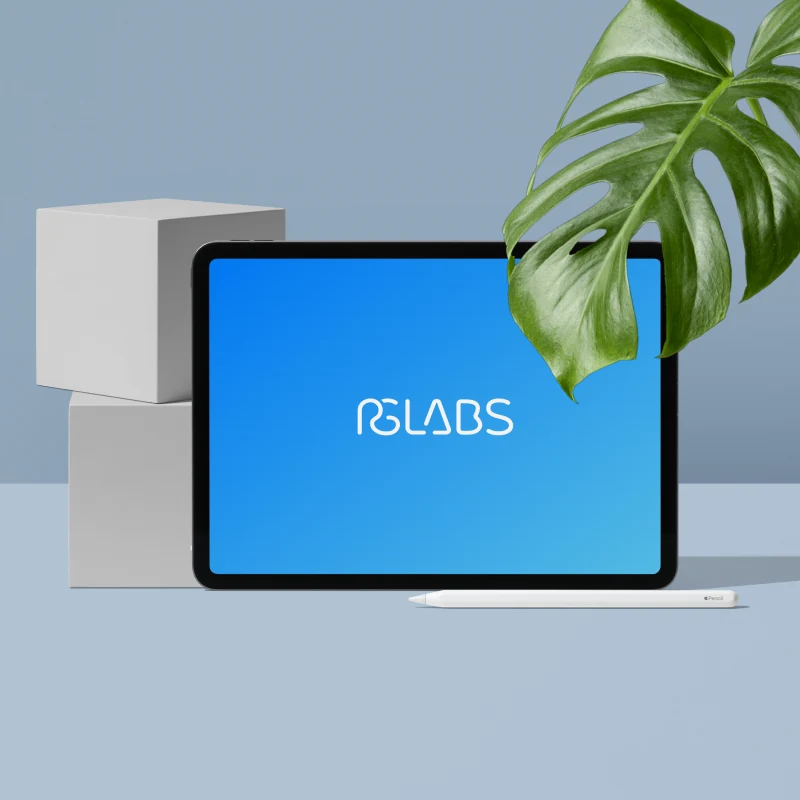
We demonstrated the identity in real applications, not only a logo presentation. Business cards, mugs and tablet screens define how the mark behaves across surfaces through colour, spacing and contrast.
The result is a simple, flexible system that can provide a shared signature across RGLABS’s digital products.
Typography
Renkler
Outcome.
The identity retains the seriousness of technology without becoming cold or uniform. Clear typography, vivid colours and adaptable applications give RGLABS a contemporary, capable, digital-focused appearance.