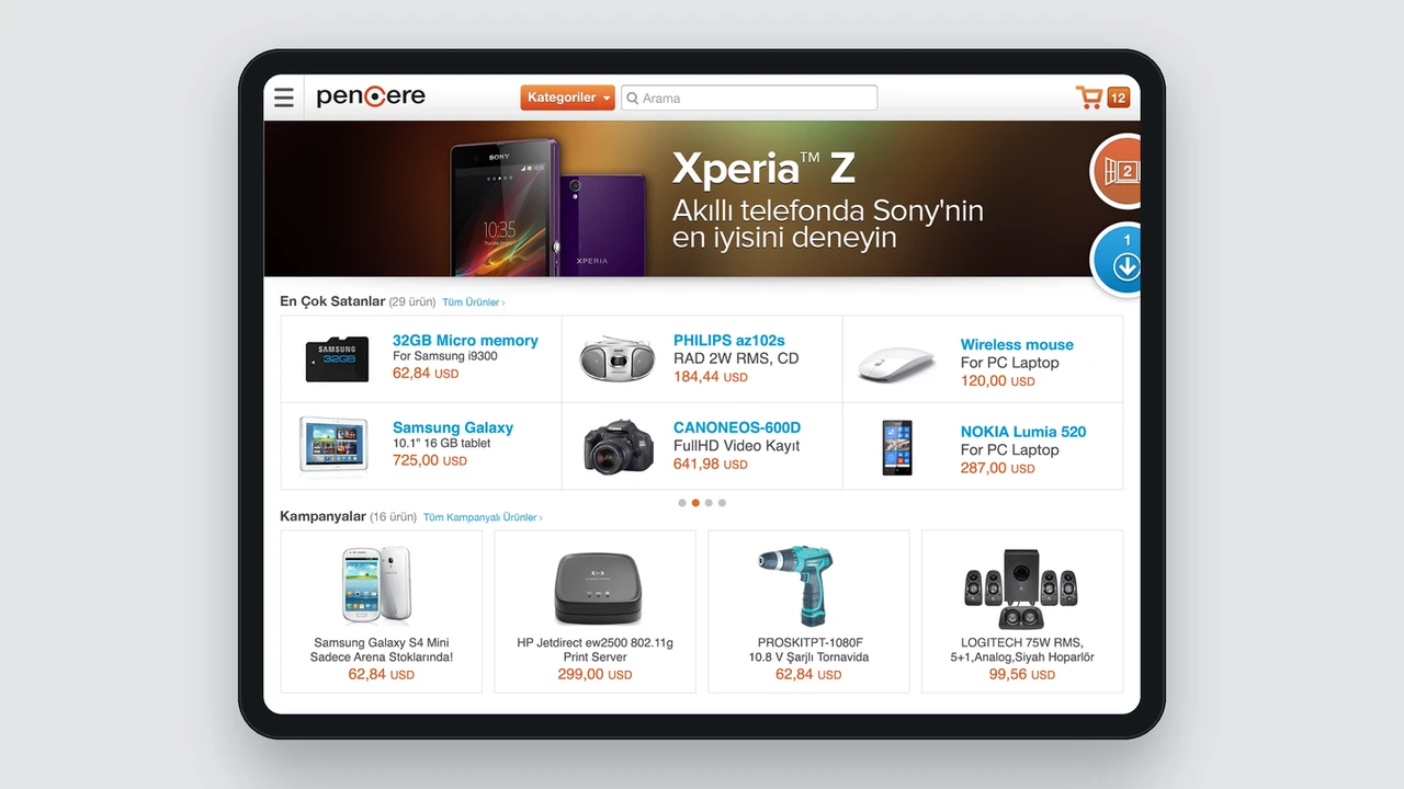
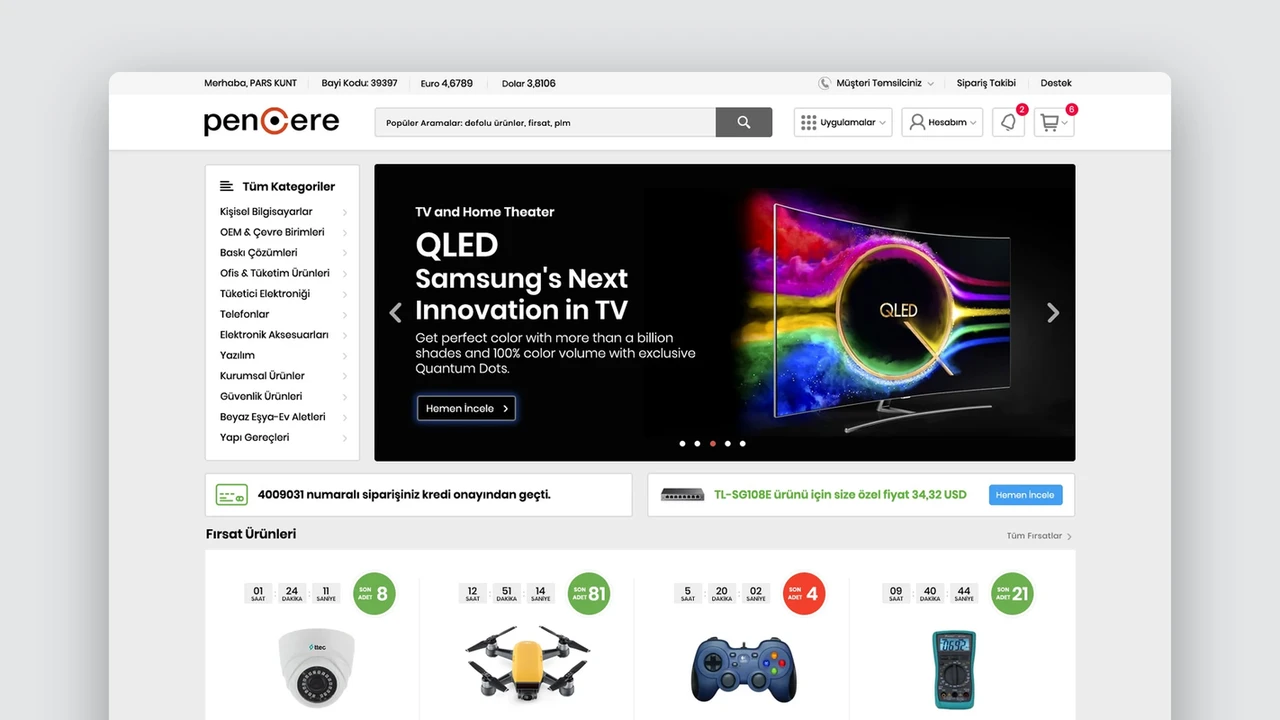
Pencere Mobil.
Accessing thousands of technology products and orders from anywhere.
We designed Pencere’s mobile experience for products, stock, prices, baskets, payments and notifications. Rather than shrink the desktop platform, we reprioritised its extensive commerce functions for users on the move.
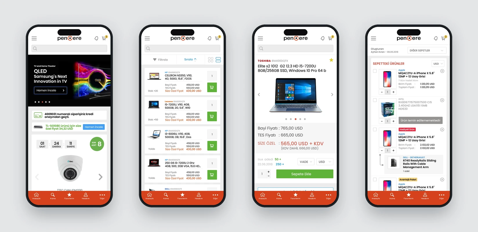
Home, product list, product details and basket
Need.
For Pencere’s B2B users, product information goes beyond catalogue content. Current prices and stock, specifications, order terms and payment options are part of daily work. Users needed quick access away from their desks and the ability to complete orders when required.
The app needed to present thousands of products without losing users on a small screen, simplifying listings, details, baskets and payments while preserving commercial information.
Design approach.
Scrollable, scannable blocks organise campaigns and product showcases on the home screen. Listings prioritise price and stock, with an alternative image-led view for more visual browsing.
Product details sequence imagery, price, stock and specifications around decisions. Basket, delivery and payment become clear consecutive steps, allowing users to review and complete orders on a small screen.
The support area combines categories and frequently asked questions. Coloured status labels distinguish campaign, order and transaction notifications. The visual language shared with web and iPad is adapted for mobile use.
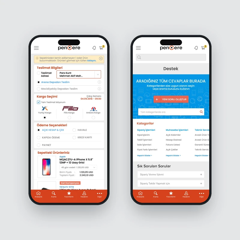
Payment and support
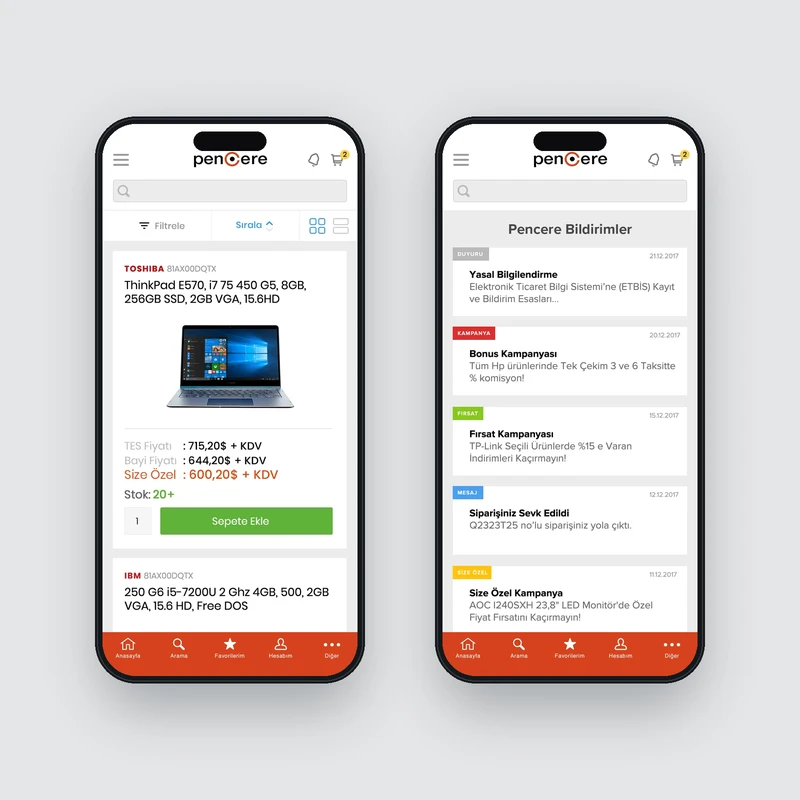
Large-image listing and notifications
The work.
The complete mobile app brings Pencere’s extensive B2B commerce experience to users on the move. Discovery, payment and support follow the same product language.
The mobile design was an important cross-device part of our roughly ten-year collaboration with Arena, which included three major Pencere redesigns.