Organicera E-commerce.
A warm, simple shopping experience for organic baby products.
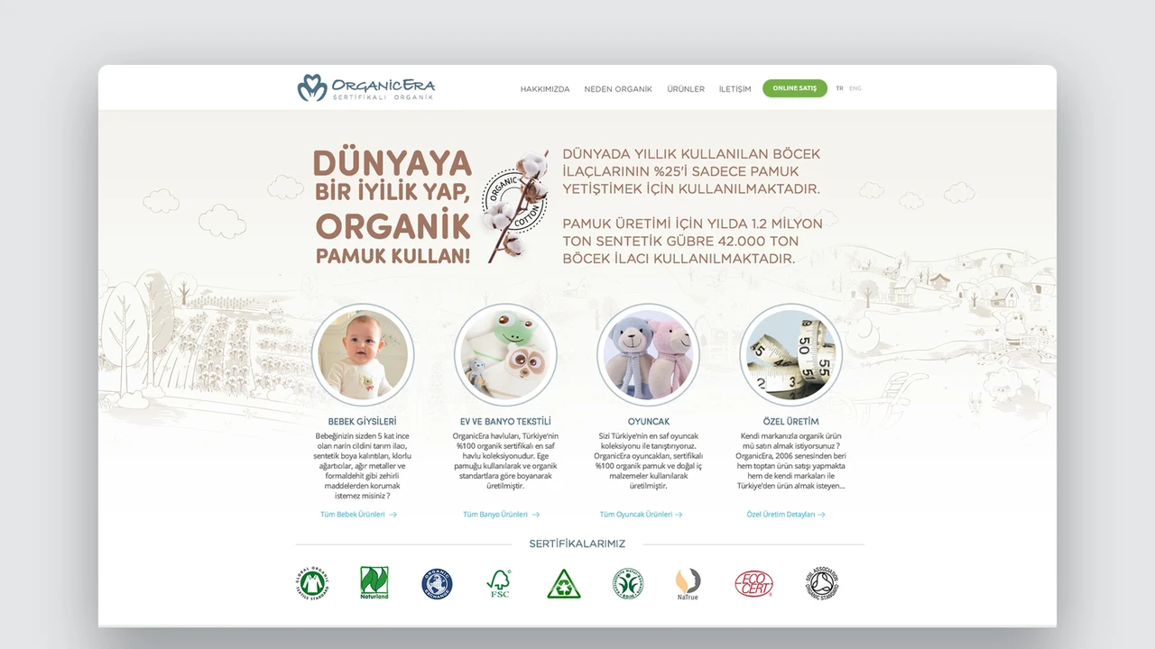
We designed Organicera’s direct-to-consumer e-commerce UX/UI from discovery to product details and purchasing. A visual language reflecting the products’ natural character balances campaign and commerce needs.
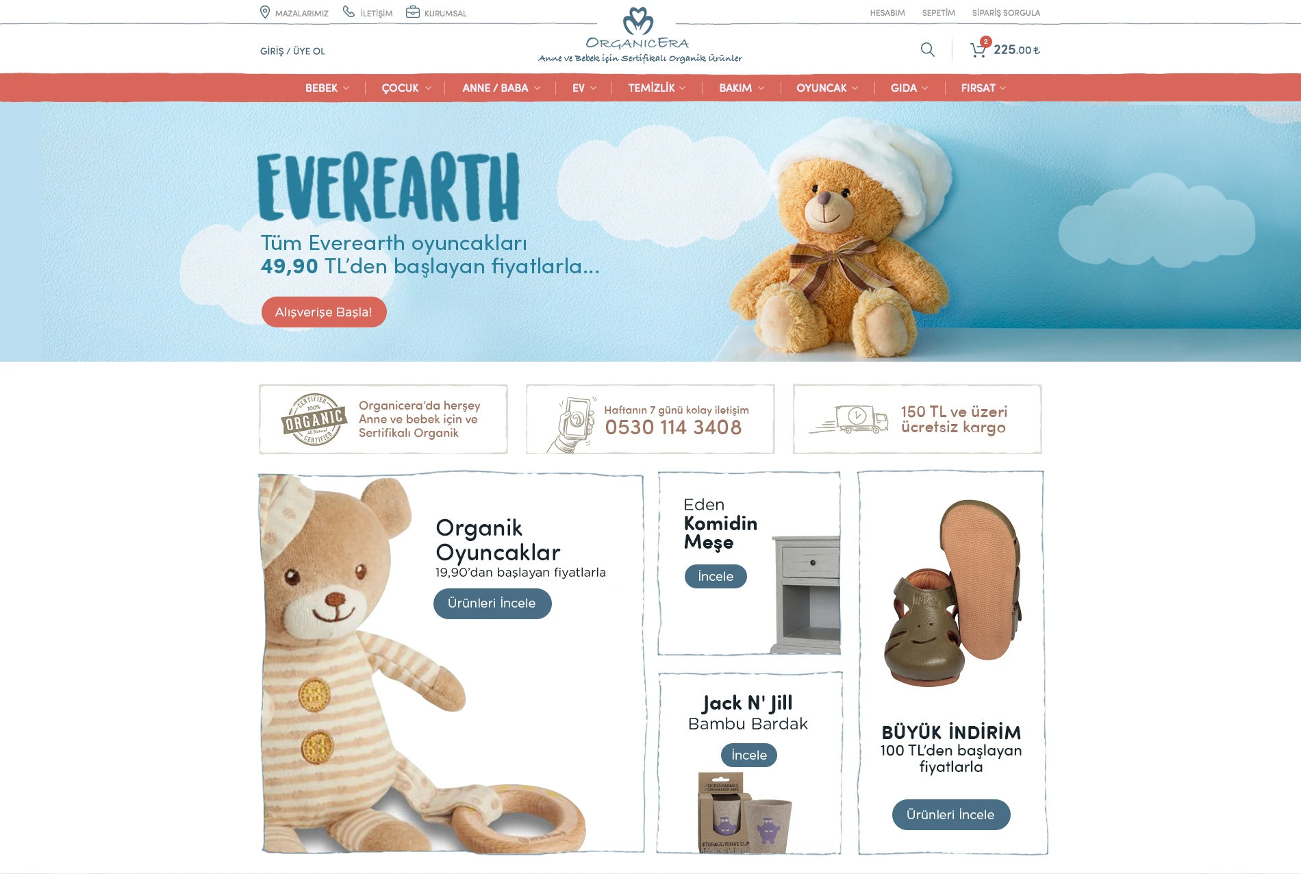
Ana sayfa
Need.
The site needed to do more than list organic baby products. It had to carry the brand’s reassuring approach throughout shopping. New products, bestsellers, campaigns and content should be easy to discover, with product details clearly supporting purchase decisions.
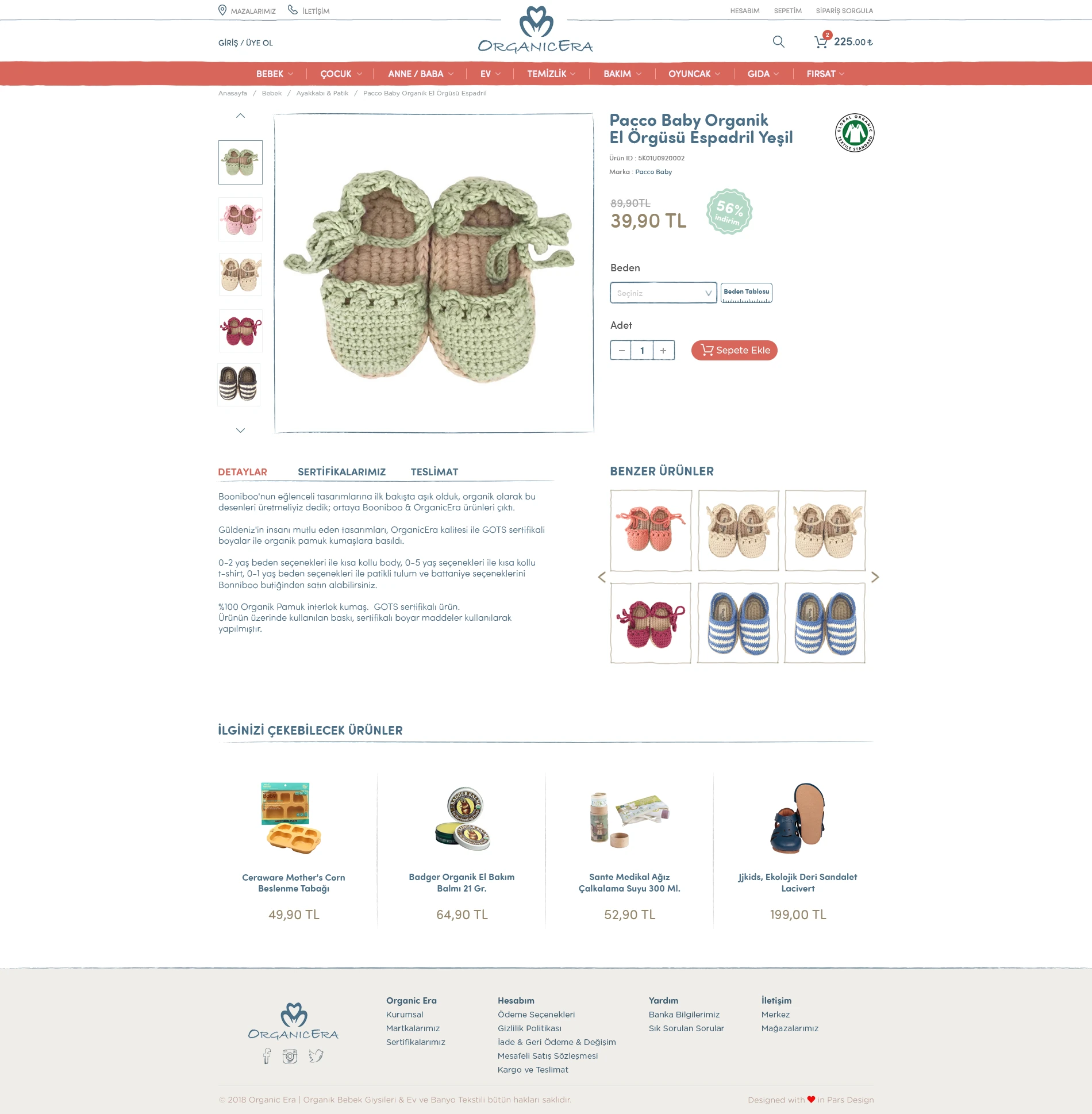
Product detail page
Design approach.
The homepage creates a natural path through campaigns, featured collections, new products and bestsellers. Soft colours, large product photographs and open layouts express the warmth of baby products while keeping commercial messages clear.
Product pages give imagery, names, prices, options and purchase actions a clear hierarchy. Scrollable lists connect related and new products to the journey. Blog content, shop photographs and certificates provide further touchpoints that support trust.
We reprioritised the desktop structure for mobile, aiming to keep browsing and purchasing equally clear across screens.
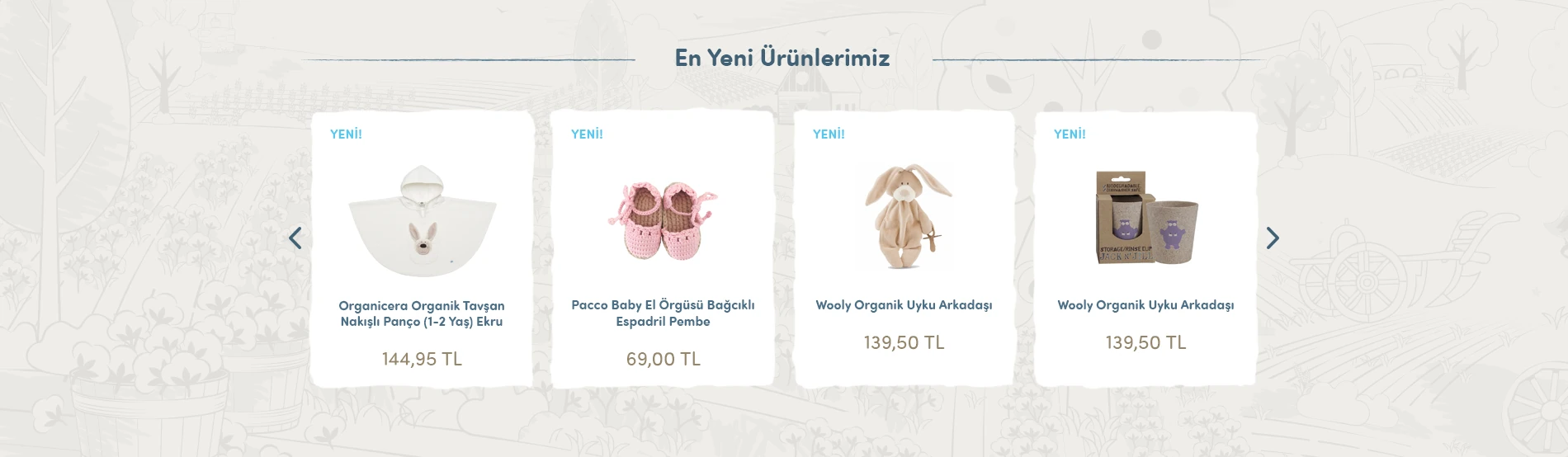
New products
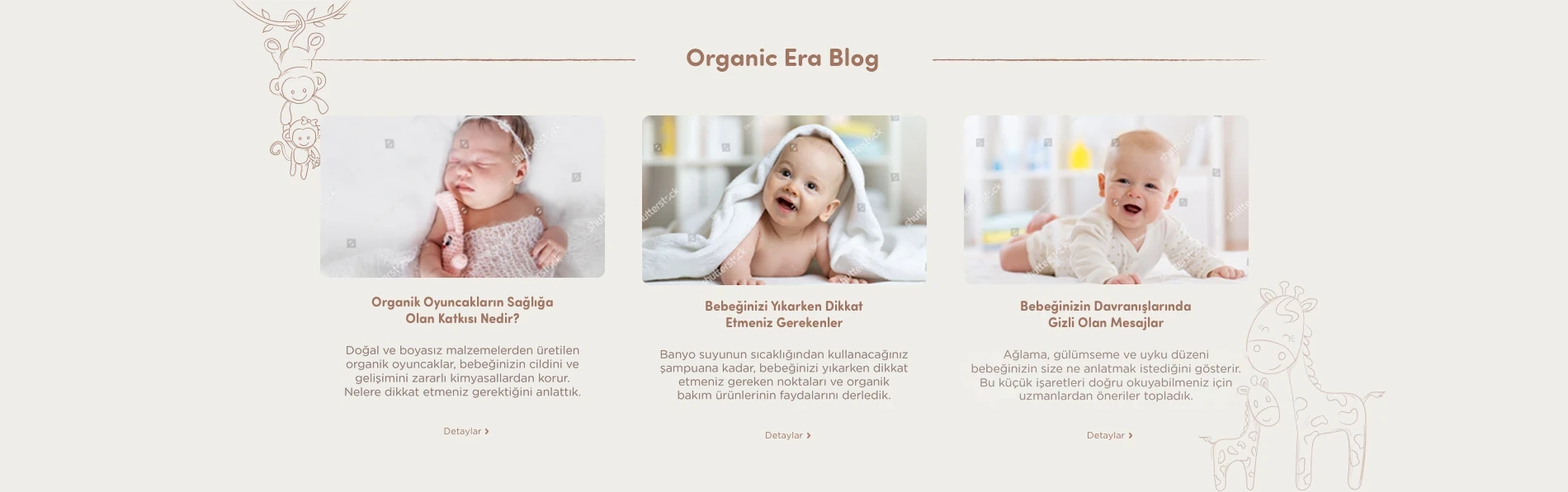
Blog section
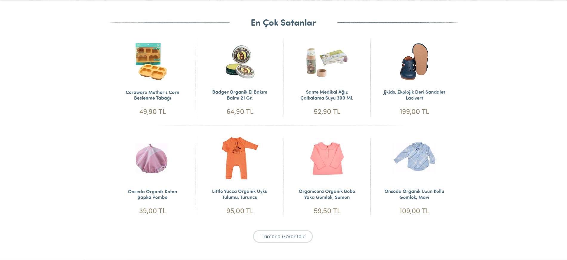
Bestsellers
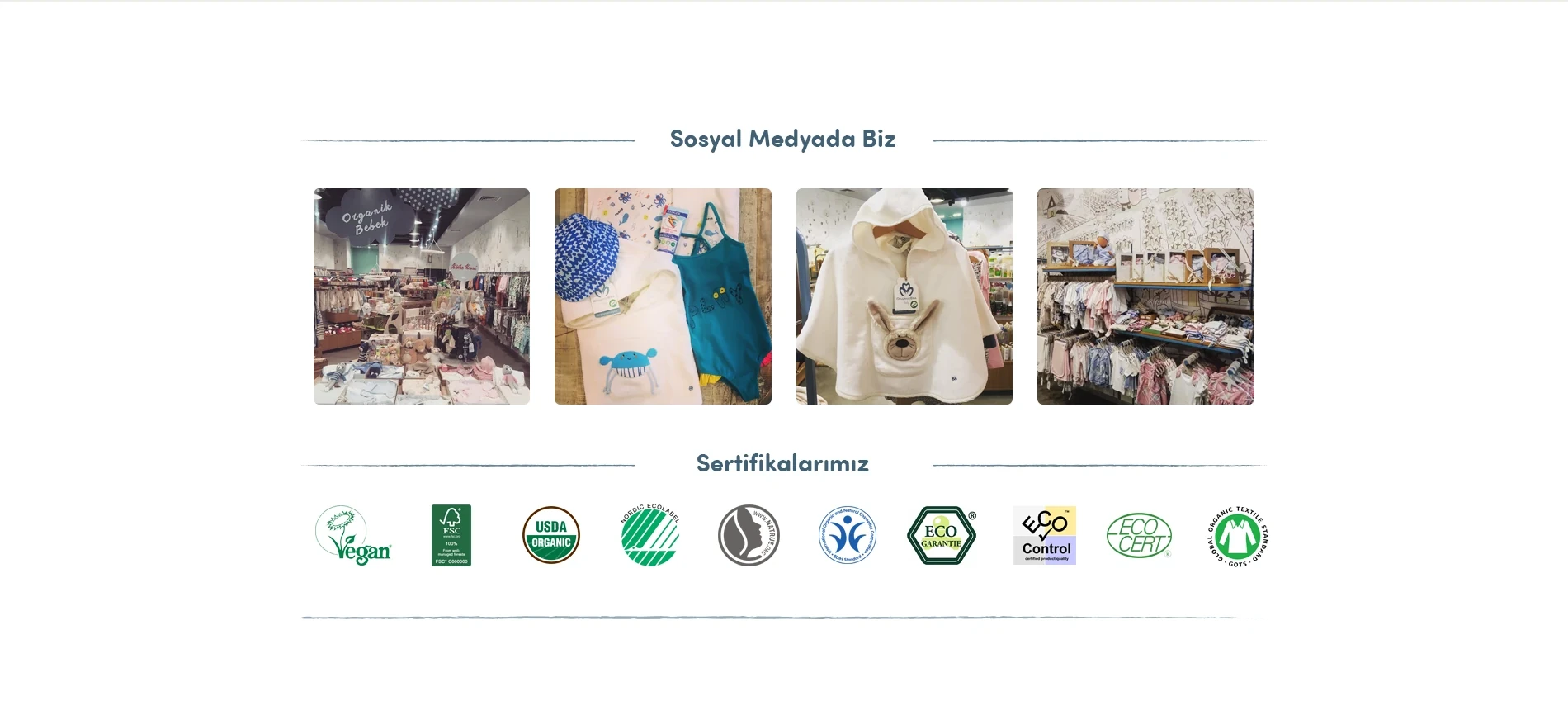
Social media & certifications
The work.
The complete e-commerce interface preserves Organicera’s natural, thoughtful character while simplifying discovery and purchasing. Pars Design handled information architecture and UX/UI; software and e-commerce infrastructure were outside our scope.