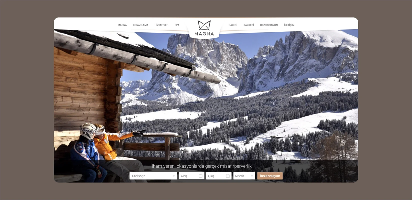
Magna Hotels Logo.
A mountain identity drawn from the hotel’s architecture.
We designed the complete logo and corporate identity for Magna Hotels in Kayseri. Staying at the hotel and working directly with its owners informed an identity that combines distinctive architecture with the calm, refined character of a ski hotel.

Logo
Need.
Magna offered a distinctive experience within Kayseri’s winter and ski tourism. Its identity needed to reflect the architecture, setting and guest atmosphere rather than look like a generic hospitality brand.
The task went beyond a logo. It required a corporate system that would preserve the same character across signage, print, guest communications and promotional materials.
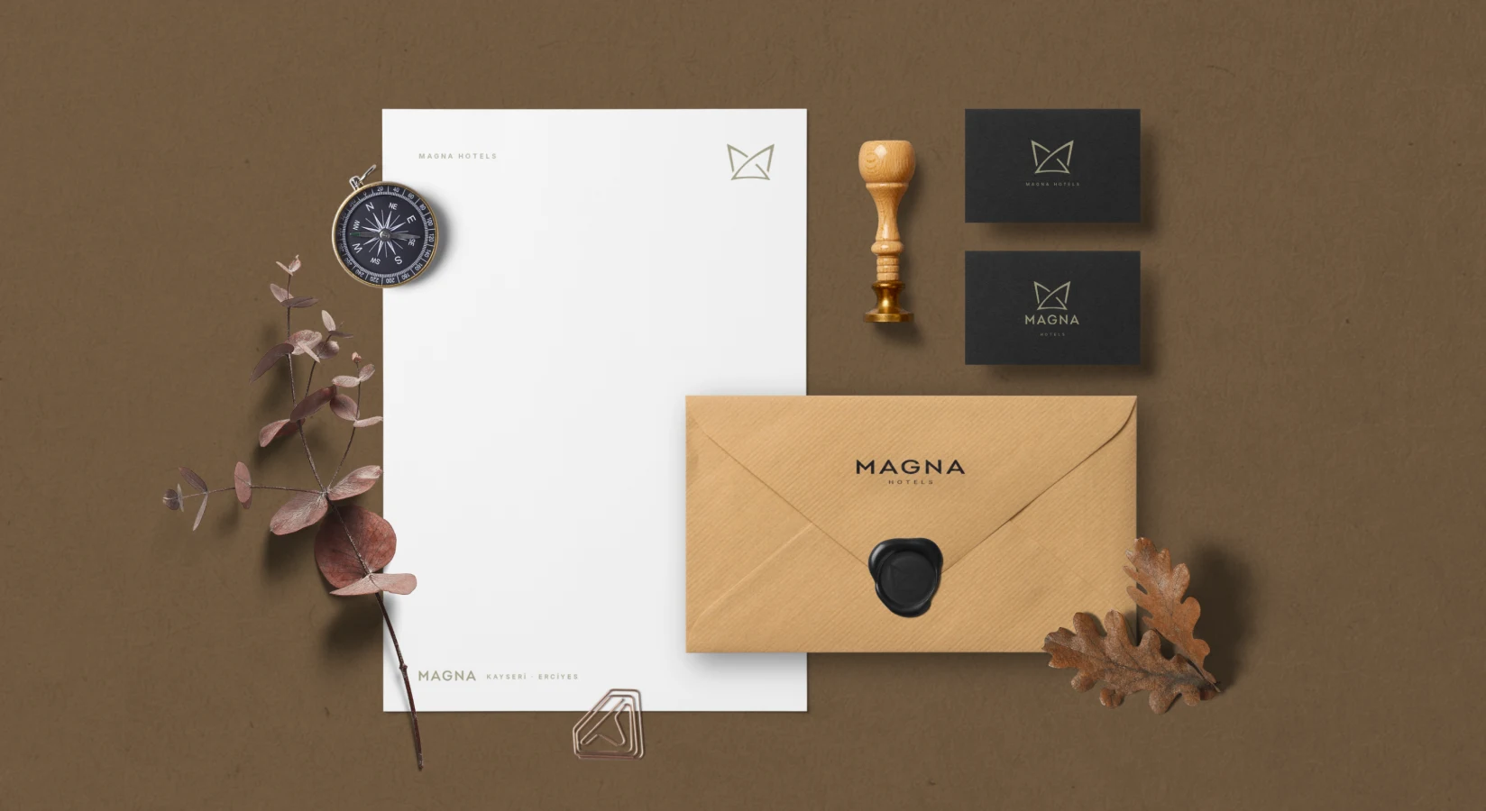
Corporate identity applications
Design approach.
We travelled to Kayseri, stayed at the hotel and experienced the building and its surroundings. Conversations with the owners helped clarify its story and desired perception. This first-hand work grounded the identity in the hotel’s actual character.
The geometric mark draws on the hotel’s architecture. Intersecting lines suggest both its distinctive silhouette and mountain peaks. A restrained palette and simple typography create a refined, lasting hospitality identity without exaggerated luxury cues.
We extended the logo into business cards, envelopes, catalogues, notebooks and other hotel communications, creating a complete corporate identity.
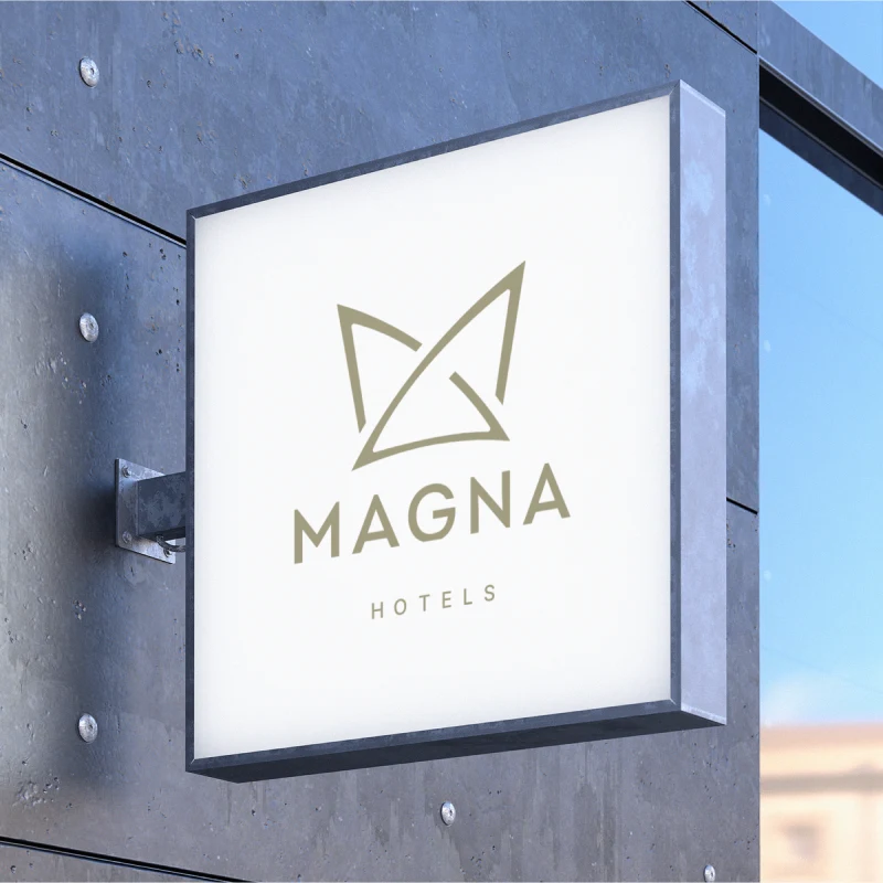
Tabela
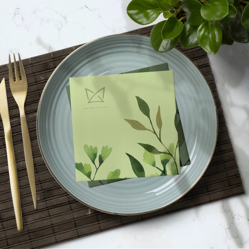
Napkin
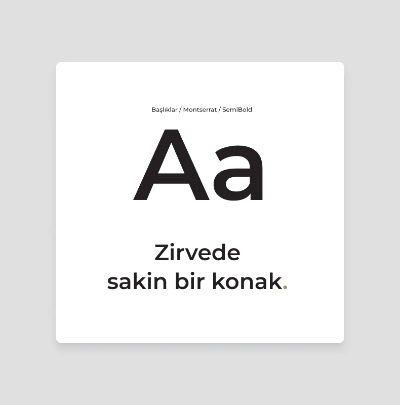
Typography
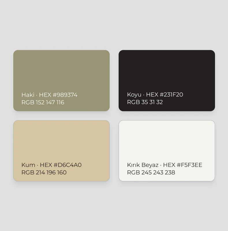
Renkler
The work.
The identity connects Magna Hotels with its setting and architecture, carrying its distinctive character across touchpoints. A close client relationship kept the design grounded in the real experience of the hotel.
Magna Hotels remains in operation and continues to use the identity we designed. That continuity reflects the lasting value of a simple identity rooted in the place and the brand itself.