Avsos Logo Design.
One mark for the connected nature of airline operations.
Avsos provides cloud-based, modular, mobile-first software for sustainable, high-performing aviation operations. We expressed its approach—connecting resources from crews to aircraft and processes from ground to flight operations through an AI-supported system—in a simple logo.

Logo
Need.
Airline operations depend on shared decisions by planners, administrators, operations-centre staff and resource managers. Crew, aircraft, flight and ground data must work together. The identity needed to suggest connection, modularity, optimisation and coordination while staying clear at small sizes in software interfaces.
Design approach.
Three flowing elements meet around a common centre to form the mark. They suggest operational modules coming together, data moving between systems and a continuously working network. The product’s application, AI, optimisation, business logic, data and integration layers support the same idea of connected parts.
Rounded forms make the technical structure more approachable. The open movement suggests a product that can evolve and add modules. Blue connects with trust, technology and aviation, while a white lowercase wordmark balances the symbol with restrained, contemporary typography.
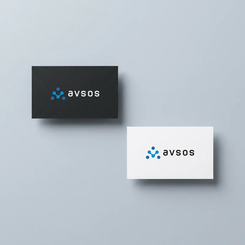
Business card
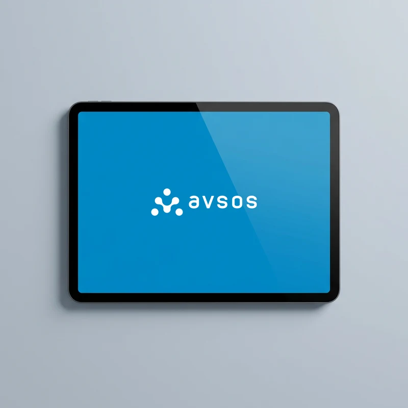
Tablet
An identity that simplifies a complex system.
Data flows, connection points and layered operations shape Avsos’s visual world. The logo condenses them into a simple idea: different parts, one centre and continuous connection. Its joined elements reflect the integrated yet modular nature of IOCC, crew, flight and ground operations.
The compact symbol can stand on its own across software interfaces, app icons, presentations and digital communications.
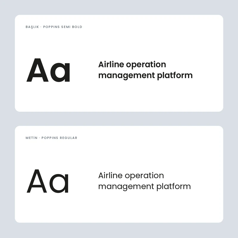
Typography
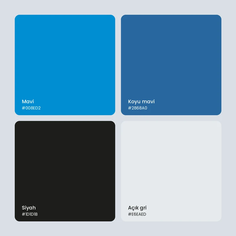
Colours
Outcome.
The Avsos logo expresses the product’s central promise through a simple system idea. Its connected, modular character provides a flexible identity foundation for the digital product.