Fraport TAV Antalya Havalimanı.
A website experience from a traveller’s first question to their first impression of the city.
We redesigned Antalya Havalimanı’s website in two separate periods. Flight information, passenger services, transport, terminal content and a city guide shared one information architecture, creating a visually strong, responsive experience that supported quick decisions on any device.
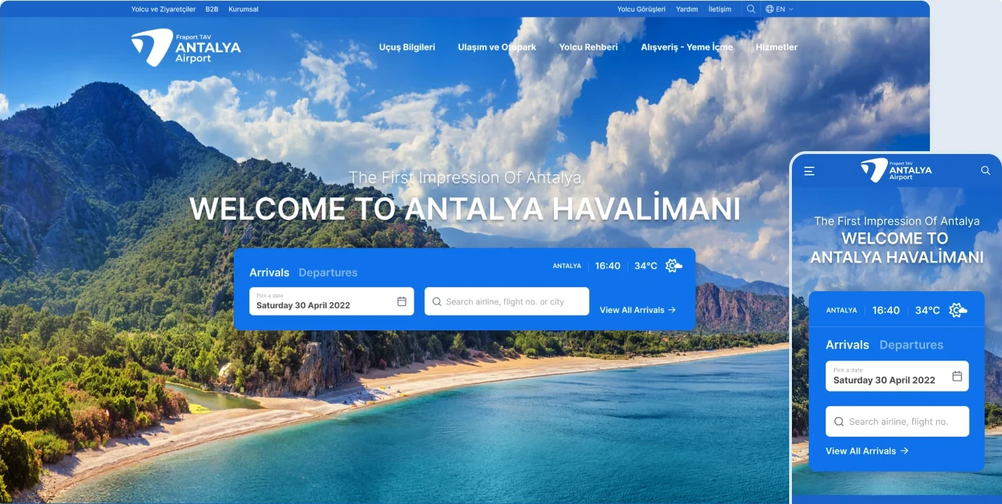
Home page on desktop and mobile
Need.
An airport website serves people with very different needs, often under time pressure. Passengers check flights, find terminals, compare transport or access services. Visitors, partners and job applicants seek corporate information, commercial opportunities, announcements and careers content.
The task was to make this range of content accessible without requiring users to understand the airport’s internal structure. Time-sensitive, task-focused information needed prominence, while services, Antalya as a destination and corporate content each needed their own space.
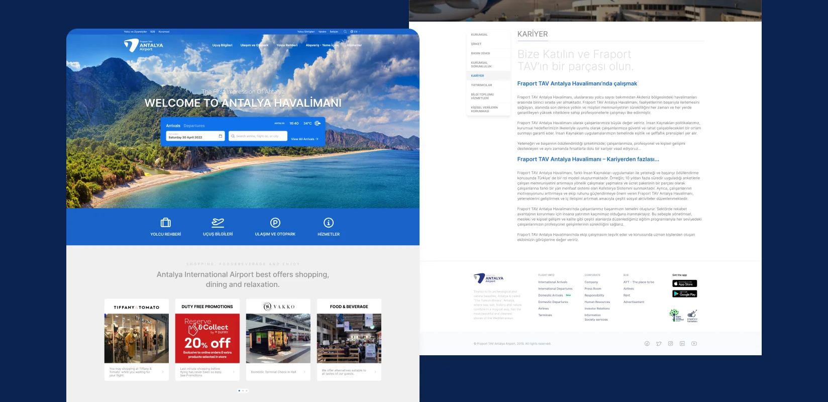
Homepage, corporate and careers pages
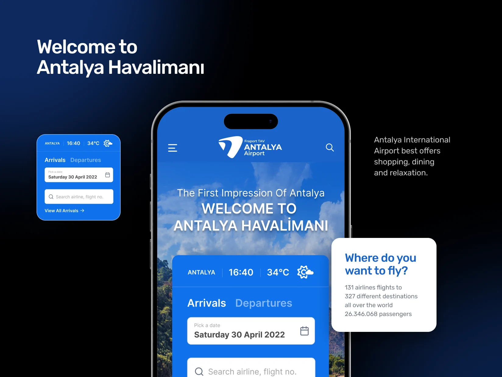
Mobile homepage and flight search
Logo
Approach.
Information architecture shaped around passengers’ questions
We organised navigation and pages around questions such as “When is my flight?”, “How do I get to the airport?”, “What services are in the terminal?” and “What can I do in Antalya?” Flight information, passenger guidance, transport and parking were directly accessible.
Balancing operational information and destination content
We treated the airport as the beginning of the Antalya experience. Flight search, statistics and terminal services sat alongside the city guide, news and visual content in a balanced structure.
Building the content architecture together
With Guns of Marketing and the client teams, we defined scope, page hierarchy and content priorities. A modular structure helped different content types work consistently from the home page to corporate and careers sections.
Bringing the experience to every screen
For mobile, we reconsidered priorities rather than shrinking the desktop layout. Flight search, quick links, announcements and passenger services became flows that were easy to scan and use by touch.
Rethinking the same digital presence a second time
Several years after the first design, we revisited the website as brand, content and user expectations changed. Drawing on what we had learned, we redesigned the interface, content structure and responsive experience around the new needs.
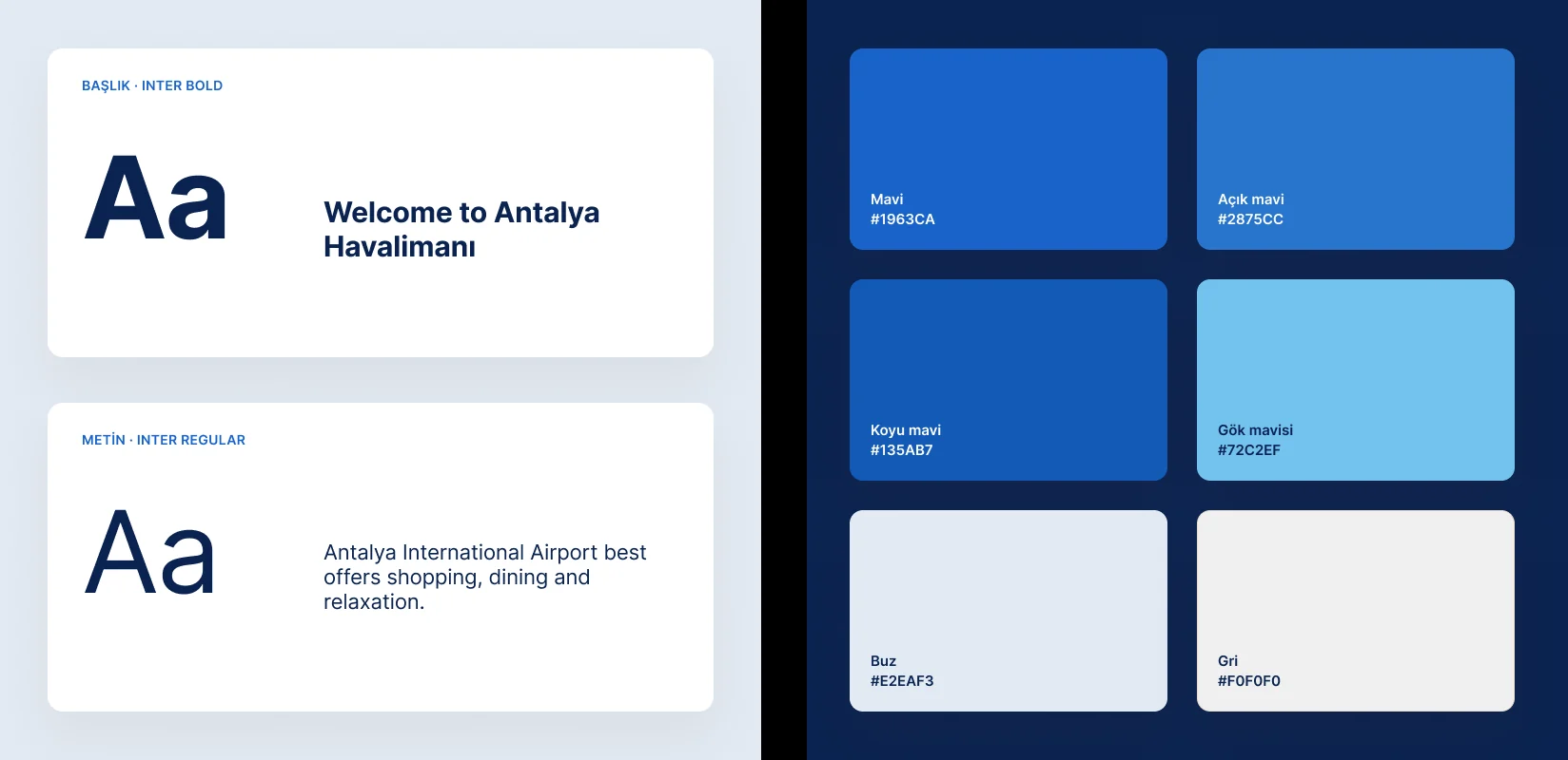
Typography and colours
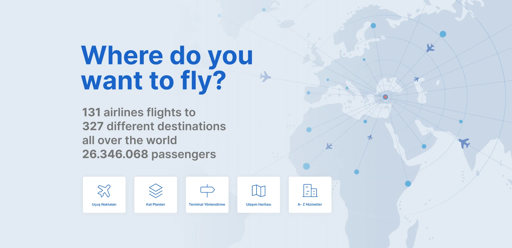
Flight statistics section
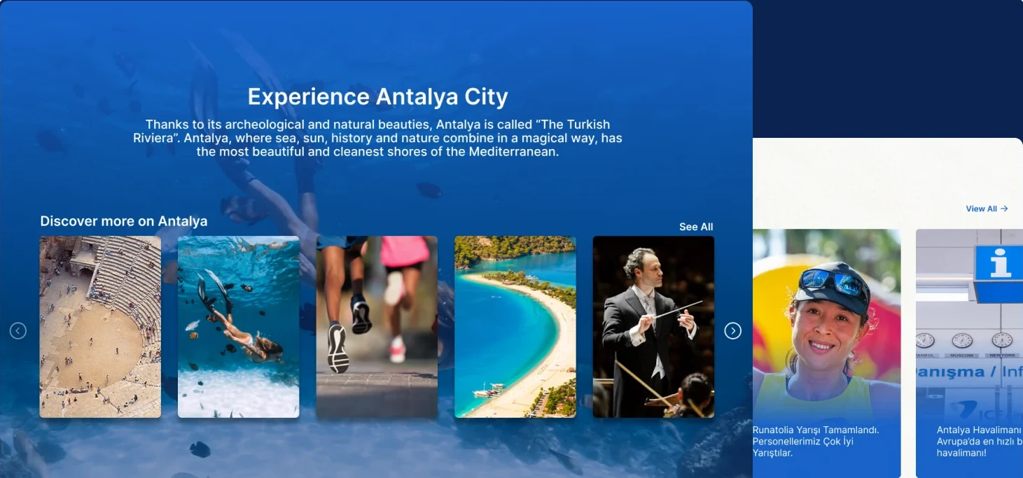
City guide, announcements and news
The work.
The website brought flight information, terminal guidance, transport, airport services, shops, dining, the Antalya city guide, announcements, corporate information and careers into one experience.
Redesigned in two periods, the website remains Fraport TAV Antalya Havalimanı’s active digital presence. The project shows how information architecture, visual hierarchy and responsive design can work together in a large service website with extensive content and varied user needs.