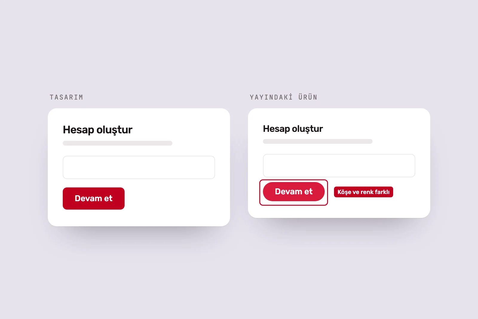
Building a design system sounds sensible, and often is. But teams make mistakes in both directions: spending months on a system for five screens, or growing a product with dozens of screens without one. To judge the timing, first define what a system means.
The difference between a design system and a UI kit #
A UI kit is a file: a Figma library of buttons, form fields, cards and colours. It speeds up design work but lives only on the design side.
A design system is a way of working. It includes tokens, matching design and code components, usage rules, documentation and governance defining who can change what. The difference is visible in a simple example: change a button colour in a UI kit and the design file updates. In a system, a token can carry that change across the product.
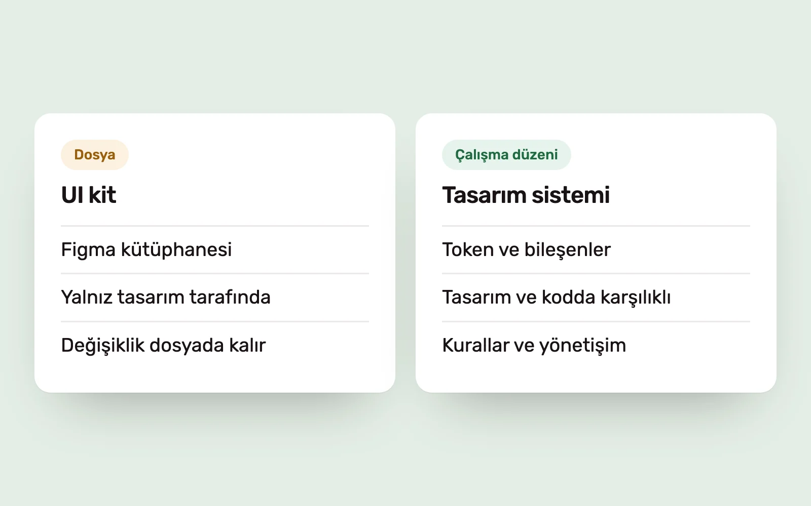
This distinction matters because what many teams call a design system is a UI kit—and early on, that may be all they need.
Six criteria for choosing the right time #
Consider these six questions together.
- Screen count: a handful of screens, or dozens of screens and modules?
- Product lifespan: a campaign site, or a product that will evolve for years?
- Team size: one designer and one developer, or several teams working on the interface?
- Repeated components: how many places use the same table, form or card?
- Platforms: web only, or web, iOS and Android together?
- Design–code gap: how far has the live screen diverged from the Figma design?
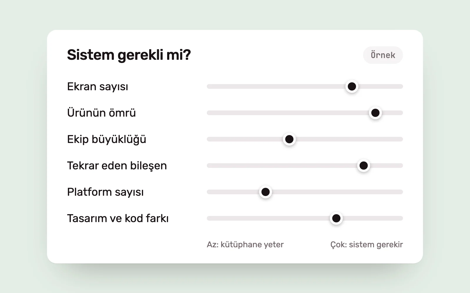
If most answers are “few” or “one”, a comprehensive system is overhead. If most are “many”, its absence costs you in every release.
The cost of building too early #
A system built before the product is understood is a detailed answer to the wrong question. Components are abstracted before they are used, and much of the system is discarded when the product changes direction.
The second cost is maintenance: every component’s variants, states and documentation need updating, taking time from product development in a small team. The third is rigidity. Teams avoid trying solutions outside the system, losing the flexibility an early-stage product needs.
Before a product’s first release, the right investment is a few consistent foundations, not a comprehensive system.
Signs you have waited too long #
The product itself reveals when a system is overdue.
- Several buttons, modals or tables perform the same job.
- Designing a new screen starts by copying and adjusting an old one.
- Spacing, colour and behavioural differences have accumulated between design files and live screens.
- A small visual change requires edits in dozens of files.
- New team members cannot find out which component is correct.
- The same feature looks and behaves differently across platforms.
If several signs appear together, the team is already paying the cost of a system without getting its benefits.
A minimum viable design system #
A system is not an all-or-nothing decision. The smallest useful version includes:
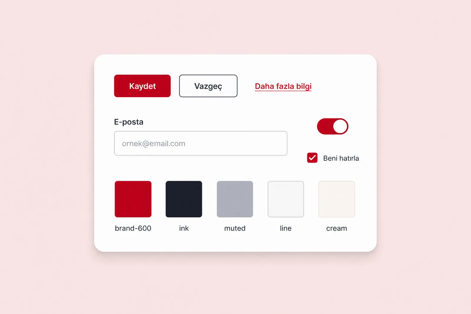
- Core tokens: colour, type scale, spacing and corner radius, with matching names in design and code.
- Common components: buttons, form fields, selection controls, cards, tables and modals, including every state.
- Brief usage rules: when to use each component, and when not to.
- Ownership: who decides on changes to the system.
These four parts begin with a few components and expand with the product. A component should already be used in at least two or three places. Unused components do not enter the system.
Audit and setup #
For a live product, a system is extracted from what exists, not drawn from scratch. Design System Audit and Setup follows this sequence.
- Inventory: bring existing screens and components into one view, marking duplication and gaps.
- Architecture: define tokens, component layers, naming and ownership around the product’s actual needs.
- Components: build priority components with their variants and states.
- Mapping: connect Figma components and tokens with their code equivalents.
- Documentation and governance: record usage rules and establish who makes decisions.
The inventory alone is often valuable: for the first time, the team sees how many components do the same job. Maintaining the system is a separate responsibility. Regular Design QA checks whether the live product has drifted from the system. When several teams contribute, design leadership keeps decisions within a shared framework.
When is a basic component library enough? #
A well-built library is enough in place of a comprehensive system when:
- The product runs on one platform with a limited number of screens.
- One designer and a small development team work on the interface.
- The product is approaching its first release and its direction is not yet settled.
- The site or product is intended for a limited lifespan.
In these cases, adapting an open-source component library to the brand’s colours and typography is a better investment than building a system from scratch. As the product grows and the signs above appear, the library can become a system. By then, working components and real use cases ground it in needs rather than assumptions.
Sources #
- Design Systems 101, Nielsen Norman Group; design system components and when they are needed