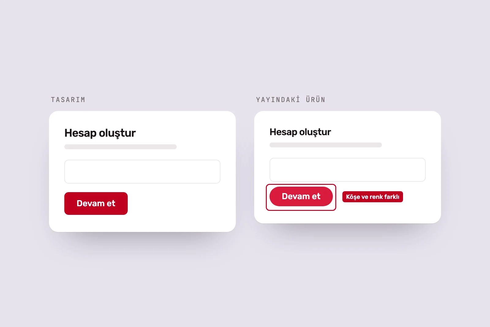
The design is approved, development begins and the product goes live. Then someone puts two screens side by side: spacing differs, a button has no hover response, a long heading overflows its card and a table runs off the phone screen. Nobody deliberately got it wrong. The gaps appeared where the design file had nothing to say.
This article works through those gaps. The first seven sections explain where they arise; the final two show how to catch them.
1. Missing state designs #
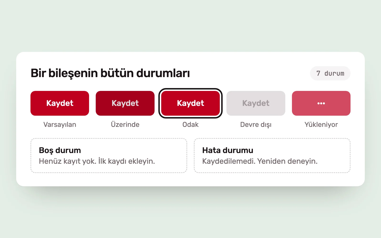
Design files usually show the ideal screen: populated with data, fully loaded and error-free. In a real product, every screen has other states.
- Loading: what appears before the data arrives?
- Empty: what appears with no records, and what can the user do?
- Error: what does the message say when a request fails?
- Partial: how does the layout behave when only some data is available?
- Interaction: hover, focus, pressed and disabled states.
When these states are not designed, developers invent their own solutions, each differently. This accounts for a significant share of product inconsistency.
2. Undefined responsive rules #
A design drawn at two or three screen widths leaves every width between them open to interpretation. Which elements stretch? Which stay fixed? When do columns stack? What happens to a table on a narrow screen?
The answer is not to draw every width, but to define the rules. Minimum and maximum component widths, breakpoints and overflow behaviour give developers what they need to handle the widths in between.
3. Component variants #
How many sizes, types and states does a button have? If the design file has four variants and the code has seven, they no longer match. The gap often grows quietly: a designer makes a small change on a new screen, it is not added to the library, and a developer writes a screen-specific style.
Design and code need the same variants, with the same names. When a new variant is needed, the decision belongs at component level, not screen level.
4. Content limits #
In the design, the heading has two words, the username is short and the price has three digits. Real content does not behave that way: product names are long, translated buttons grow, fields are empty and numbers can be very large.
Every text field needs minimum and maximum lengths, overflow behaviour—truncation, wrapping or resizing—and a rule for empty values. Designing with real or realistic content exposes many of these problems before handoff.
5. Accessibility #
Some accessibility requirements are visible in a design file: contrast, touch target size and focus indicators. Others are not: keyboard navigation order, screen reader labels and how errors are announced.
If the invisible parts are not documented at handoff, they may not be implemented. Focus order, text alternatives for icon buttons and form labels should accompany the screens as notes.
6. Design tokens #
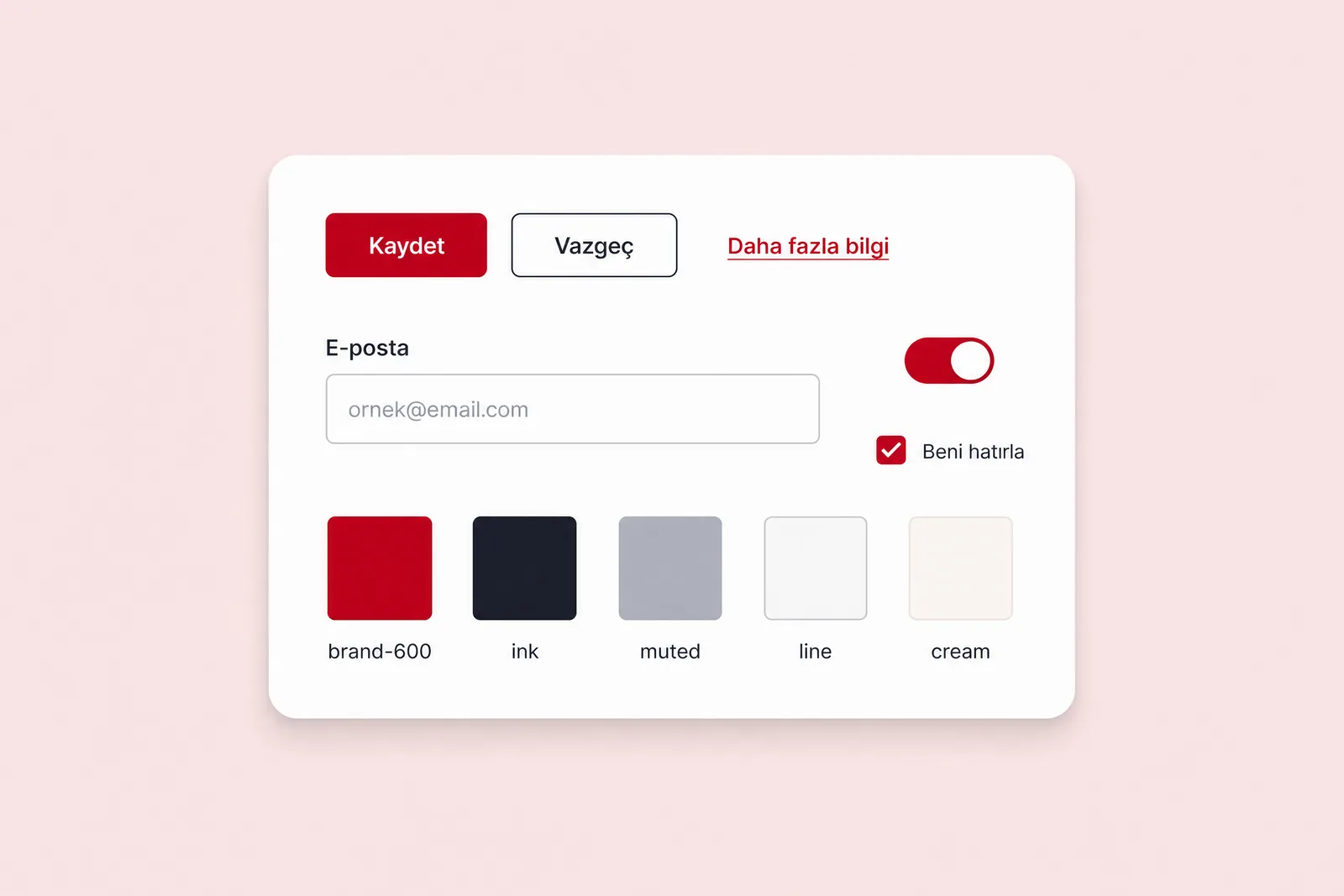
In the design, a colour is “brand red”; in code, it is a hexadecimal value. Spacing is adjusted by eye in design and written as arbitrary pixels in code. Even a small visual change then requires edits throughout the product.
Tokens give these values the same names in design and code: colour, spacing, type scale and corner radius. Developers use the name rather than copying a value. We explain when tokens and components need to become a fuller system in our guide to design systems.
7. Communication between design and development #
When designs are thrown over the wall, developers have nobody to ask and must guess. The reverse happens too: without knowing technical constraints, designers produce work that cannot be implemented as drawn.
A workable arrangement is simple. Developers see the design before handoff and flag difficult areas. During development, there is an open channel for questions and a designer available to answer them. Design changes are documented. For live products, we maintain this continuity through Product Design Support: design works within the sprint and development process.
8. Post-implementation Design QA #
Even with these gaps closed, an implemented screen should not go live without comparison against the design. Design QA is different from functional testing. Functional testing checks whether a button works. Design QA checks whether it is in the right place, at the right size, with the right states and component.
Design QA systematically reviews a live product’s design, behaviour, content, responsive layouts and accessibility. We check on real devices at different screen widths, and test empty, error and loading states separately.
9. A prioritised issue report #
“Does not match the design” is not a useful issue report. A good entry includes the screen and step, expected behaviour, actual behaviour and a screenshot. A developer should not have to ask what needs doing after reading it.
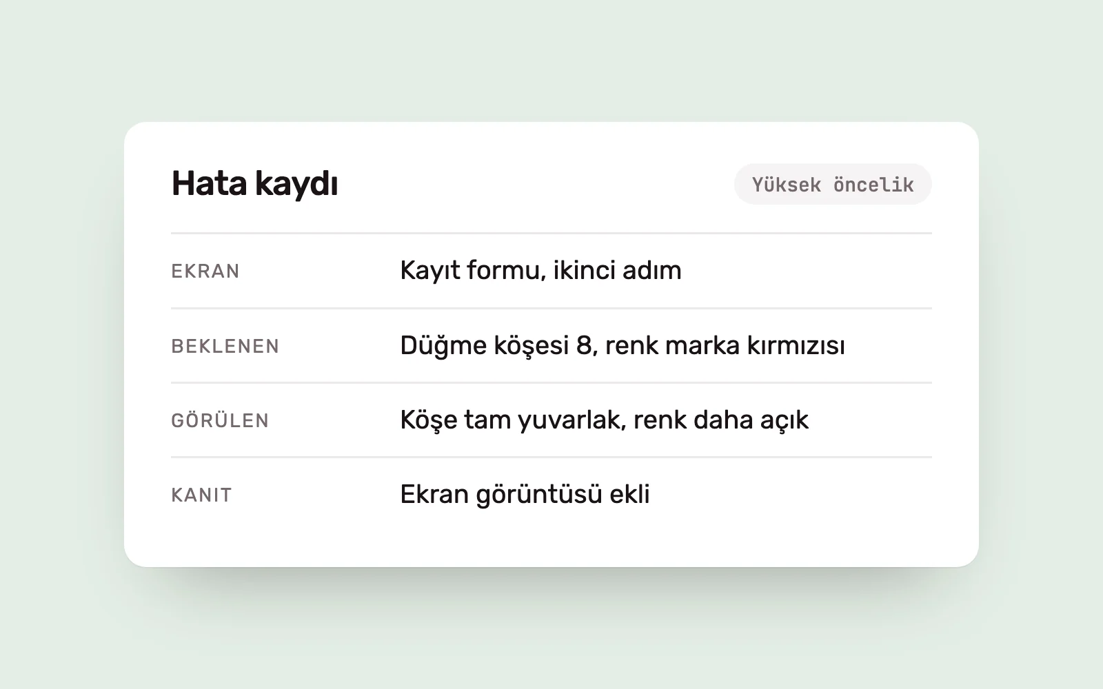
Issues are not equally important. They are ranked by impact, effort, risk and dependencies.
- Issues that block users’ tasks or compromise accessibility come first.
- Component-level issues affecting many screens are prioritised because one fix can address them all.
- Small, purely visual differences are grouped and handled together.
After a fix, the same screen is checked again. Closing a ticket does not prove that the expected behaviour has been delivered.
Closing the gap for good #
Design QA catches problems but does not remove their causes. If the same differences reappear in every release, the missing piece is not another review but a standard: designed states, documented rules, mapped tokens and a shared point of decision-making.
When several development teams or agencies work on one product, someone needs to own that standard. Our Design Leadership service establishes the quality standard and review schedule for this purpose. We explain how decisions are managed in design decisions in product teams.
Sources #
- Design Systems 101, Nielsen Norman Group; a shared component language between design and code
- Web Content Accessibility Guidelines (WCAG) 2.2, W3C; the criteria behind accessibility checks