What an interface typeface needs to do #
A brand’s display typeface and a typeface used in app forms, tables and menus have different jobs. The first carries character and tone. The second is read for hours, used at small sizes and exposed to all kinds of data. For interfaces, we consider the following:
- Legibility at small sizes. A high x-height and open letterforms make a difference in form labels and supporting text.
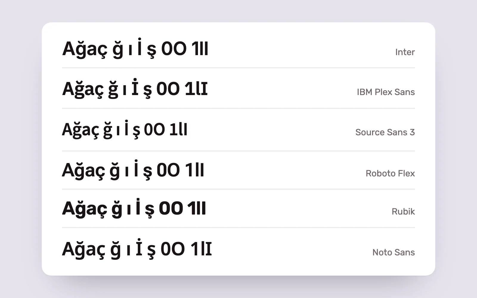
- Distinct characters. Uppercase I, lowercase l and the numeral 1, or uppercase O and zero, must not be confused in code, passwords and product identifiers.
- Tabular figures. Equal-width numerals keep numbers aligned in pricing and data tables.
- A broad weight range, ideally with a variable version. Variable fonts provide multiple weights in one file, making hierarchy and performance easier to manage.
- Full Turkish support. The characters ğ, ı, İ and ş need well-drawn forms, with accents that do not collide with adjacent lines.
Turkish has another detail worth checking. For CSS uppercasing to turn i into İ, the page or relevant element must declare Turkish as its language. Otherwise, uppercase headings will show an undotted I.
Inter and IBM Plex #
Designed by Rasmus Andersson, Inter covers uses from detailed interfaces to signage. According to its official site, it contains more than 2,000 glyphs across 147 languages, offers weights from 100 to 900 and has separate optical sizes for text and display. Its text cuts use a high x-height to improve legibility. It also includes OpenType features such as tabular figures. Google Fonts distributes it under the SIL Open Font License.
IBM Plex is a large family developed as IBM’s corporate typeface and released as open source. Related families including Sans, Serif, Mono and Sans Condensed make it possible to create a consistent voice across interface text, long-form reading and code. Plex Sans supports extended Latin alongside writing systems including Arabic, Cyrillic, Greek and Hebrew. It is also available on Google Fonts under the OFL.
The choice often comes down to tone. Inter is more neutral and recedes into the background; Plex feels more mechanical and distinctive. In data-heavy products and developer tools, Plex Sans and Plex Mono form a coherent pair.
Source Sans 3, Roboto Flex, Rubik and Noto Sans #
- Paul D. Hunt designed Source Sans 3 for Adobe as part of its open-source Source family. Its GitHub repository describes it as a sans serif designed for user interfaces. It is a quiet, legible choice that remains comfortable over longer passages.
- Roboto Flex is a variable family developed for Google Fonts by Font Bureau, David Berlow and his team. Alongside weight, width and optical size, it offers multiple parametric axes for fine adjustment. It is a natural fit for teams working with Android and Material Design.
- Rubik is a slightly rounded sans serif designed by Philipp Hubert and Sebastian Fischer of Hubert & Fischer. It works well in consumer apps and gamified interfaces that need a friendlier tone.
- Noto Sans is part of Google’s Noto project, which aims for broad language coverage. It also serves well as a fallback in multilingual products.
All these families appear in the OFL directory of the Google Fonts repository and include the Latin Extended subset covering Turkish letters. Before choosing, we still recommend a test page using your product’s real content, especially headings and button labels containing ğ, ş and İ.
Read the licence #
The SIL Open Font License is a widely used open-source licence for typefaces. Its current version is 1.1, dated 2007. According to its official site, OFL fonts can be used in books, posters, logos and websites, and embedded in apps and software, modified and redistributed under specified conditions. A modified font may need a new name if the original has a Reserved Font Name.
Commercial typefaces work differently. Families such as Euclid, Brandon Grotesque, Graphik, GT America and Akkurat, popular a few years ago, are commercial products from independent foundries. Desktop, web, mobile app and publishing use are generally licensed separately, with terms varying by foundry. A font installed on a designer’s computer is not automatically licensed for a website or app.
A commercial brand typeface paired with an openly licensed interface family is a common, balanced solution. The brand retains its character in headings and marketing pages, while dense product text and data use the openly licensed family.
Performance on web and in apps #
- Serve fonts in WOFF2 format, preferably from your own server.
- If you use several weights, choose a variable font. One file can replace multiple static files.
- Limit the number of families and weights. Most interfaces work comfortably with two or three weights.
- When subsetting, include Latin Extended for Turkish characters. A site serving only basic Latin will display ğ, ı, İ and ş in a fallback font.
- Use font-display to keep text visible while the font loads, and choose a fallback with metrics close to the primary font.
For some products, the operating system’s own font is the best choice. It needs no download and feels familiar, though it will not look identical across platforms.
Legibility and the type scale #
Once you choose a family, use it within a consistent type scale. Define size, line height and weight for headings, subheadings, body text, labels and supporting text once, then store them as design system variables. This keeps the product consistent as the number of screens grows.
For accessibility, WCAG 2.2’s text spacing criterion is a useful check. Content and functionality should remain intact when users increase line height to at least 1.5 times the font size, paragraph spacing to 2 times, letter spacing to 0.12 times and word spacing to 0.16 times. Fixed-height boxes and overflowing text are usually the first things to fail.
At Pars Design, we test a product’s typography with real content first: screens with long names, large numbers and Turkish characters. Only then do we record the family and scale in the design system.
Sources #
- Inter font family, rsms.me; Inter’s language coverage, weights, optical sizes and OpenType features
- IBM Plex, IBM GitHub; related Plex families and language support
- SIL Open Font License; OFL 1.1 terms for use, embedding and modification
- Understanding Success Criterion 1.4.12: Text Spacing, W3C; accessibility values for text spacing