Sefa Dairy Logo and Packaging Design.
A reassuring identity for the natural character of dairy products.
We designed Sefa Dairy’s logo, identity and packaging system together. A coherent visual language reflects expectations of trust, freshness and naturalness while retaining recognition across products and packaging formats.
Logo
Need.
The dairy brand needed to inspire trust and reflect its products’ natural, everyday character. The logo had to work on bottles, jugs, cartons and other packaging while remaining readable at small sizes.
An expanding product family needed more than one logo. It required flexible packaging that could organise categories, product names and mandatory information.
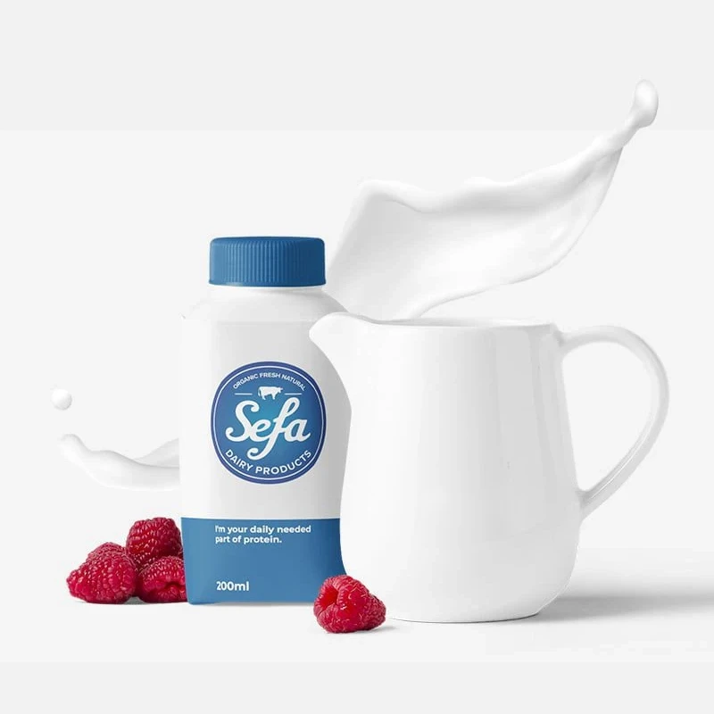
Logo on packaging
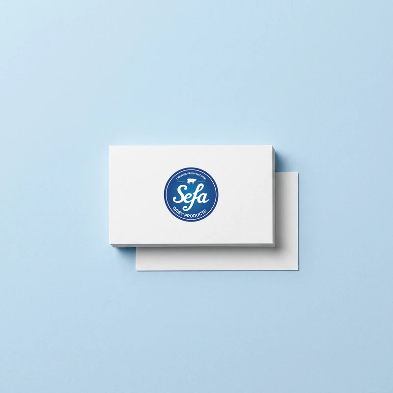
Business card
Logo design.
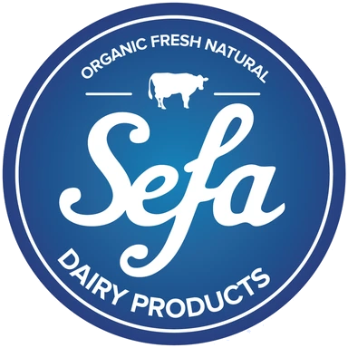
Blue supports associations with cleanliness and trust; the circular form acts as a visible quality cue on packaging. A readable wordmark and ‘Dairy Products’ descriptor make the category immediately clear.
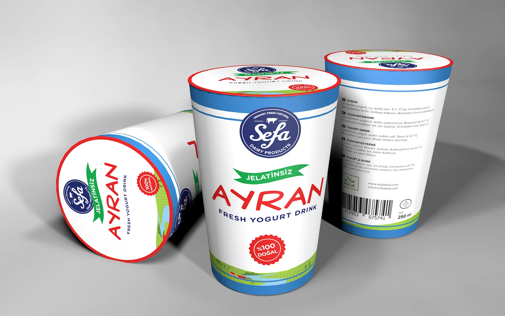
Ayran containers
Packaging system.
We adapted the system for milk bottles, jugs, ayran cartons and other packaging. A clear hierarchy around the main mark organises product names, types, ingredients and supporting information.
Our aim was an immediately recognisable family on the shelf, with colours and information layers distinguishing products. Simple geometry works across broad labels and small caps and seals.
Business cards and corporate applications extend the identity beyond packaging. Sales, distribution and company communications retain the same character.
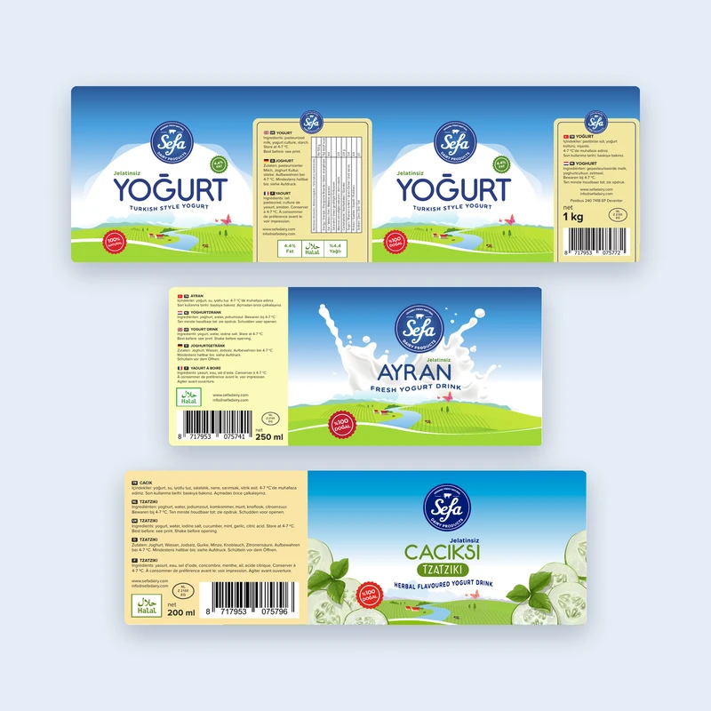
Labels
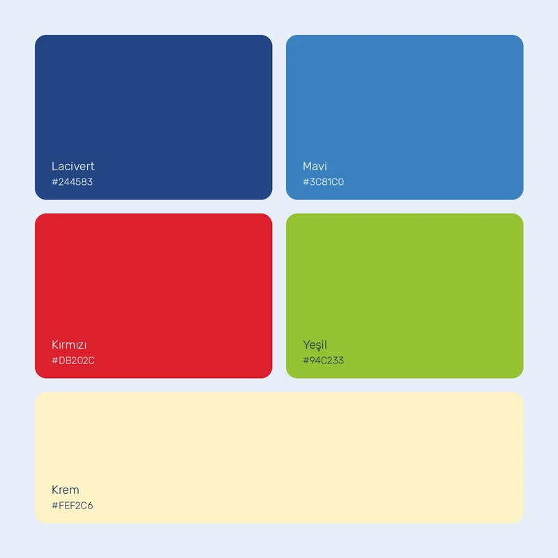
Renkler
The work.
The logo and packaging system bring Sefa Dairy’s products under a trustworthy, natural and recognisable identity. Flexible formats support shelf visibility and corporate consistency.