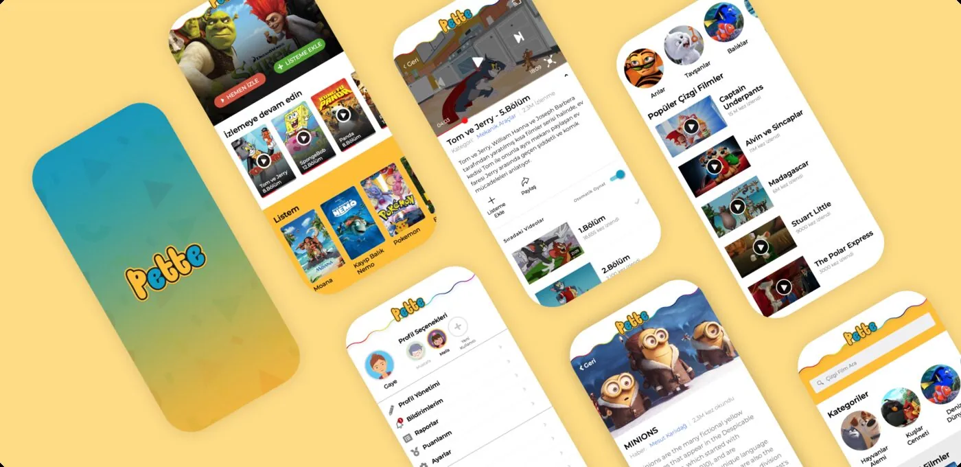
Pette Mobil.
Bringing a safe video world for children to every screen.
We designed Pette’s iOS and Android apps around two audiences: children aged 8–12 discovering selected videos, and parents following viewing habits. Part of the same system as web and TV, mobile has a simple, colourful interface suited to its own context.
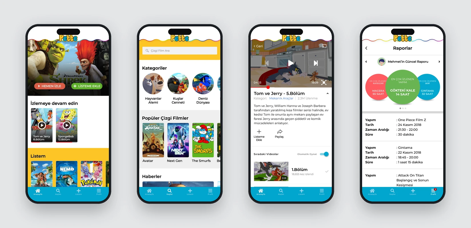
Home, categories, player and reports
Need.
Children needed to find content without adult assistance and understand categories, videos and episodes on small screens. Parents needed a separate area with clear information about viewing time and preferences.
Mobile could not be a shrunken web interface. It needed to reflect touch interaction, limited space and children’s visually led decisions.
Design approach.
Large cover images and horizontal lists present videos on the home screen. Explore brings categories, popular content and current recommendations together. Video pages connect the player with episode lists so children can easily continue a series.
Colour helps children navigate sections and content types rather than simply decorate the interface. Large touch targets, short headings and image-led cards reduce decision effort.
Parental visibility and gamification.
Readable charts show total viewing time and content distribution in parent reports. For children, points and gifts add a sense of progress and achievement.
Different information densities and visual tones address children and parents within the same app without confusing their needs.
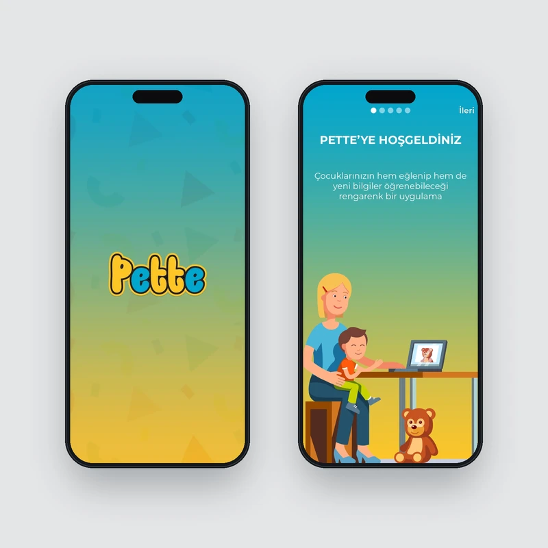
Launch and welcome
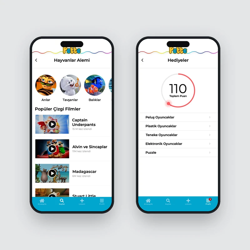
Film listing & gifts
The work.
The iOS and Android apps combine video discovery, categories, episodes, parent reports and points and gifts. Pars Design handled mobile information architecture, UX/UI and front ends; the core app infrastructure was developed with a partner.
Pette Mobil was published for a period. Together with web and TV, it formed part of the wider Pette ecosystem.